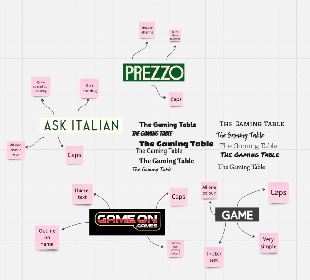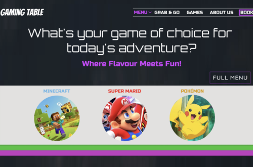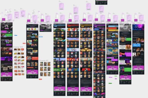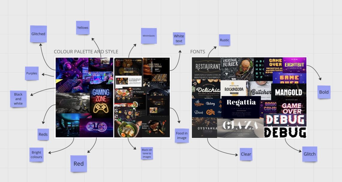
After creating my site map and wireframes, I delved into font and color palette research. This step was essential to ensure my website adhered to the conventions of both restaurant and gaming websites, providing valuable insights into their styles and potential synergy.
The design process for my website is anticipated to be challenging, given the contrasting themes. Combining restaurant and gaming elements seamlessly will require experimentation and thoughtful consideration to reach a cohesive final product.
Initially, I examined the fonts utilized by other restaurant and gaming websites, aiming to discover a font that could bridge both categories effectively. Subsequently, I explored the color palettes of gaming platforms and restaurant websites, which highlighted the distinction between neon-like tones favored by gamers and the darker, more neutral hues preferred by restaurants. This contrast may pose a challenge in merging the two seamlessly, and I documented my findings for future reference.
This research was highly beneficial, kickstarting my design process by prompting consideration of font, color, and style, providing a solid foundation for my website’s visual aspects.