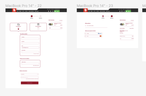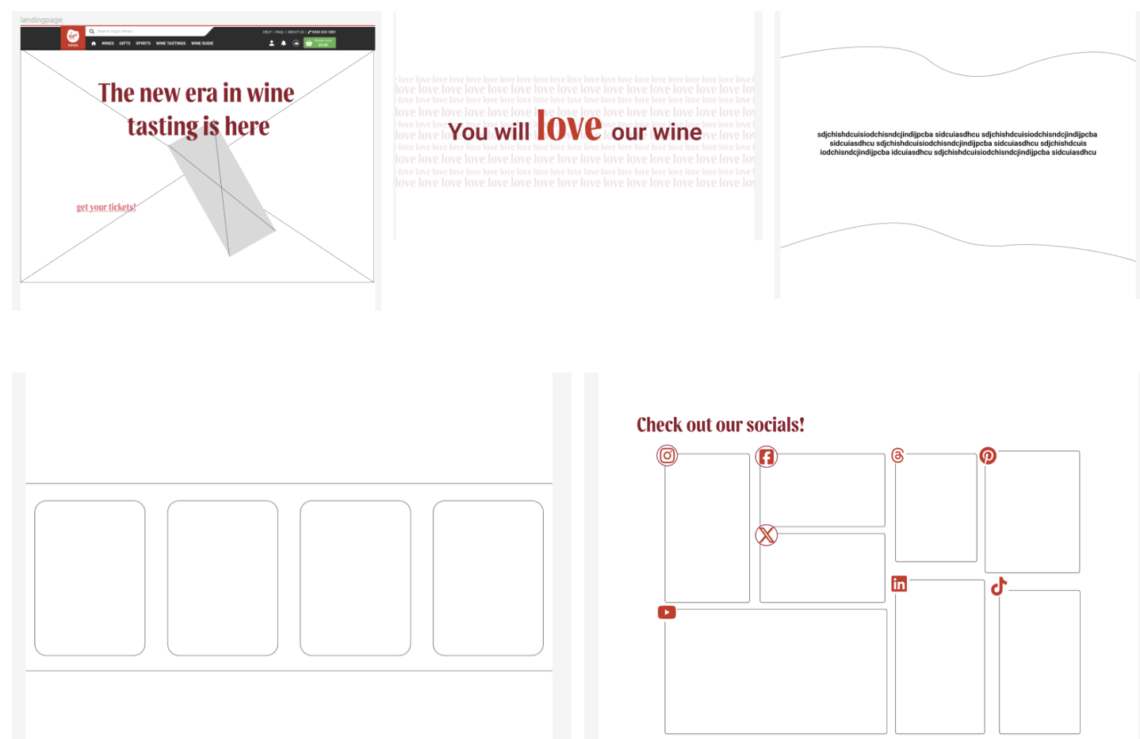
Initially, we approached this process similarly to the about us page, where each team member generated their own design ideas before merging them to create a final concept. However, following this initial phase, I underwent numerous iterations exploring different design ideas, struggling to find the perfect balance between conveying information in a fun and joyful manner while maintaining clarity and legibility.
Eventually, I settled on a wireframe design originally for desktop, then once I was happy with that design, that I felt effectively conveyed the necessary information without overwhelming the user. I took the necessary time to convert it to mobile wireframes, so I was in a good place to start the higher fidelity designs. The design achieved the desired balance, ensuring clarity and readability while incorporating an element of joyfulness.
Notably, I incorporated four curved boxes towards the end of the page, intending to use card-like icons to present event information in a visually engaging yet informative manner. This addition aimed to enhance the overall user experience, making the page both informative and visually appealing.
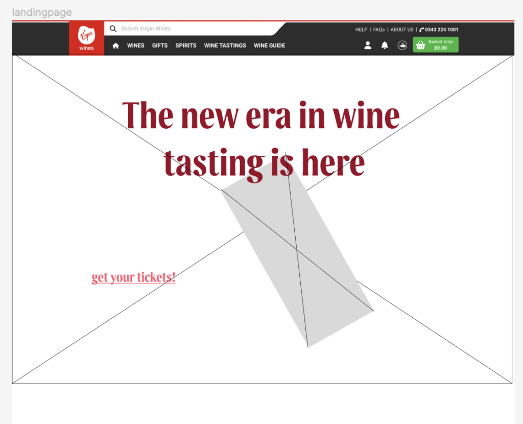
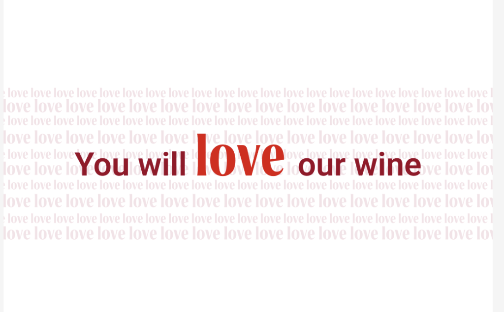
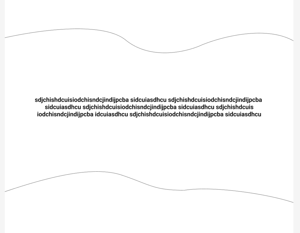
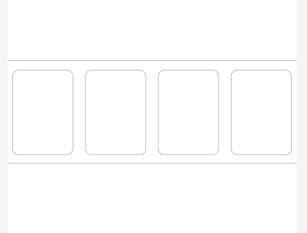
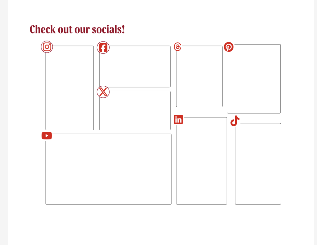
Above, are the desktop wireframes.
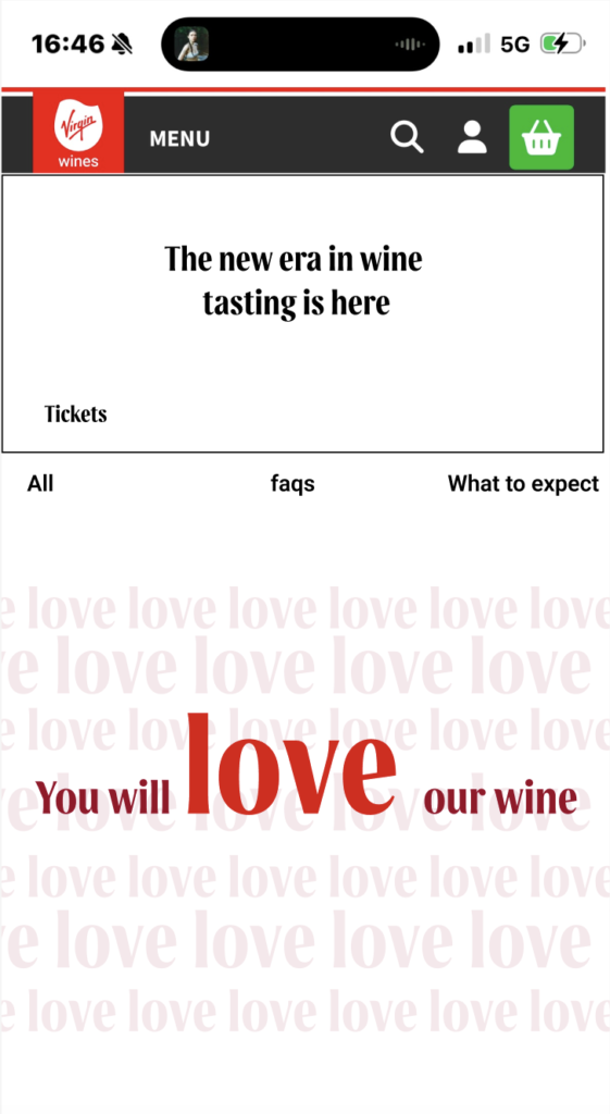
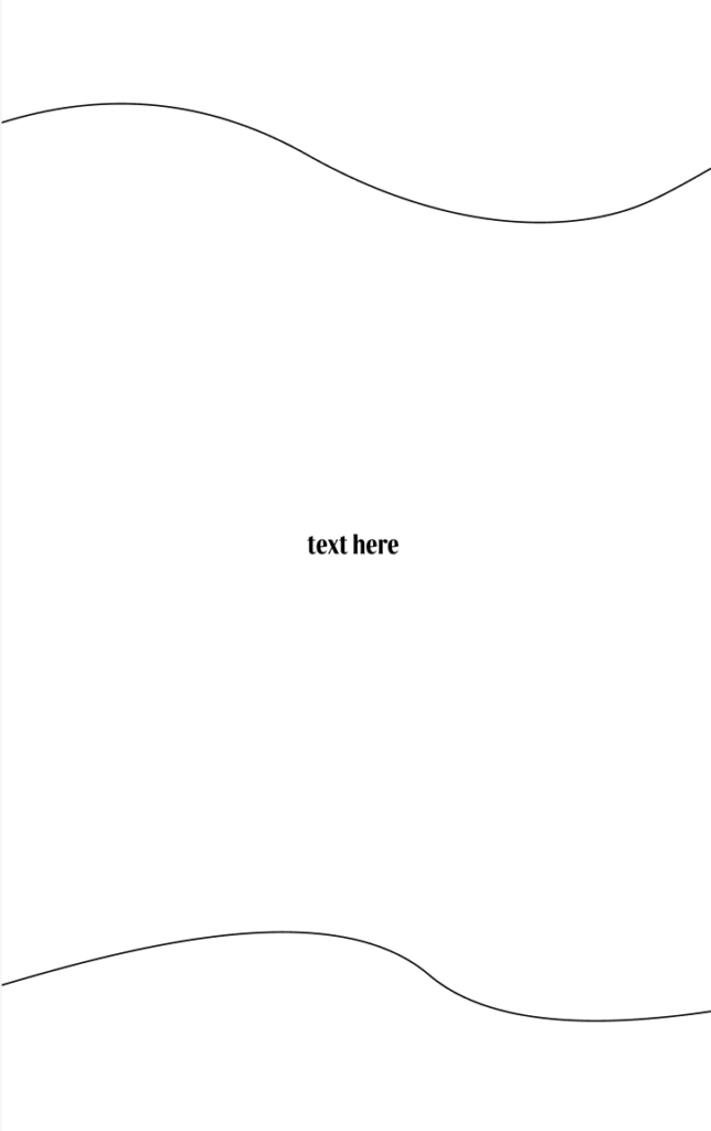
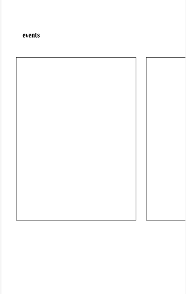
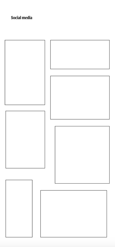
Above, are the mobile wireframes