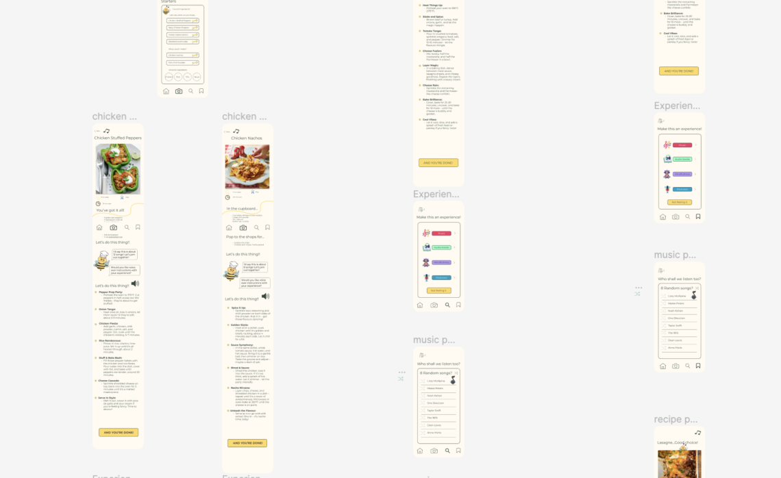
In the development of my app, I initially embraced a dark colour palette inspired by competitor research, drawn to the striking contrast between deep blue and bright white. The initial choice was a dark green background with white text. However, I later found this scheme too sombre and sought to…
-
-
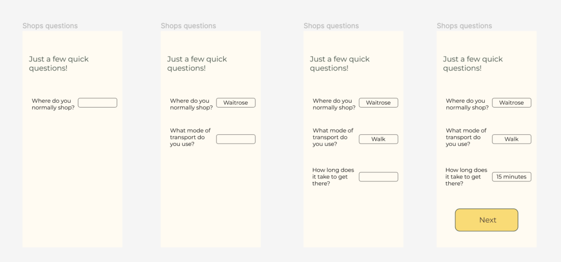
The user testing phase for my app design played a pivotal role in the overall design process by providing valuable insights into how individuals from diverse backgrounds respond to the same app. Deliberately selecting a mix of three university students and two adults over 50 allowed me to discern potential…
-
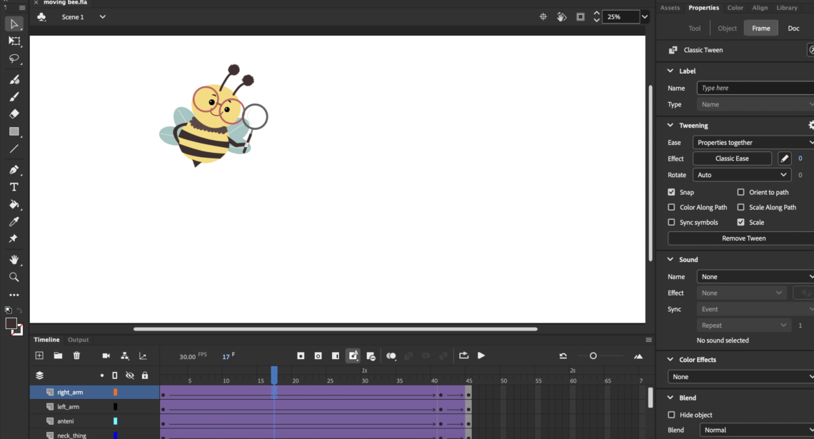
I delved into a bit of animation to inject some personality into the app. Drawing inspiration from the Snapchat ghost and the DuoLingo owl, my goal was to create a character that would be the app’s focal point, transforming it from a mundane to-do app into an enhancer of cooking…
-
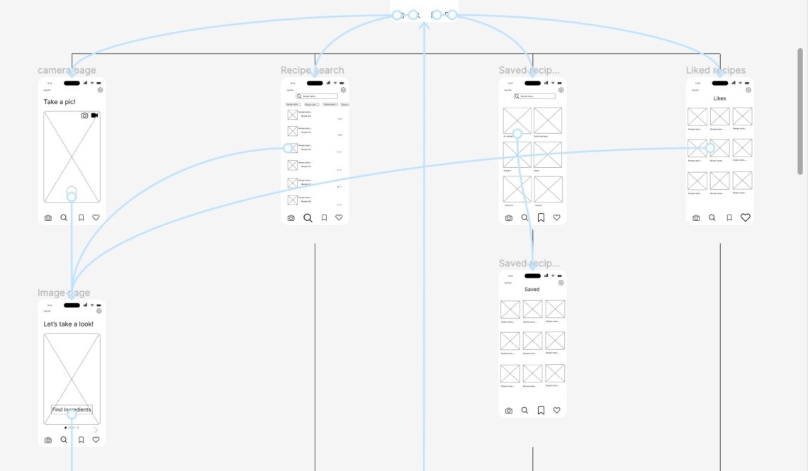
I initiated the design process by referring to my site map as a foundational guide, strategically determining the placement of various elements within the app. Utilising the site map proved invaluable, providing a structured framework that prevented the ad-hoc creation of wireframes. This systematic approach in Figma streamlined the design…