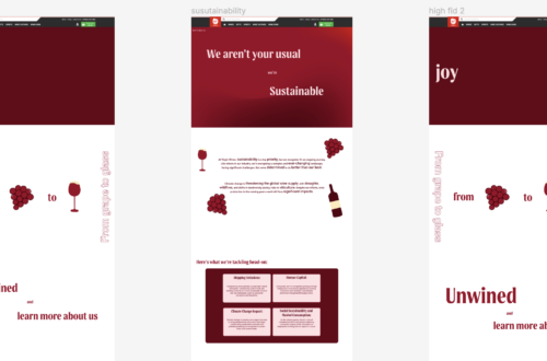
In the design process, having established the design style from the about us page, I found that I could progress swiftly with fewer iterations needed. This smoother process allowed me to develop a final design more efficiently after merging our initial wireframe ideas.
While I wasn’t involved in the events research, as our group divided the workload evenly, I maintained communication with my team to ensure coherence and draw inspiration for my designs.
I’m particularly pleased with this design because of its seamless flow down the page, which avoids feeling too static. Additionally, I found the transition to mobile design intriguing, incorporating scroll effects to present information dynamically.
The card-like icons used to showcase events are a highlight for me. They add an illustrative touch while serving as effective navigation to the events pages. Overall, this project allowed me to refine my design process and explore innovative ways to enhance user experience.
Below is my events landing page on desktop.


Below is my events landing page on mobile