I’m pleased with the final outcome of the about us page. It achieves my goal of being more illustrative and interactive while still presenting all the essential information. During research, I realised that much of the existing content was unnecessary and could be streamlined for better engagement.
Research, including user flows, heuristic analysis, and competitor research, guided our design process, helping us prioritise changes and find inspiration. Although we could have benefited from more research on Virgin Wines’ brand guidelines initially, the process taught me resilience, adaptability, and the importance of feedback.
When designing the final wireframe, I was inspired and passionate, which made the project enjoyable. Reflecting on my initial choice of a pink aesthetic, choosing it due to pink being my favourite colour, I realise it didn’t align with Virgin Wines’ brand identity. So, I adjusted the colour palette to maintain consistency while adding contrast and originality.
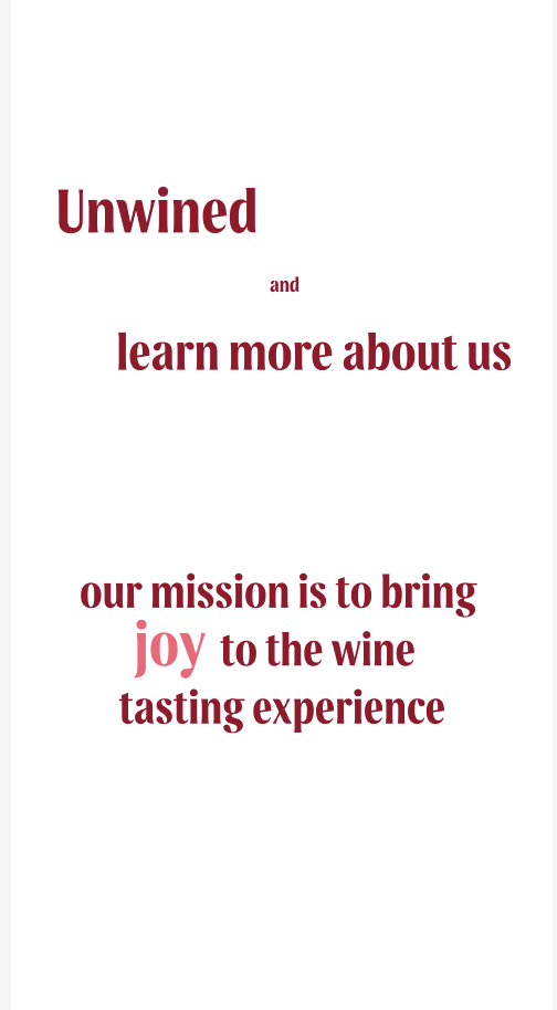
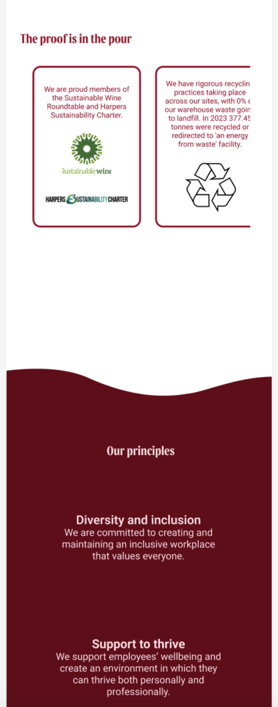
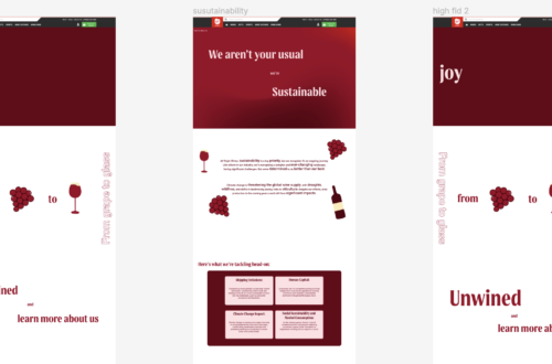
Below are my final high-fidelity designs for both desktop and mobile, featuring the updated colour palette to align with Virgin Wines’ branding being using the darker red Malbec as the background colours and the pink shade used on the text.
This first set of designs is the desktop and mobile about us page with the sustainability information on the same page – running down the page.

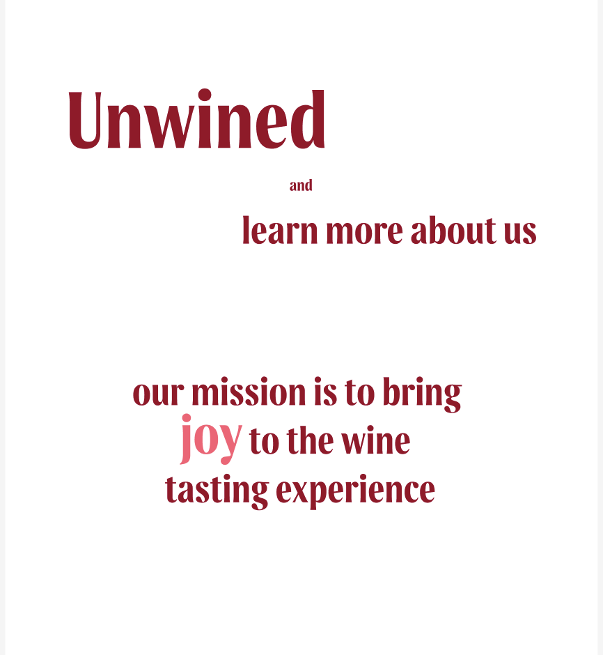
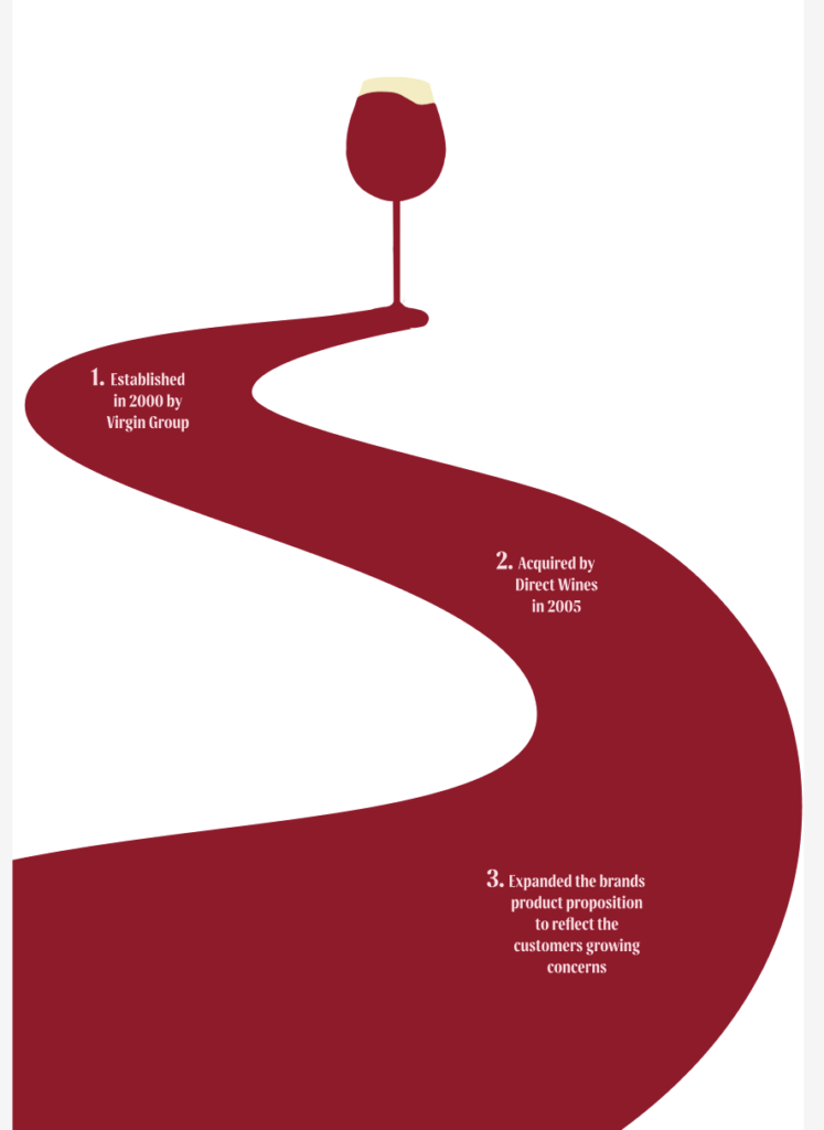


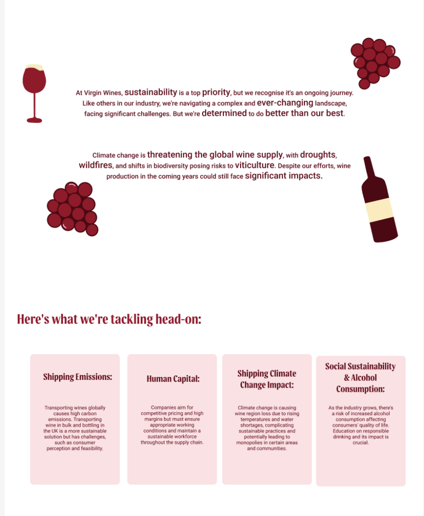

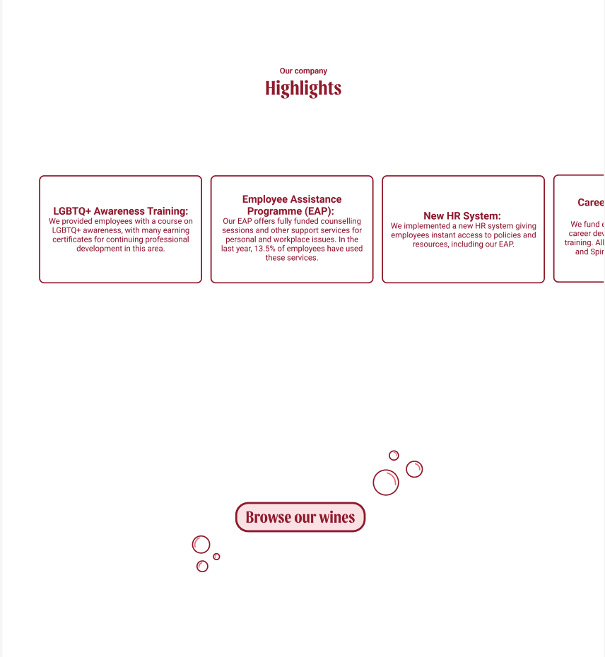
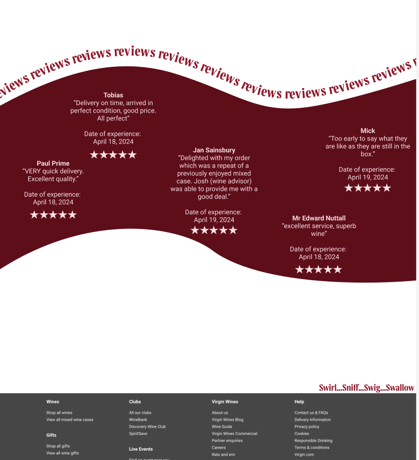
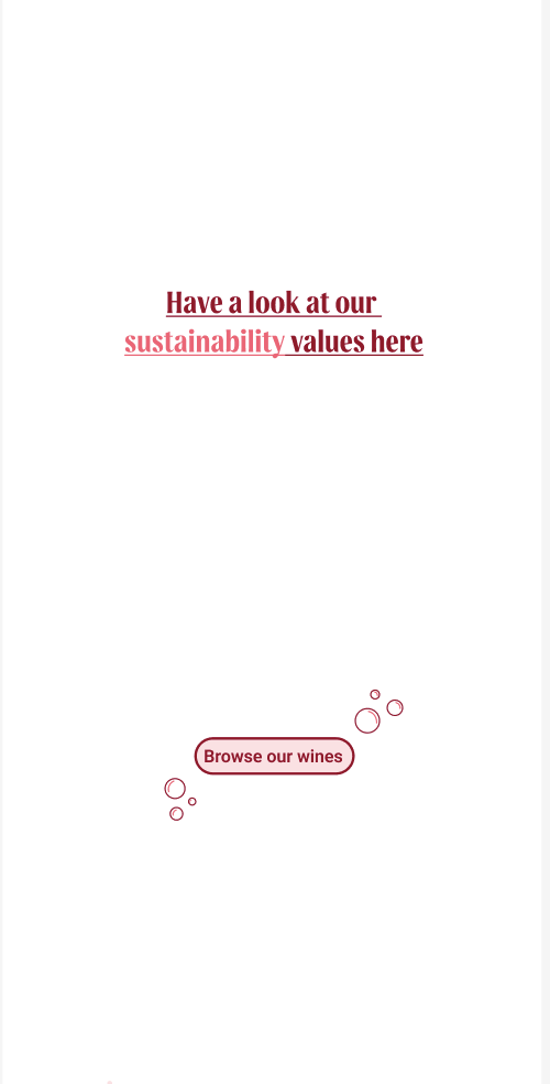
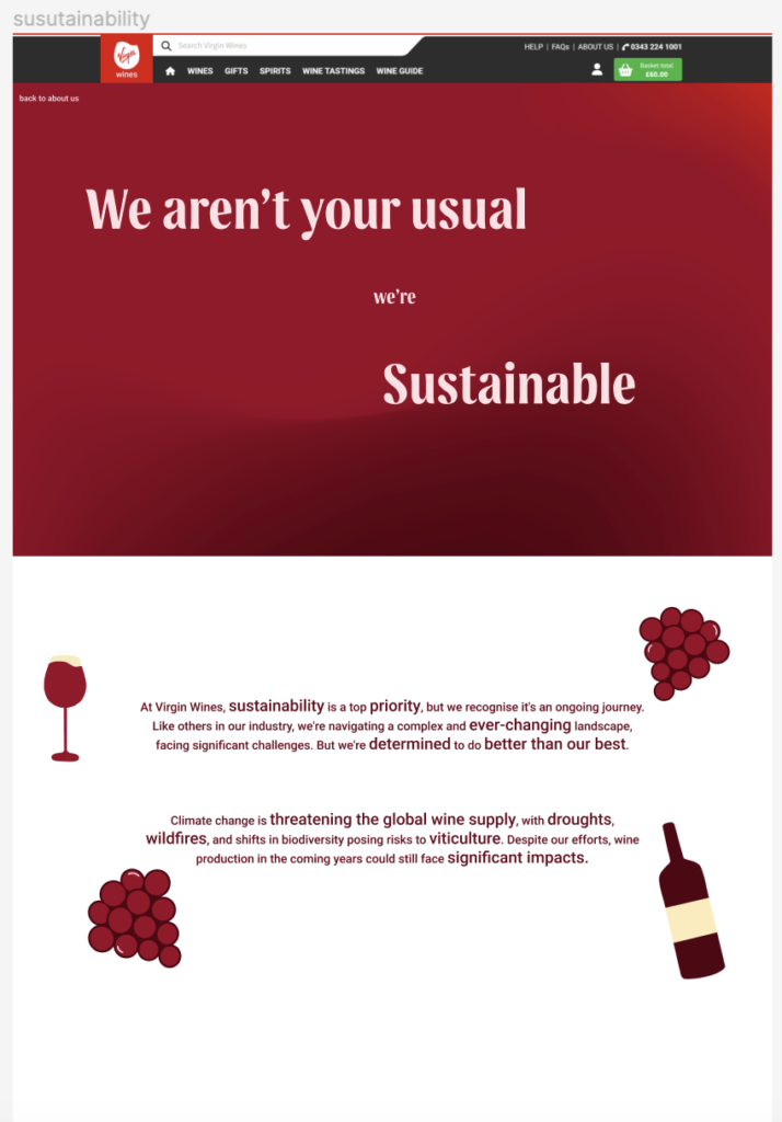
This design below however, has the sustainability information on a separate page, accessible from the about us page through a simple button back and forth to see the information, without it feeling too overwhelming for the readers and being overcrowded
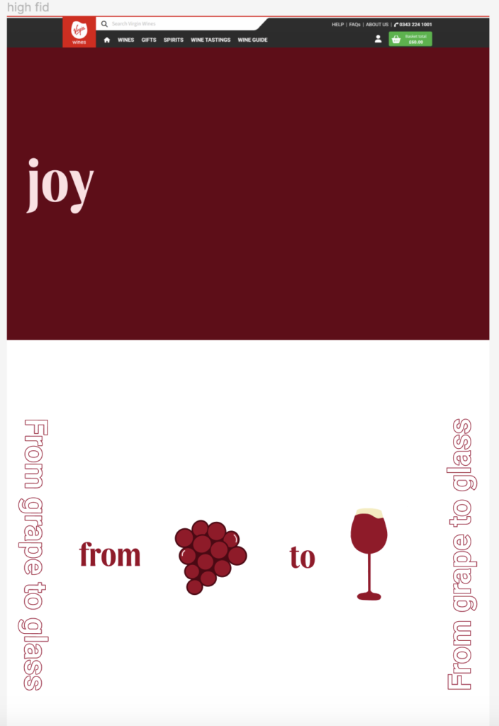
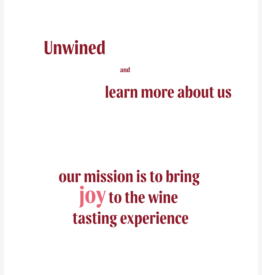


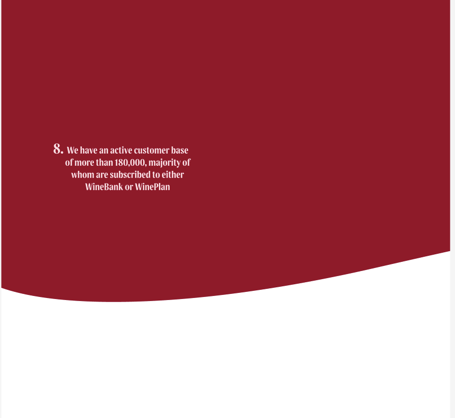



Below are the mobile about us page with the sustainability values on a separate page