In the development of my app, I initially embraced a dark colour palette inspired by competitor research, drawn to the striking contrast between deep blue and bright white. The initial choice was a dark green background with white text. However, I later found this scheme too sombre and sought to transform it into a more engaging and inviting app to encourage repetitive use.
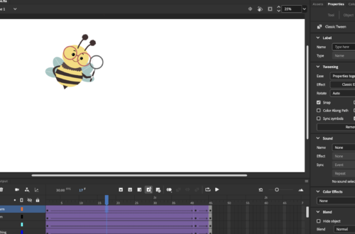
Taking a fresh approach, I started anew with a different palette, retaining the green but reversing its prominence – a white background with dark green text. Still feeling it lacked vibrancy and complexity, I introduced the concept of an app avatar, initially a squirrel but later refined into a bee. The bee’s association with foraging and industrious hive activities made it an ideal companion for the app.
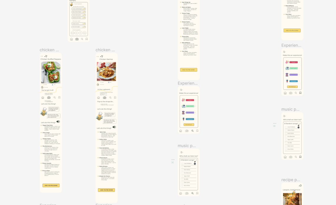
As the app design progressed with the bee character, I subtly incorporated the bee’s colour palette throughout, such as using yellow for buttons and brown for text, creating a cohesive feel without being overtly apparent.
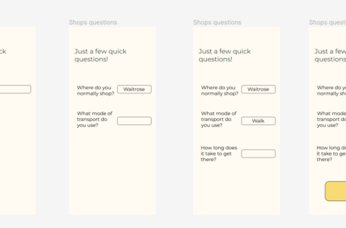
In crafting the app’s copy, I aimed for clarity and informativeness, striking a balance to guide users without overwhelming them with excessive text. Although it posed a challenge, multiple drafts helped achieve a concise yet effective result.
Overall, I am delighted with the app’s outcome. The cohesive blend of design elements gives it a sleek finish, striking the right balance between sophistication and a lively, upbeat style.