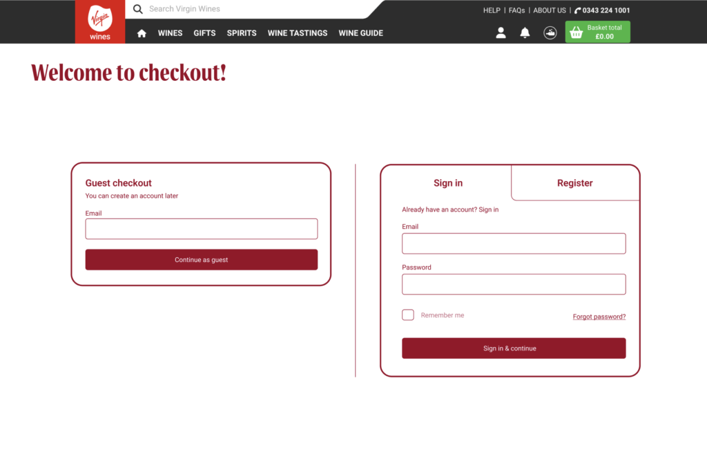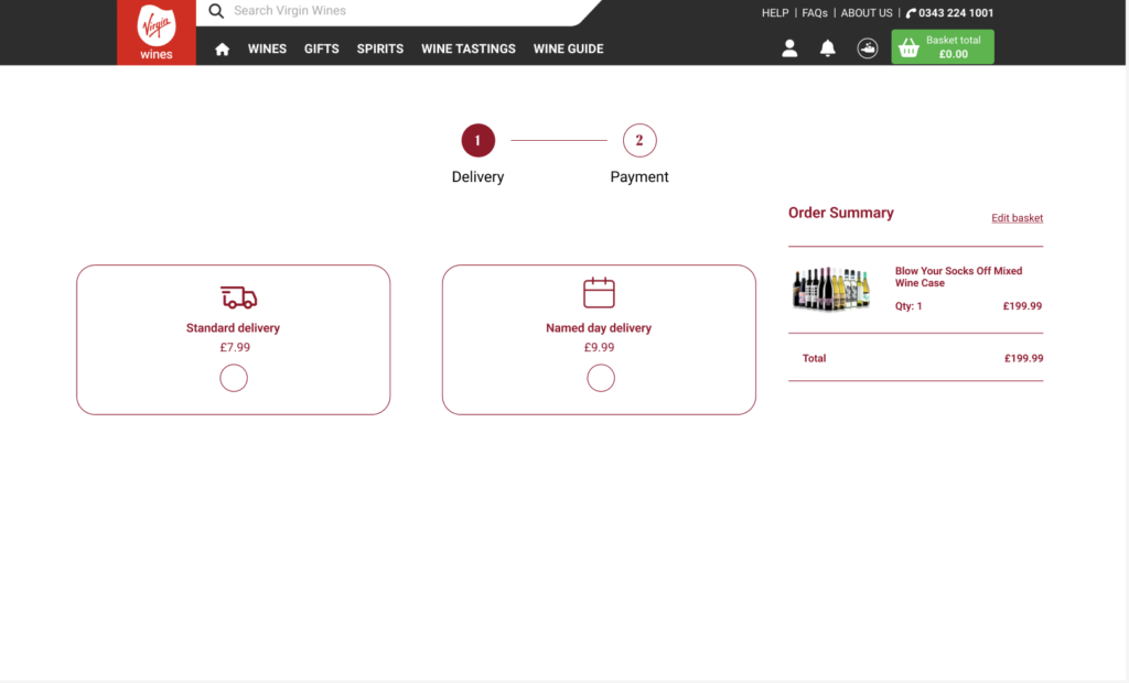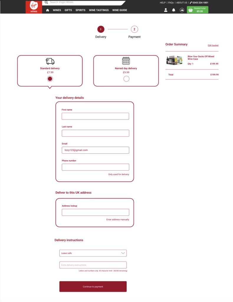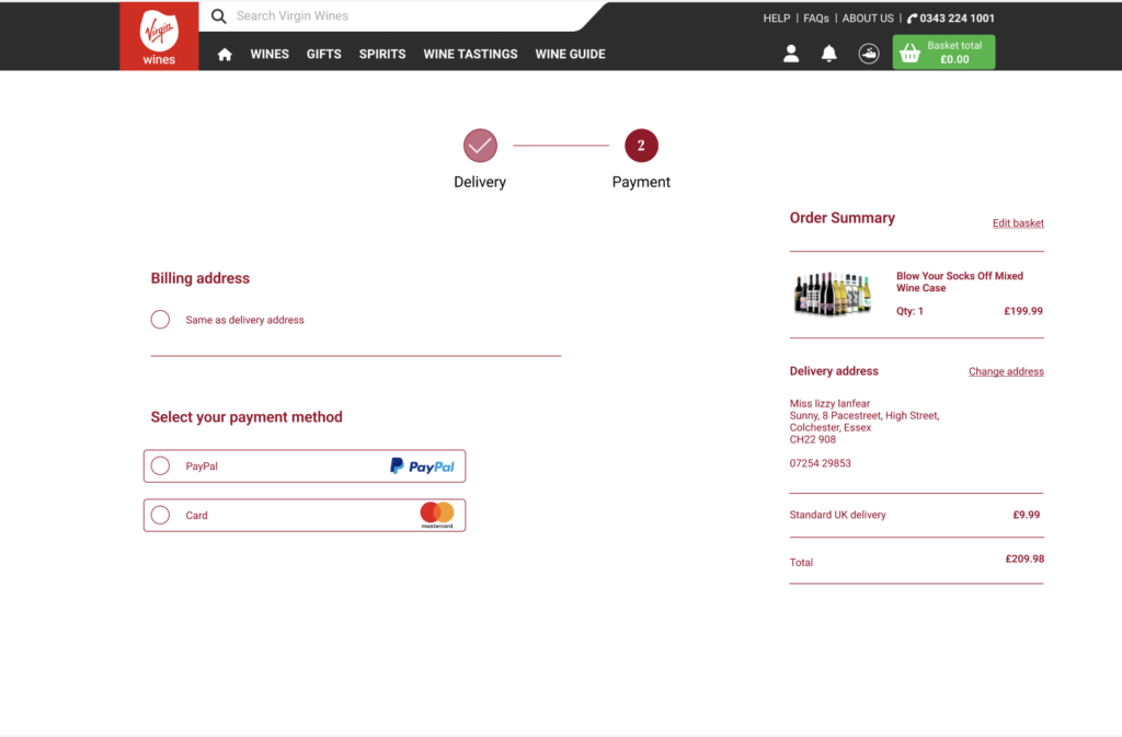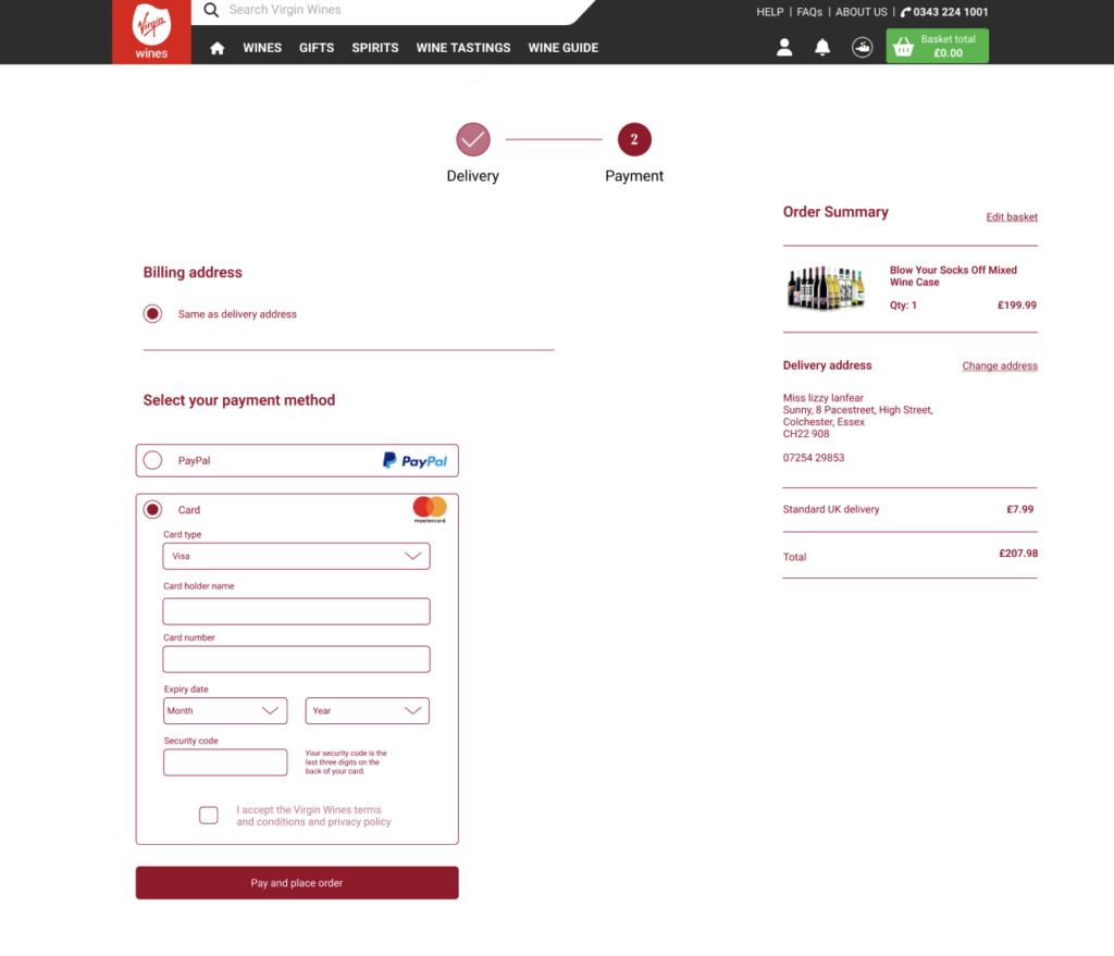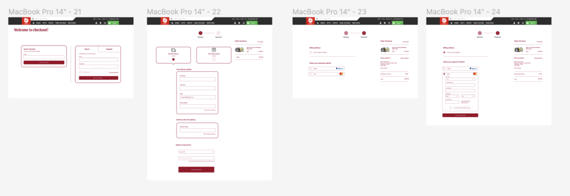
Below are the final low-fidelity wireframes of the checkout process I designed, which we advanced to high fidelity. I take pride in designing this process, as it was praised by my peers, staff, and design professionals for its streamlined, easy-to-navigate, and cohesive appearance.
Due to me focusing on the desktop design and Ellana copying that design and turning it into a mobile format, I didn’t make any of the final mobile wireframes for these page.
When conceptualising this process, my primary focus was on enhancing the user experience by ensuring clarity and simplicity.
Our research revealed that the existing checkout processes are verbose and cluttered, giving users a sense of unnecessary complexity and leading to higher drop-off rates. To address this, I dedicated a lot of time to crafting these wireframes.
My goal was to maintain clarity and usability while creating a more streamlined appearance with fewer perceived steps, all while retaining the necessary information from the current site.
Below are the final wireframes for desktop.