This week has been quite a satisfying journey of productivity and progress, particularly in advancing Project 3. I’m pleased to note a significant evolution in my approach to the website’s design, especially considering last week’s uncertainty about its direction. The completion of wireframes for desktop was a pivotal achievement, allowing…
-
-
After analyzing user flows, Don Norman’s 7 Design Principles, conducting site mapping, and heuristic markup, I gained a comprehensive understanding of the elements that required redesign due to identified issues. I initiated a mind map, highlighting problematic areas and outlining improvements to the website. The first aspect I addressed was…
-
When researching, I came across Disney Land Paris’s ‘Captain Jack’s – Restaurant des Pirates’ which is a Captain Jack Sparrow themed restaurant that creates an immersive experience for all ages. I found some images of the restaurant and it is completely themed around him as a character. From the colour…
-
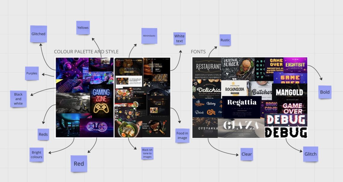
After creating my site map and wireframes, I delved into font and color palette research. This step was essential to ensure my website adhered to the conventions of both restaurant and gaming websites, providing valuable insights into their styles and potential synergy. The design process for my website is anticipated…
-
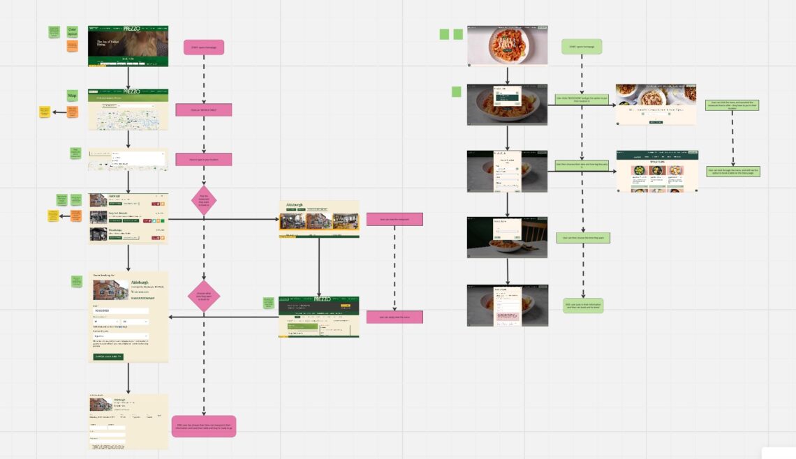
To better understand restaurant website design and navigation, I conducted additional research on two restaurant websites: Prezzo and Zizi. This research was crucial for my own design stage. I created user flows to thoroughly comprehend the websites’ navigational structure and the user experience on professional websites. This step greatly informed…
-
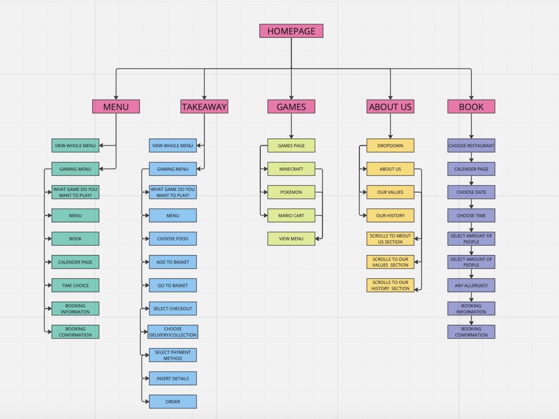
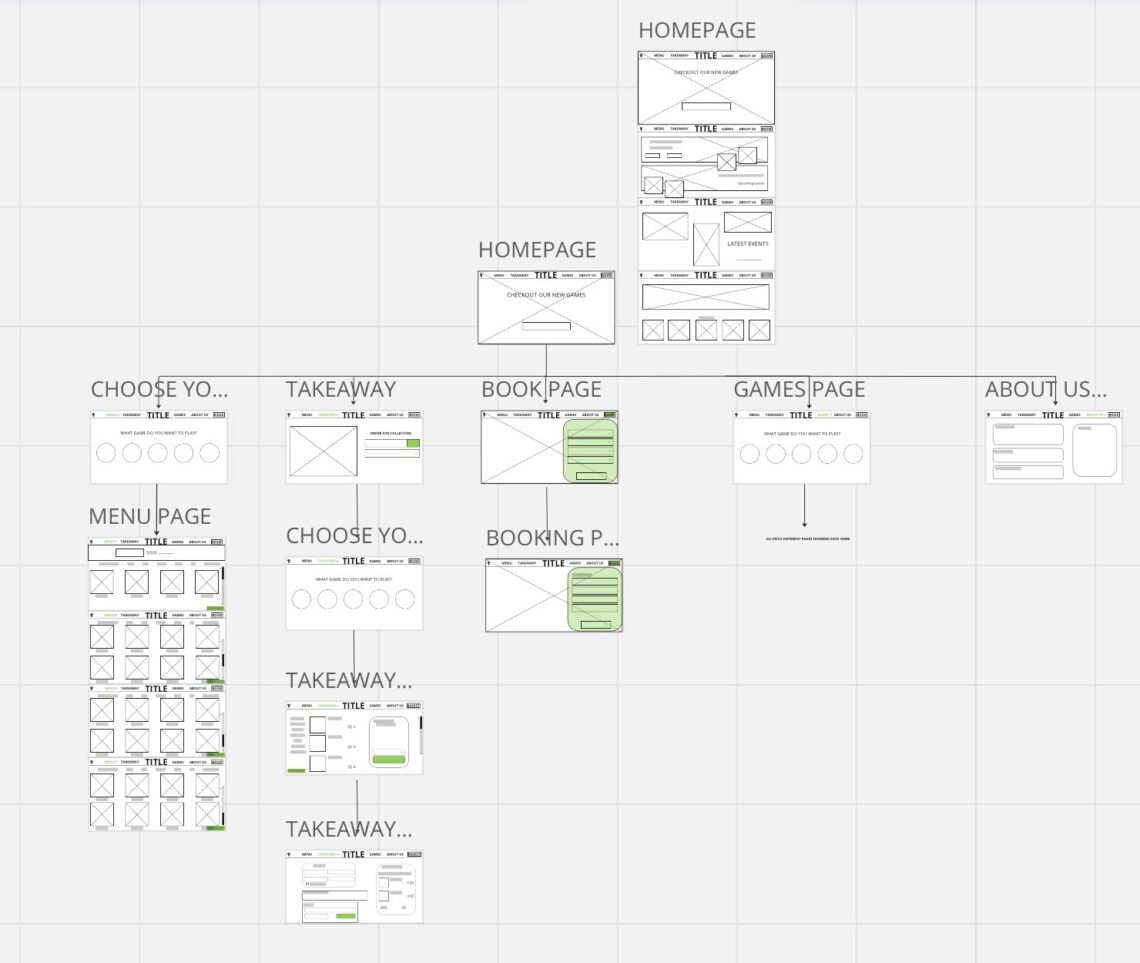
For this task, I initially started with a rough post-it note site map to get a basic structure of what I wanted the site to look like. This step allowed me to focus on the layout before diving into the details of the site’s appearance, which worked well for me.…
-
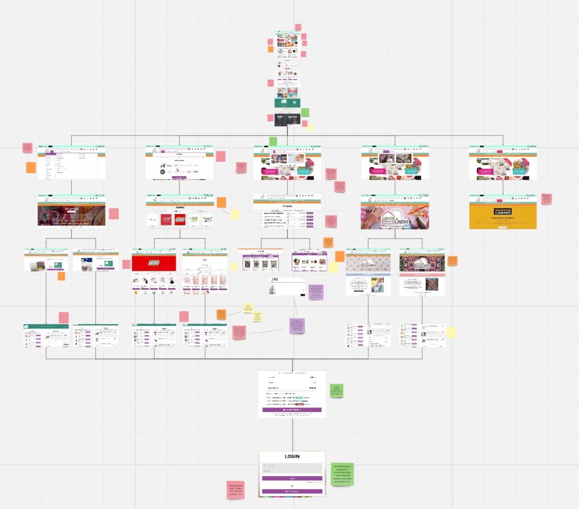
This task brought to my attention the numerous issues present on the website. Identifying ‘green’ (good design choices) was challenging because most of the design elements appeared outdated and ineffective. First, I captured screenshots of the five different landing pages accessible through the navigation bar and outlined two possible user…
-
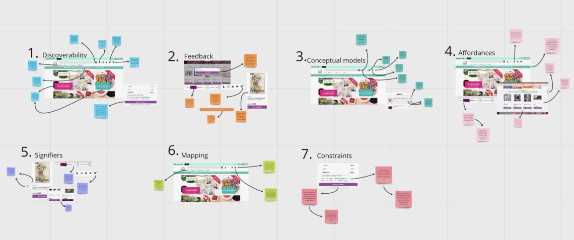
For this task, I utilized my previous work from project two to assist me, as I needed a refresher on the distinctions between the 7 design principles. I referred to both the Oliver Bonas project and revisited the project brief to reinforce my understanding. In conclusion, this task significantly enhanced…
-
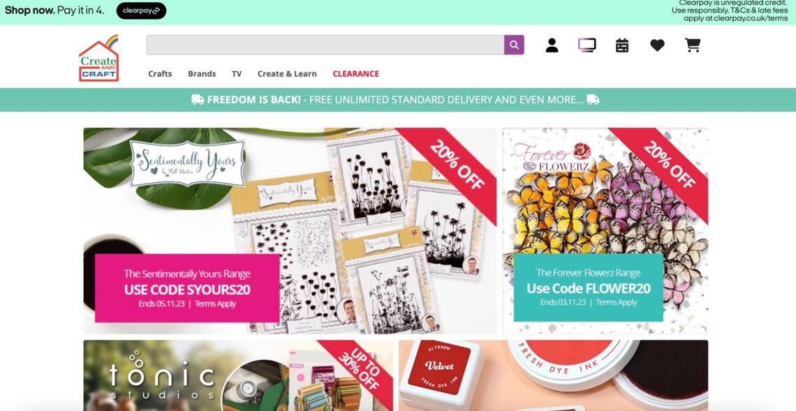
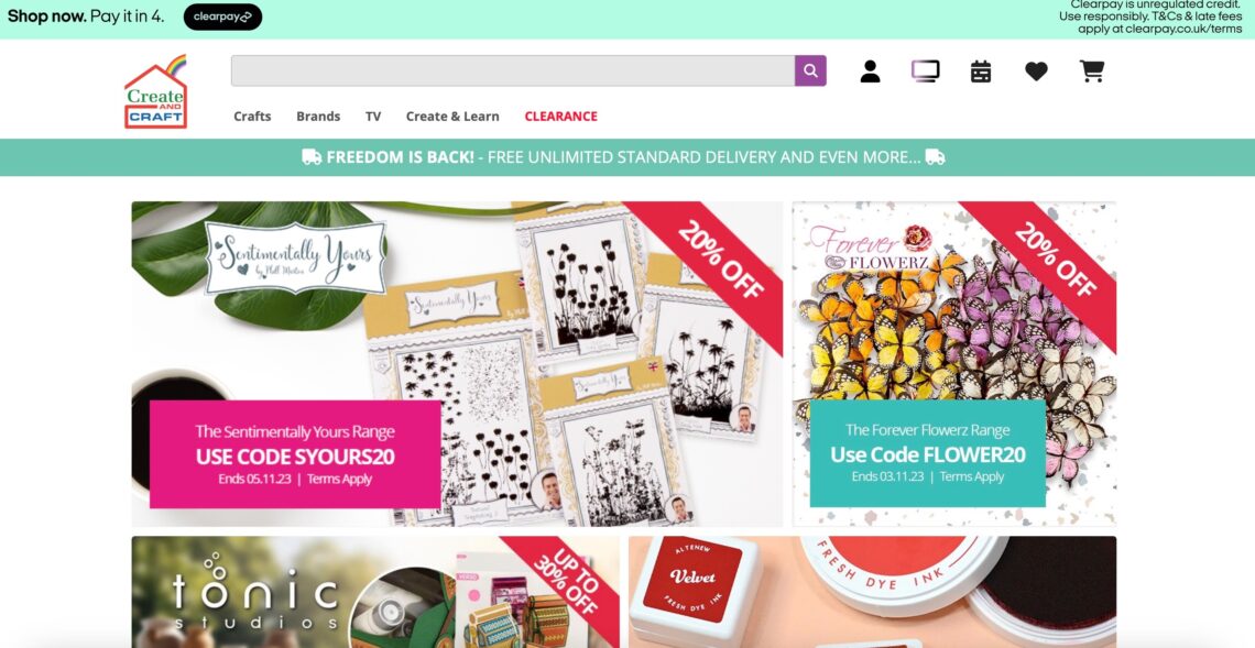
During weeks 4 and 5, I made the decision to revisit and revamp my project 2 because I wasn’t satisfied with its initial outcome. I wanted to challenge myself further and enhance the project. To achieve this, I embarked on research and analysis of ‘CraftandCreate,’ an online arts and crafts…
-
At the outset of this project, I had limited experience with wireframes, having primarily worked on minimalistic ones in the past. The challenge here was to create comprehensive wireframes for an entire website, considering elements like text size, image placement, navigation bar, and interactivity. Initially, I felt uncertain about how…