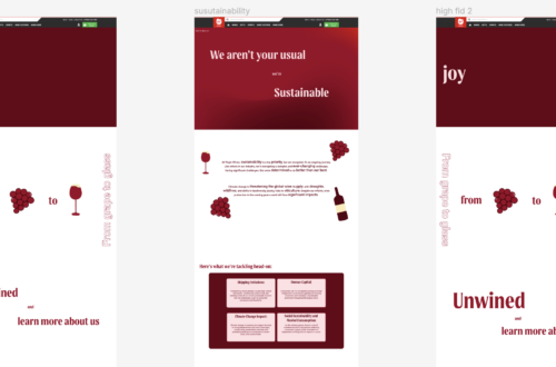
This stage marked the transition from low-fidelity wireframes to a more defined style for our project. I took the lead on the initial design for the “About Us” and events landing pages, and when I presented my ideas to the group, they adopted my style for their own pages, which was quite rewarding.
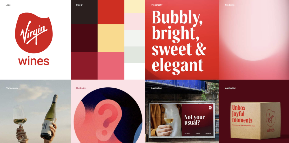
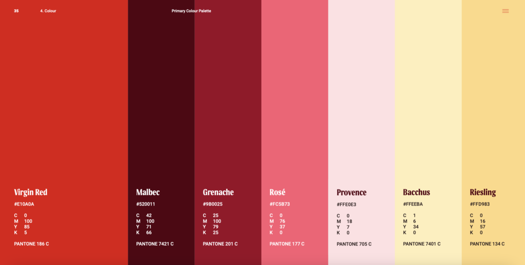
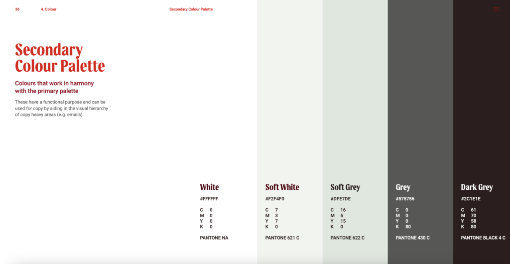
To align with the new brand guidelines, I carefully studied their slide deck, incorporating the colour palette, font styles, and illustration techniques. As a team, we initially experimented with white backgrounds and the signature Virgin Wines red, but it ended up looking too much like a first-aid kit—too medical. So, I decided to move away from that direction, opting for a new colour palette and using the bright red sparingly.
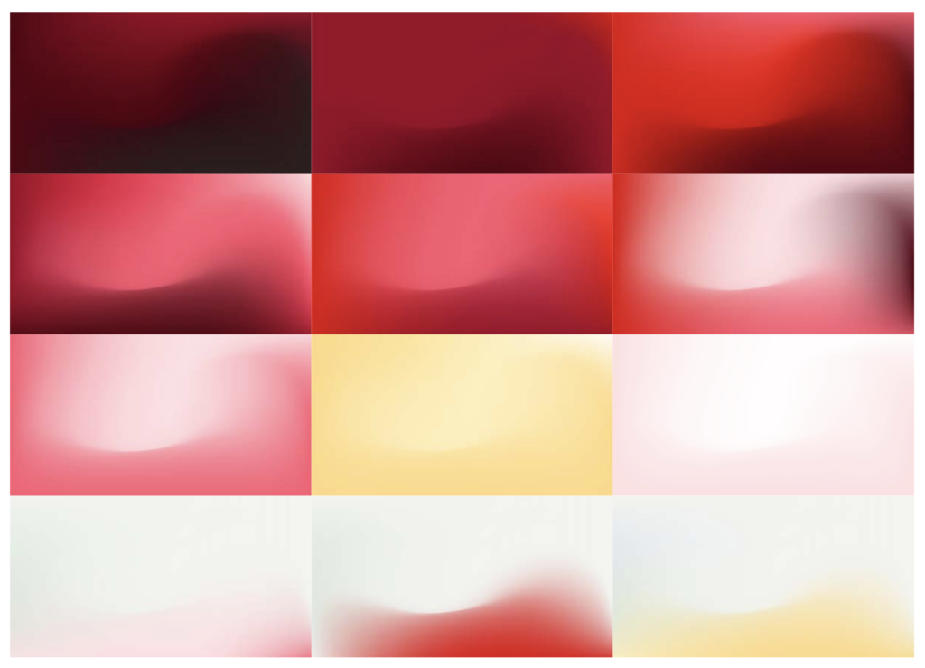
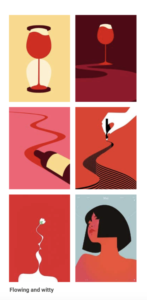
As shown earlier, Virgin Wines had designed some new illustrations, which I was eager to include because I felt they added a joyful touch to the design. I recreated some of their illustrations and produced a few of my own, keeping in line with their style and colours.
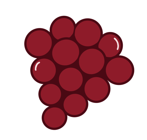
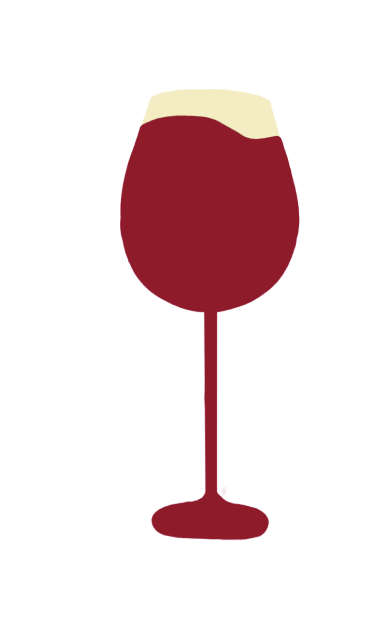
Throughout the design process, I focused on presenting information in a visually engaging and interactive way to capture the viewer’s attention. For example, on the “About Us” page, I turned their slogan into playful illustrations, using a little grape and glass, rather than just text. For the events landing page, I conveyed information about the four events in a more stylised manner, aiming to attract more interest.

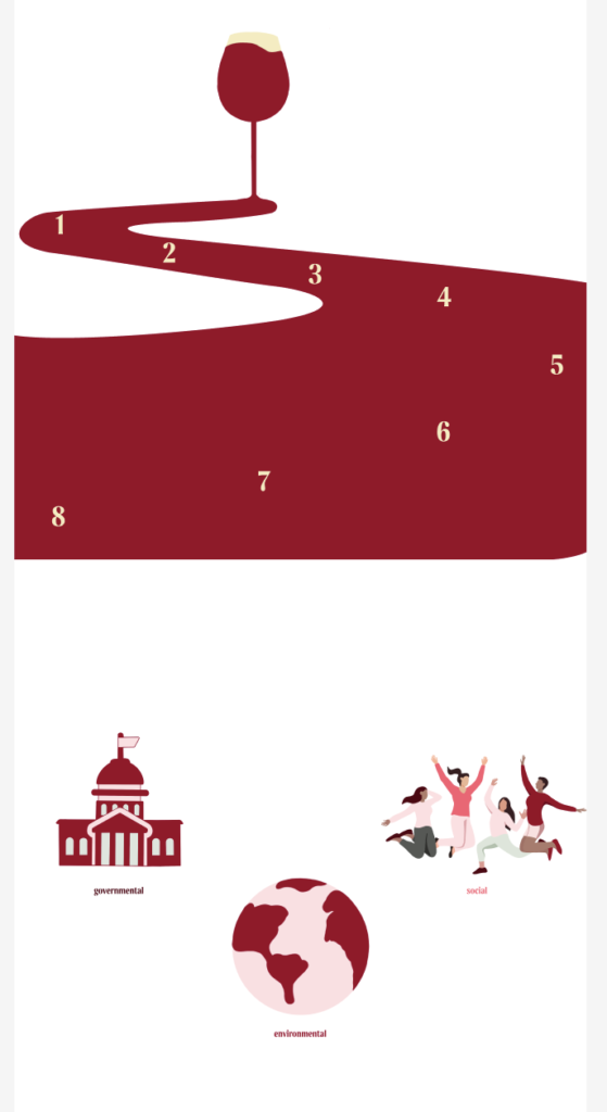
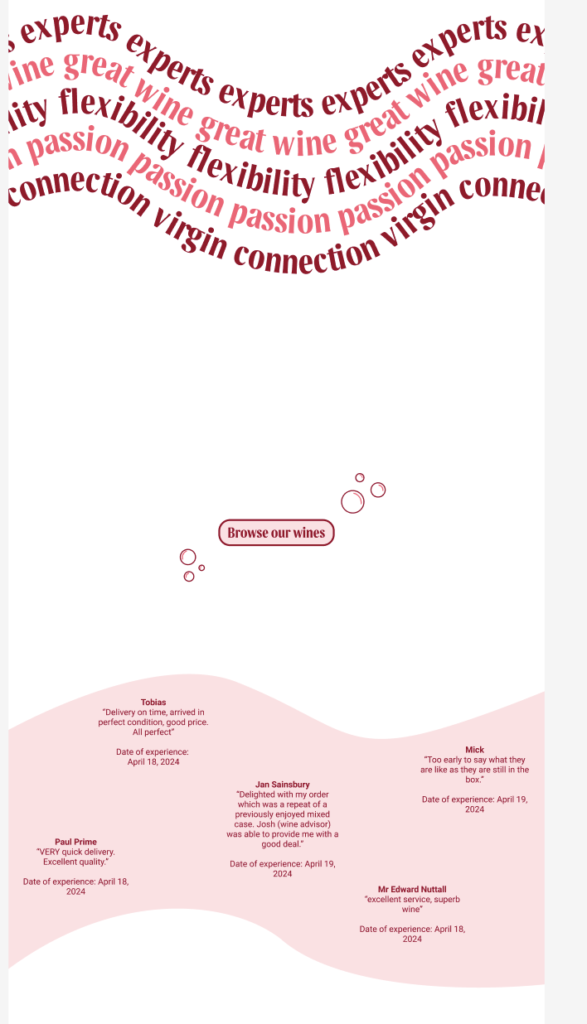
The image above shows my mid-fidelity designs for the ‘About Us’ page, where we combined the sustainability values with the ‘About Us’ content. At this stage, I struggled with how to present and integrate the sustainability information effectively. This required considerable trial and error to find the right approach.
Overall, for the mid-fidelity wireframes, I established the style for all pages, designed the “About Us” and events landing pages, and outlined the checkout process. I also designed some illustrations for the site, selected the colour palettes, and created an animation video. I’m pleased with what I achieved during this stage.
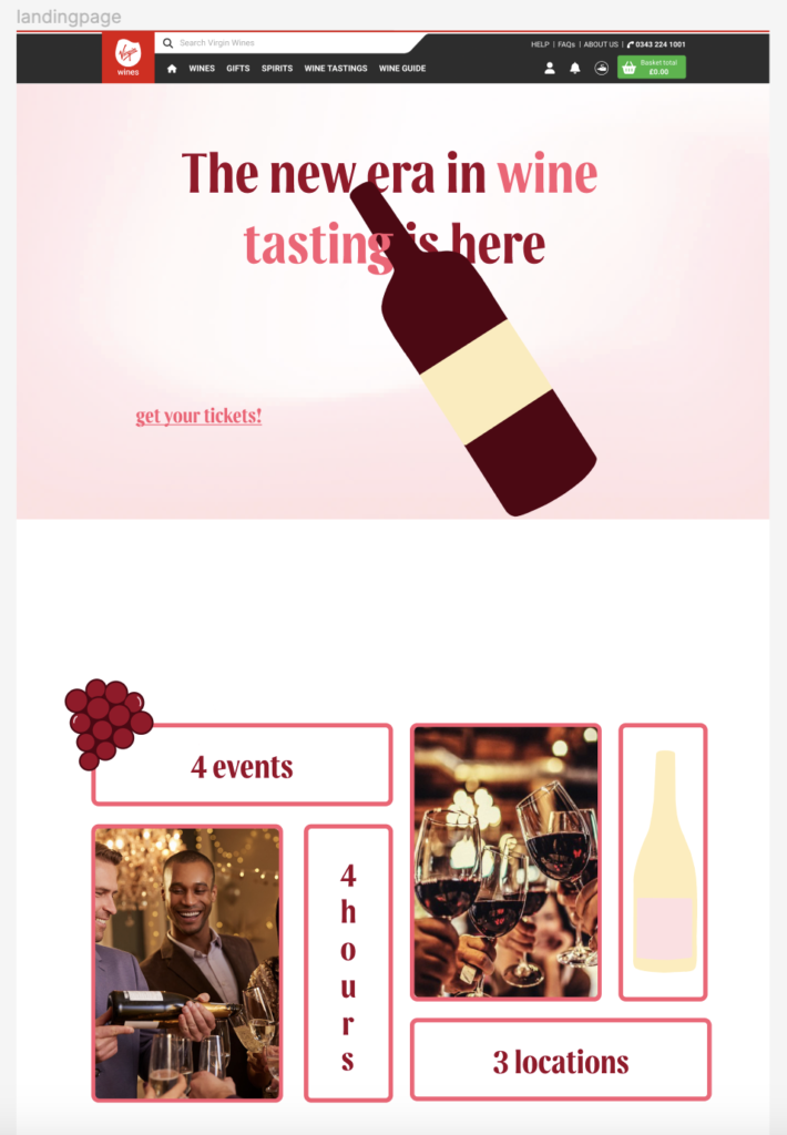
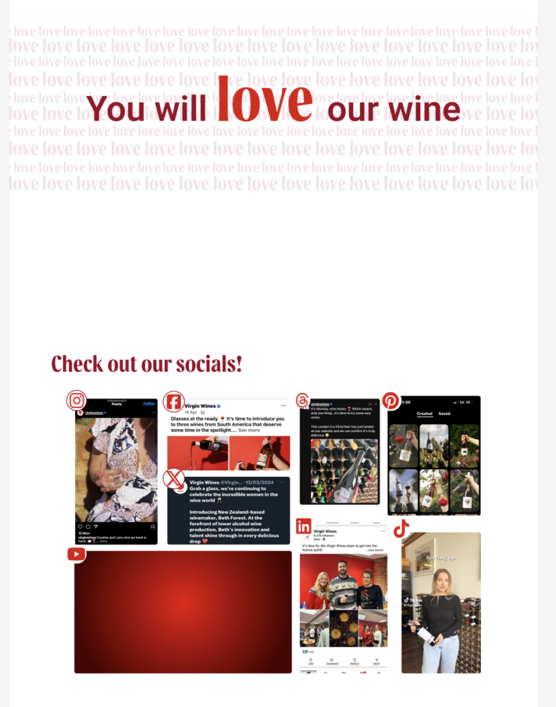
Above are my mid fidelity designs for the events landing page, experimenting with text position and layout.
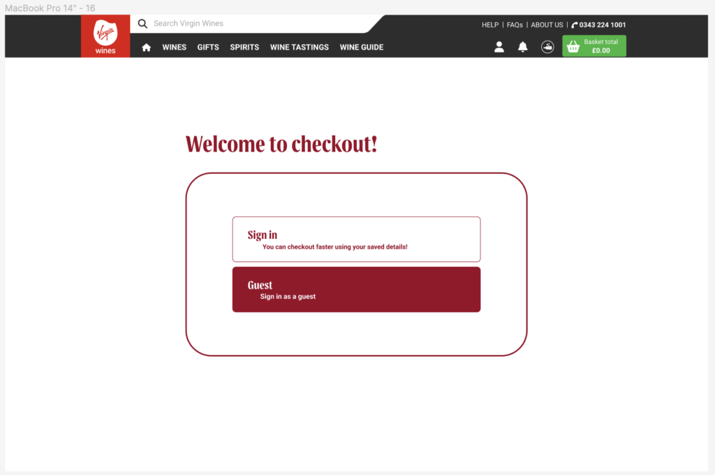
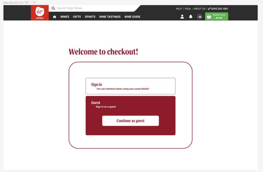
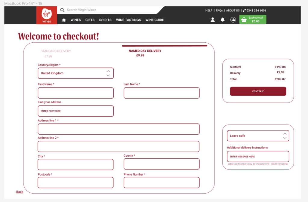
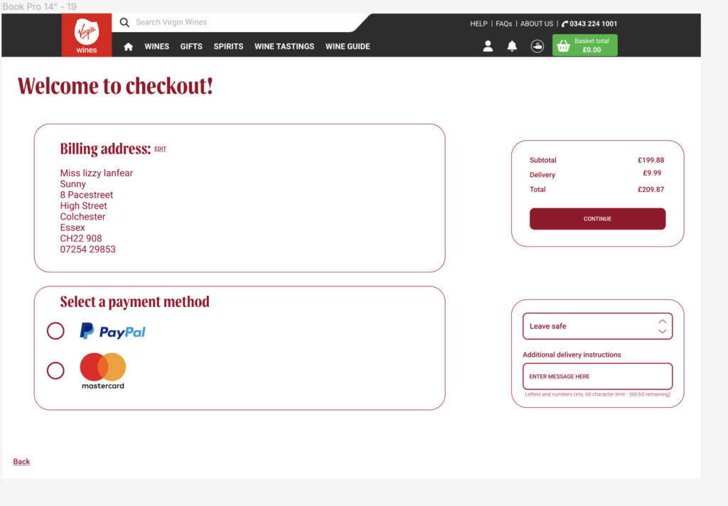
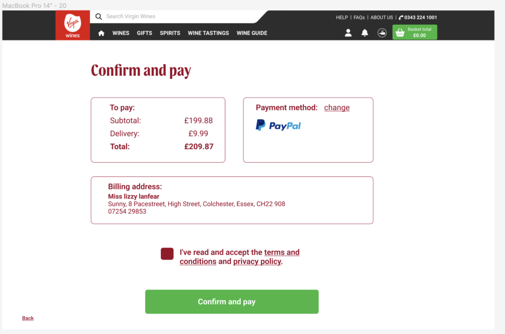
Above are my mid fidelity designs for the checkout process. I designed the entirety of the checkout process and then Ellana would turn it into mobile from my designs.