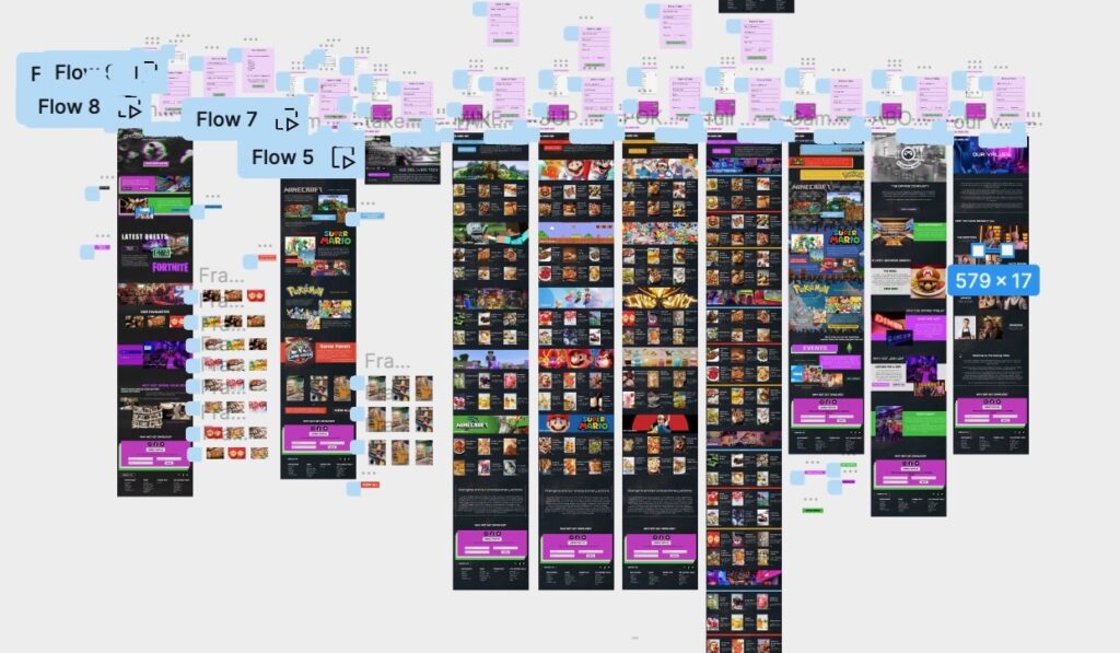
This week has been particularly demanding, grappling with the extensive workload and the looming mid-unit review next Monday, which has added a layer of stress to my already overwhelming tasks. While I believe I am on track with the completion of my high-fidelity desktop design and prototype, I’ve been wrestling with the pressure of initiating my mobile version. The recent briefing on Project 4 has further intensified my concerns about not having started it, fearing it might impact my mid-unit review. This apprehension has lingered heavily on my mind throughout the week.
Beginning the week with a continuation of desktop design efforts, I delved deeper into Figma, attempting to master basic animations. Progressing significantly, I thought I had nearly completed the desktop design, only to receive valuable insights from Rob, one of my tutors, during a conversation. His pointers prompted me to revisit the desktop design and temporarily put the mobile version on hold to incorporate his suggestions while they were still fresh in my mind.
Initially assuming the creation of the mobile site would be straightforward due to existing content, I’ve encountered some unexpected complexities, particularly in adjusting font and image sizes relative to screen dimensions. Despite taking more time than anticipated, I prioritize meticulous consideration over rushing, aiming for a polished result rather than a hasty one.
Midweek, I attended a lecture by Anthony Burrill, an experience I found unenjoyable and uninspiring. The content lacked engagement, and Burrill’s delivery felt monotonous and uninterested. This contrasted starkly with a previous lecture that I found captivating, where the speaker’s passion shone through, making it more enjoyable. I attribute Burrill’s less impactful delivery to a perceived lack of enthusiasm, making it challenging for me to connect with the content.
During my critique session on Friday, Rob provided valuable insights on enhancing the professionalism of my site. Adjusting text alignment on the menu page and incorporating more breathing space for images and buttons were among his recommendations. This advice not only contributed to a cleaner and more professional look but also aimed to prevent user irritation caused by a cluttered screen. Ensuring consistency across the website, particularly in button design and animation, became a focal point. To address this, I opted for a uniform button style with a colored stroke, changing to a colored box upon hover, effectively signaling its interactive nature to users.
Despite the initial challenges and stress, the feedback and guidance received this week have been instrumental in refining my approach to the desktop design. With these insights, I am better equipped to progress confidently into the mobile design phase and tackle Project 4, “Design for Good,” feeling more aligned with the course objectives.