This marked the first week back after the three-week break, and it proved to be quite exhausting. Despite our return, the week was intense, and I didn’t feel adequately rested from the break. Consequently, I faced challenges with productivity in my free time. However, during studio sessions, I made significant progress with my projects. I’m now gaining a clearer understanding of what I want to achieve with my app and how I want it to resonate with users. This clarity is pivotal as I approach the video creation stage next week, a project I am particularly excited about.
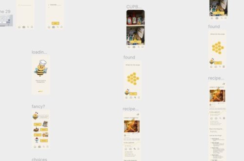
During the week, I reassessed my chosen colour palette, initially based on research and personas from other apps. Unhappy with the result, I decided to simplify and eliminate the blue background. Further research on related apps and recipe pages revealed a trend towards a sleek appearance with a white or off-white background. Aligning with these conventions, I aimed to inject my unique twist into the design.
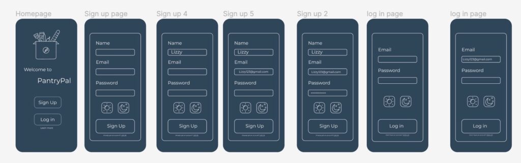
Given my aspiration for the app to be a lively and enjoyable platform for discovering recipes and learning to cook with available ingredients, I sought to infuse a fun and upbeat design. Extensive idea generation ensued, exploring aspects like tone of voice, colour palette, and layout. Dissatisfied with the initial attempts, I drew inspiration from apps like Duolingo and Snapchat, incorporating a playful animation icon into my app.
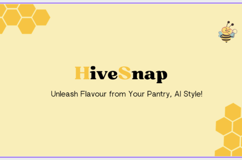
The choice of an animal as part of the app’s identity underwent thorough consideration. Initially leaning towards a squirrel, I found it didn’t align with the desired colour palette. After further exploration, I settled on a bee. Bees, known for their industrious nature and foraging habits, particularly resonated with the app’s concept. This choice inspired my design direction.
Reflecting on the week, I feel accomplished in making significant strides and devising a plan for the upcoming week. This preparation ensures I enter the next phase with clear objectives, avoiding a blind start.