This week has been quite a satisfying journey of productivity and progress, particularly in advancing Project 3. I’m pleased to note a significant evolution in my approach to the website’s design, especially considering last week’s uncertainty about its direction. The completion of wireframes for desktop was a pivotal achievement, allowing me to visualize and streamline the design process more effectively.

A notable highlight was the presence of a stand-in tutor, Johnny Gibson, whose insights and ideas proved to be both insightful and immensely useful. During his session, Gibson shared his personal journey, emphasizing the qualities he believes make a good designer: passion, motivation, and curiosity. These resonated with me, aligning with my own approach to design. His perspective on not confining oneself to a singular title, as reflected in his statement “I am not a UX designer, but I am also not, not a UX designer,” was particularly thought-provoking.
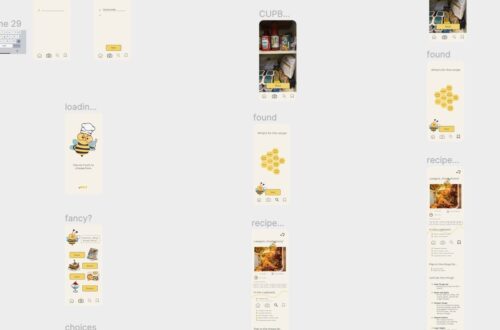
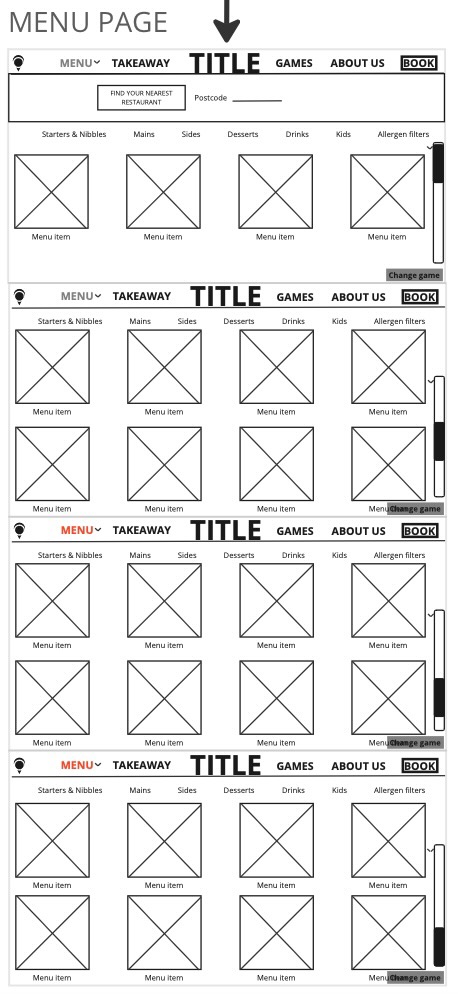
On the practical side, I dedicated the beginning of the week to finalizing wireframes for the desktop. To enhance the design process and reduce potential stress, I extended the wireframing beyond the landing pages, delving into the intricacies of various sections. This meticulous approach allowed me to understand the layout as users scroll down, a crucial aspect of user experience. It was an exciting phase, as the wireframes provided a tangible visualization of what the actual website might look like. The excitement and clarity derived from this phase were invaluable.
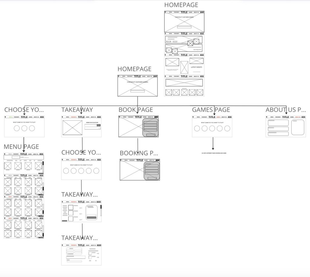

The standout moment this week was the insightful lecture by Johnny Gibson, where he shared snippets of his work, including designing Costa’s app a few years ago. His emphasis on being passionate, motivated, and curious as prerequisites for a good designer struck a chord with me. It’s a philosophy I’ve inherently followed throughout my journey in design, continually striving for improvement and maintaining a deep curiosity about the intricacies of the craft.
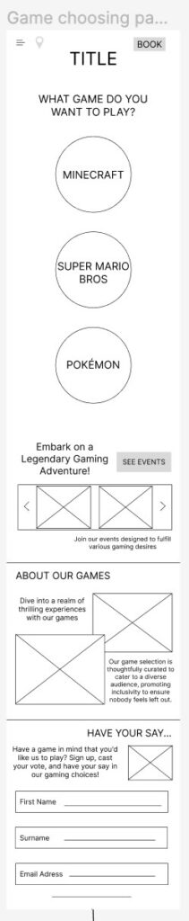
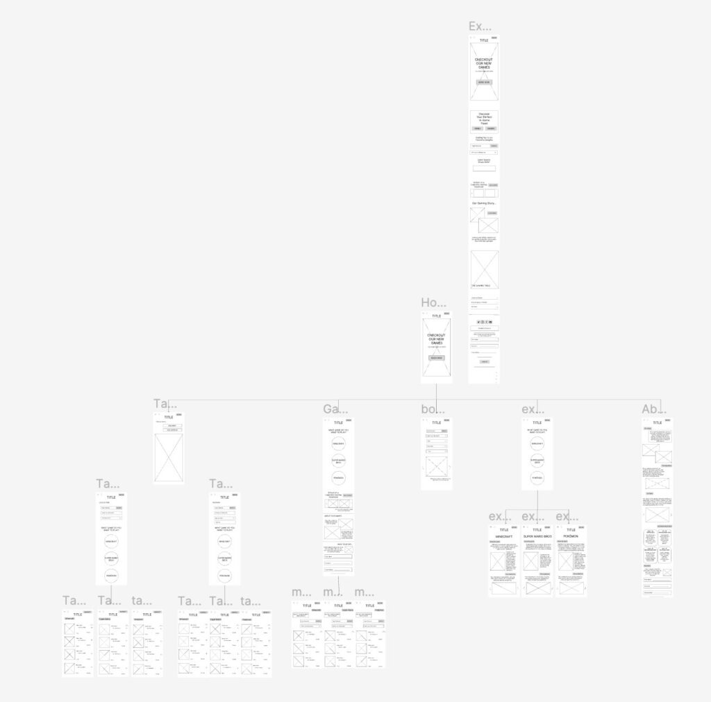
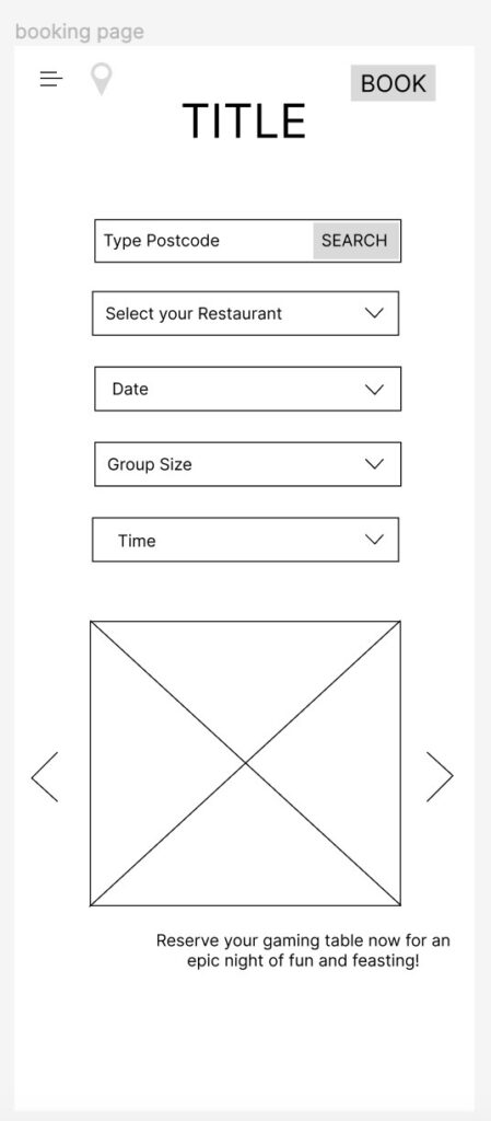
In the studio session following the lecture, I had the opportunity to showcase my work to Gibson. His positive feedback and encouragement boosted my confidence, affirming that I was on the right track. However, he suggested a strategic consideration before delving into desktop design on Figma: developing wireframes for mobile. This preemptive step aimed at avoiding potential issues where certain elements might not seamlessly translate to mobile after completing the desktop design. I took this advice to heart, meticulously crafting wireframes for mobile, ensuring a cohesive design language between the two platforms.
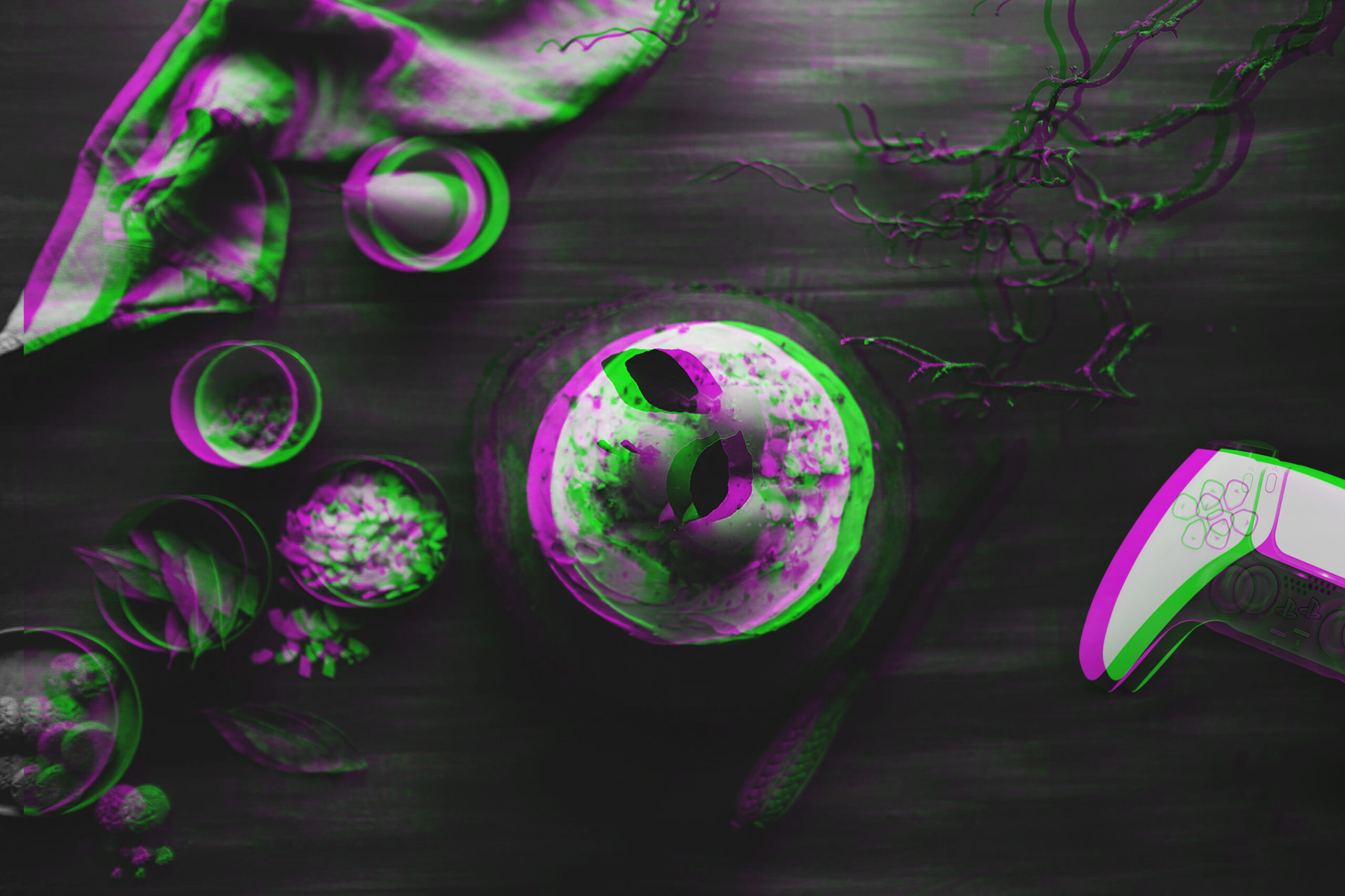
As the week progressed, I seamlessly transitioned to the mobile design phase. Admittedly, there were initial hesitations, considering my lack of prior experience in web design. However, once I placed the first image, those concerns dissipated. The ideas flowed more smoothly than anticipated, and I found a comfortable rhythm. My primary goal is to blend conventional restaurant website elements with a distinct gaming vibe. Gaming setups often embrace neon colors and bright aesthetics, a departure from the more minimalistic and formal approach of typical restaurant websites. My challenge was to harmonize these seemingly disparate styles, ensuring the dominance of the gaming theme to resonate with the target audience.
An exciting element I introduced during this phase was a glitch effect on images. A tutorial on adding a glitch effect to an image sparked the idea, and I decided to take it a step further. After researching how to make the glitch image appear as if it were genuinely glitching, I successfully incorporated a dynamic glitch video. To maintain coherence and remind users of the context, the glitch video transitions back to black and white glitching midway. This added a layer of complexity to the animation, enhancing the overall visual appeal.


I also dedicated time to planning the scroll-down features of the homepage, identifying potential image placements, and gathering relevant text for different sections. The focus was on maintaining clarity and ease of use, adhering to conventional restaurant website conventions while injecting a distinctive gaming flavor. It’s crucial to strike a balance that offers users an initial understanding of the website’s functionality, facilitating usability.
Looking ahead to the coming week, my plan includes refining the homepage further by incorporating a carousel image rotation and fine-tuning various elements. I’ll also extend my focus to the ‘Menu’ and ‘Book’ sections, aiming to make significant progress. Additionally, I’ll explore Project 4, ensuring a well-rounded approach without overwhelming myself with an excessive workload.
In summary, this week stands out as remarkably successful. The acquisition of new skills, the reinforcement of existing ones, and the initiation of the website design on Figma have surpassed my initial anxieties. Completing Project 2 adds a sense of accomplishment, and I’m eager to delve deeper into my website project in the upcoming week. The journey of constant learning and exploration in Figma promises to be both exciting and rewarding.