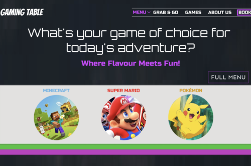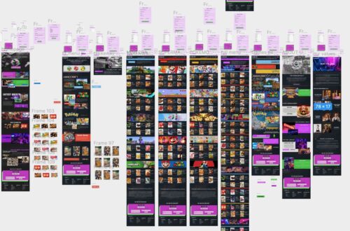
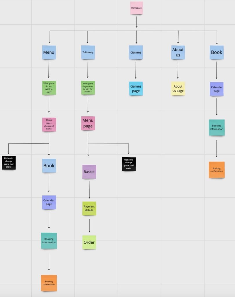
For this task, I initially started with a rough post-it note site map to get a basic structure of what I wanted the site to look like. This step allowed me to focus on the layout before diving into the details of the site’s appearance, which worked well for me.
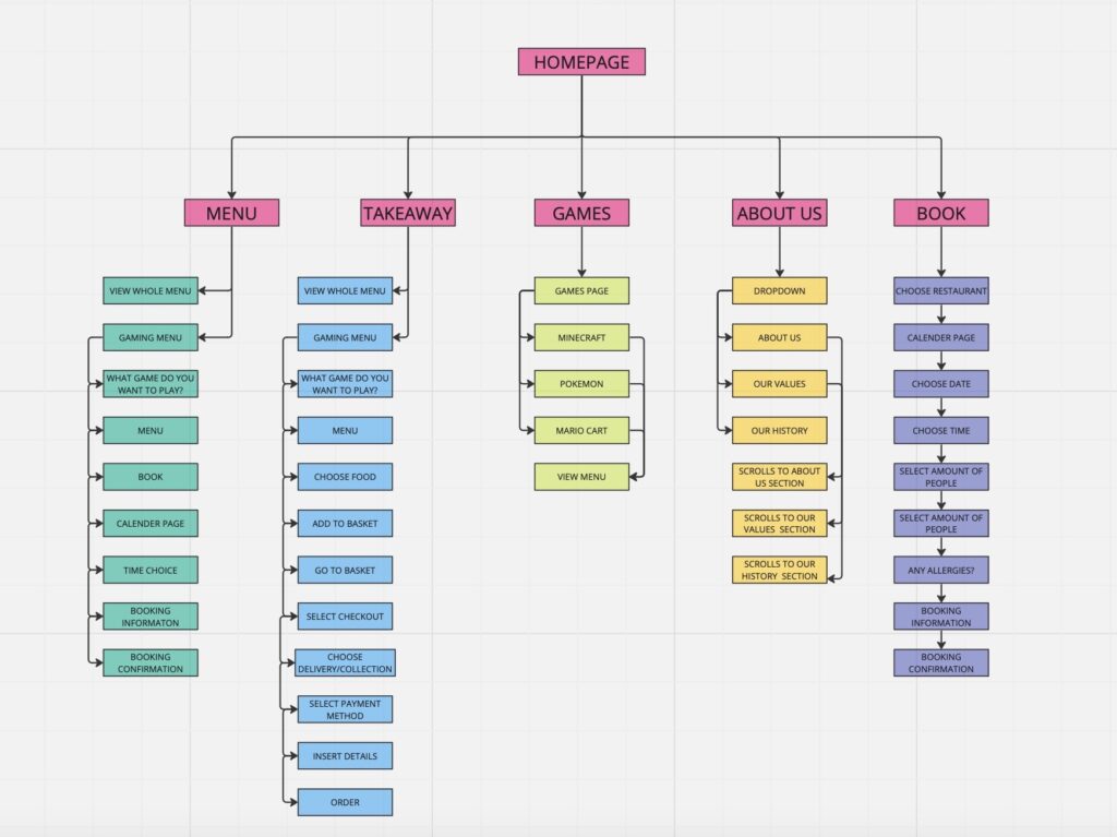
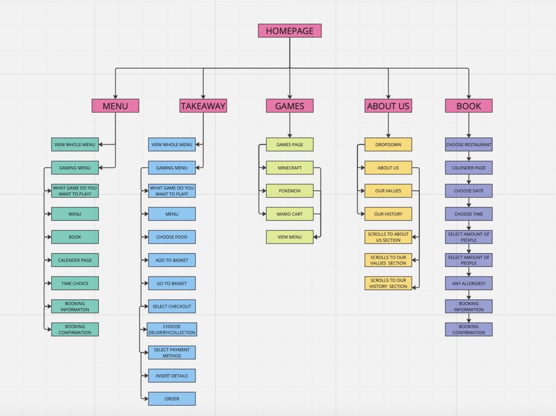
In the site map, I illustrated the navigation from the homepage to different sections of the website that I plan to design and where each button on the navigation bar will lead. This process is crucial when designing a website because it helps you consider the site’s logistics without the distraction of appearance; that comes later with the wireframes.
Initially, I had some uncertainty about how to approach the site map, especially because we had to create a site map for project 2, which had an existing site. Additionally, I wasn’t very familiar with the conventions of restaurant websites and navigation bar designs, as I don’t frequently use them. To overcome this, I decided to create user flows by examining examples of well-known restaurant websites such as Prezzo and Zizi. This exercise provided valuable insights into what information should be available on the website, the hierarchy of content, font and title sizes, and how navigation bars should function. These insights will be highly beneficial in the development of my website.
I’m satisfied with the final appearance of my site map. It looks professional, well-organized, and easy to understand. This experience has also improved my understanding of what a site map should entail, which will be useful for future projects.