In the session today, we mainly focussed on learning more about online sites and what settings are best to use when designing in Figma. We started off learning about 1x, 2x(Retina), and 3x(Super Retina). We learnt that the rectangle that has the same aspect ratio as the MacBook Pro 13″ is 1440x900px. However, the MacBook Pro 13″ has a screen resolution of 2880x1800px a Retina display of 2x.
‘Pixel Density’ is different on different screens. It’s measured in PPI (pixels per inch) and is higher for sharper images on newer, more expensive devices. When you design you won’t know when device your site will end up on – so always design in 1x.
I found out that when importing a screenshot on MacBook Pro 13″ results in a 2880x1800px ‘Retina’ image. Figma knows it would be helpful to display it at 1x so automatically reduces the size by half. This however, does not happen in Miro – but can be changed to half size in settings!
In Figma the layout grids on a frame are guides for aligning content. There are multiple sizes of grid you can create for example what is better a 10 or 8px grid? Figma by default uses a 10px grid but 8px can be more helpful and a safer choice because it can always be divisible by 2 and will always be an even number when divided. However, when creating a site for a desktop application or website, a 12 column grid may be the best choice as it can be divided by 2,3,4 and 6, which gives you more scope for flexibility. This is different again for when designing for a tablet and a phone because on a tablet 8 columns is best and for a phone it is 4 columns. It is going to be important that I create the correct sized grids and columns in my website design when I come to Project 3, Experience Website design.
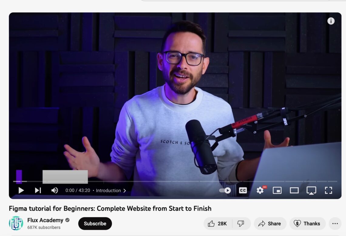
After the lecture portion of the workshop, learning all this new information, we were told to use a YouTube link to help us in creating our own high fidelity website using the resources given in the shared folder. This video took me quite a while to get through as I was learning new things and trying to adapt to the new software whilst following along with him and trying to keep up. I got the hang of it towards the end because I started to remember where to find specific things and short cuts in the process, which I found really helpful. I am pleased with how my workshop worked out because it looks similar to that of the man in the video, so I am proud of myself for that. I took a few process images of me creating this web design to show how I worked through it:


This is the final image of what I created. This took me around an hour to complete.