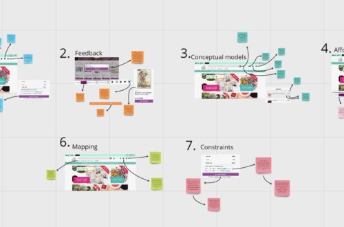
Completing the usability tests provided valuable insights into what users found problematic and less user-friendly about the website. This feedback gave me a clear understanding of the necessary improvements to enhance the website’s usability and navigation.
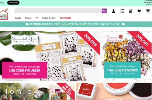
One significant issue identified was the excessive options in the drop-down menu, which led to confusion for users when searching for specific items. As part of my redesign strategy, I aimed to simplify the mega menus for improved navigation. I streamlined the menus by featuring only section headings in the drop-down menu. Further details and specific options were presented on the respective pages, rather than within the dropdown menu itself.

Another issue that arose was related to the color scheme of the website. The pale pink used, while aesthetically pleasing alongside the green, posed visibility challenges, particularly for individuals with visual impairments. The subtle color change wasn’t evident enough to provide clear feedback.
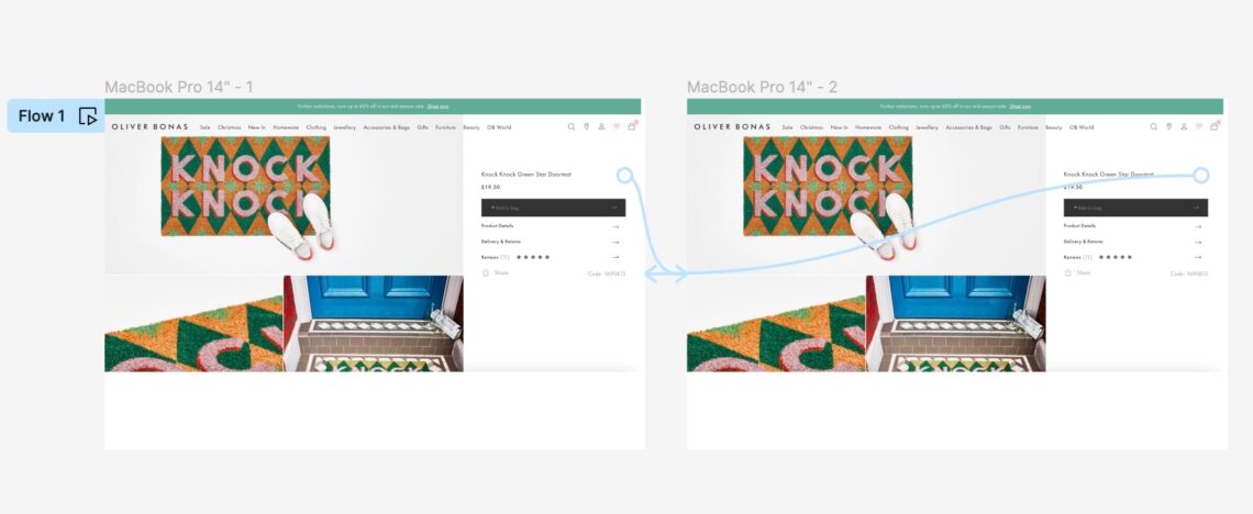
To address this concern, I recreated a page from the website using Figma. In this revised design, I adjusted the heart’s color to a darker shade of pink that still complemented the green elements. This modification enhanced the visibility of the color change on the page. Additionally, I incorporated a prototyping feature to ensure that the heart would change color upon clicking, similar to the original website.

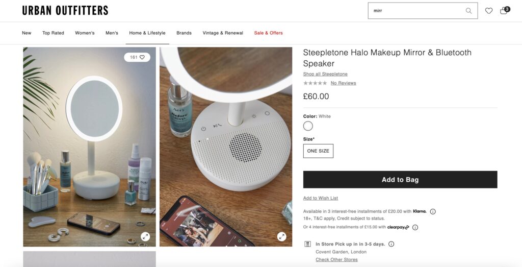
Another important design recommendation relates to the product images featured on the website. Some of these images simply show the product on a white background, offering no context regarding the product’s size relative to other items. To address this issue, I researched a website that provides an excellent example of how I believe Oliver Bonas could enhance their product presentations.
Urban Outfitters serves as a great model for how they should design their product images. While the products appear sleek and attractive against a white background, this presentation doesn’t offer much insight into the product itself. Therefore, my recommendation is to feature the product with the white background as the main image in the scroll-down view. However, upon clicking the product, it should display the item in a contextual setting, demonstrating its size and scale. This approach ensures that users can better understand the product’s dimensions rather than relying solely on numerical measurements.

Another significant design recommendation that emerged during the usability tests, and which I had already identified during my website analysis, is related to the “guest checkout” option. When you select “guest checkout,” it still requires you to enter your name and email address to “check if you have an Oliver Bonas account.” This can be confusing because users typically choose the guest checkout option when they don’t have an account. This miscommunication could lead users to believe they are creating an account or signing up rather than simply proceeding to checkout.
To address this issue, I conducted research to find a website with a more coherent and user-friendly checkout process. Brandy Melville’s website stood out as an excellent example of a clearly labeled checkout section that avoids misleading wording which could confuse users. This change would enhance the user experience by making it clear that they are checking out as a guest.