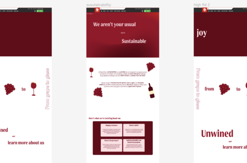
Throughout the entirety of the design process, as a group, we knew we wanted to include illustrations, to add a sense of joy and also just liven up the design of the page, to make, it seem less text heavy, we felt this was most important on the about us page.
I was put in charge of the illustrations because I do a lot of digital drawing in my free time, so we felt it was fitting that I did this too, as I can do it quite quickly. We started off making realistic looking illustrations, which look cool, but didn’t fit with their new brand guidelines.
Once i had made myself familiar with the new brand guidelines, I decided to try to recreate some of their illustrations from their ‘flowing and witty’ section, as I felt that fitted the vibe we were going for in our redesigns.
I altered some of the designs slightly to work with our page, and I designed my own, with the same feeling as their designs.
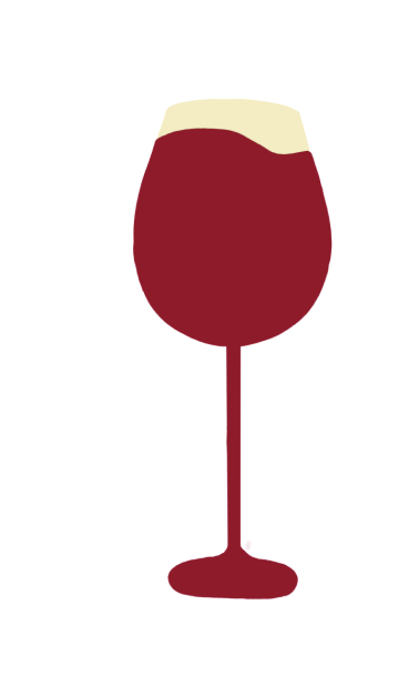
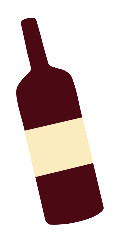
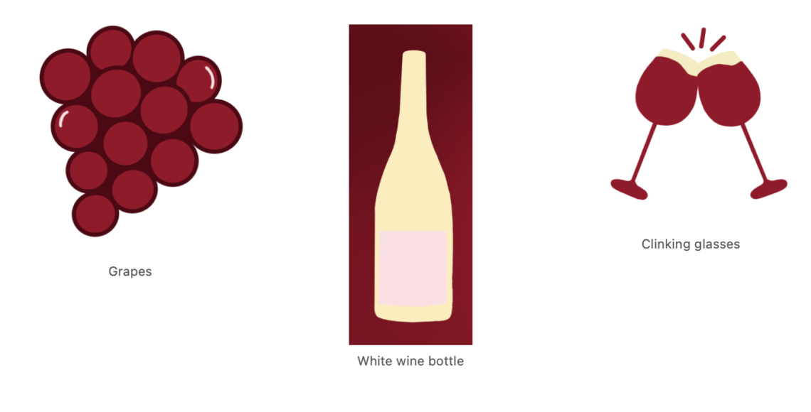
Above are the illustrations I created on my Ipad pro, that are inspired by their ideas.
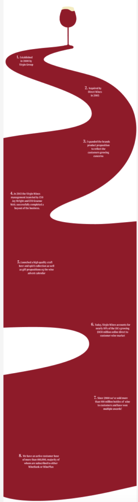
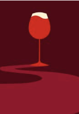
Above, on the left is inspired by their flowing liquid illustration that I designed, so it could better show the story and feeling like the liquid is flowing as you go down the page. To the right is Virgin wines illustration from their new brand guidelines.
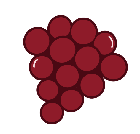
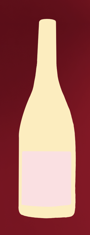
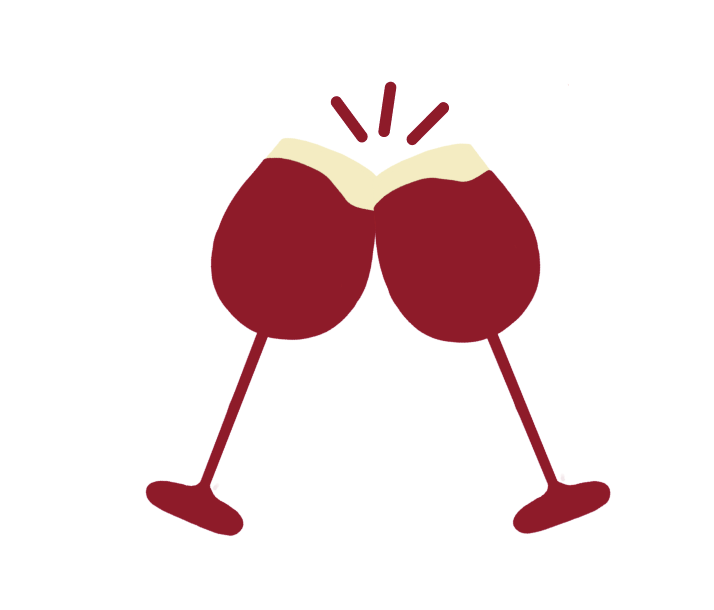
Above are three illustrations I designed, inspired by the feeling and colour palette of their new designs. I used these as a foundation to create my own iterations. Personally, I find the grapes particularly effective, as they seamlessly complemented all the pages we designed.