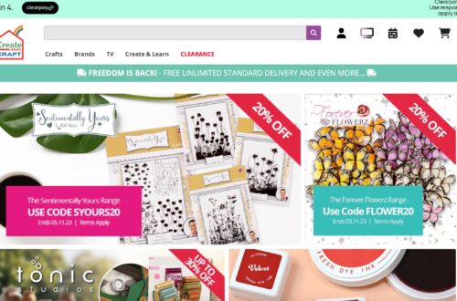
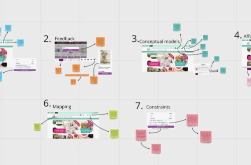
In this part of the project, I created user flow diagrams for two distinct types of websites: one for a product-selling website and the other for an experience-selling website. For the product website, I selected Oliver Bonas, primarily because it’s a well-designed website with a coherent look and feel. However, I also identified areas where improvements could be made to enhance the user experience. On the other hand, I chose Vue for the experience website to provide a sharp contrast to Oliver Bonas in terms of design and functionality.
This project segment was an educational experience for me as it allowed me to delve into the analysis of professional websites and understand their inner workings. I captured screenshots of my user flow, illustrating the steps required to reach the final point of the ordering process. This visual representation helped me identify any unnecessary elements in the user flow. Furthermore, I supplemented these visuals with a written user flow, detailing the specific actions and decisions I made at each step of the process.

This process has been invaluable for my website creation project because it provided insights into how other websites have approached the design and functionality aspects. It enabled me to identify elements I would handle differently in my website design, as well as aspects that I can draw inspiration from in the way these companies have designed their websites.