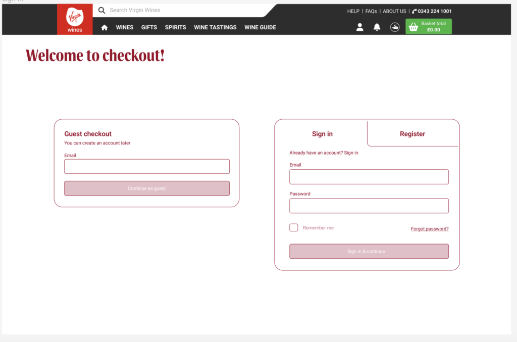
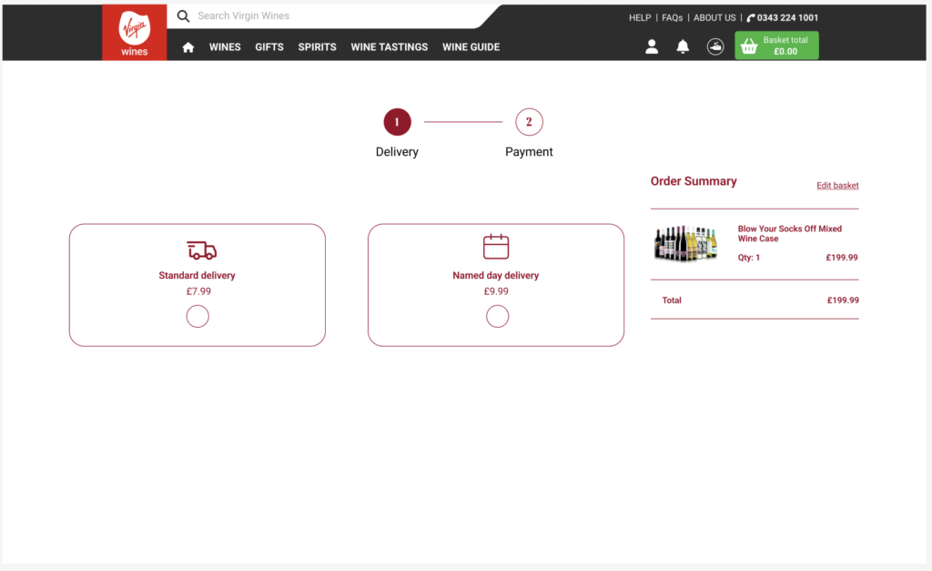
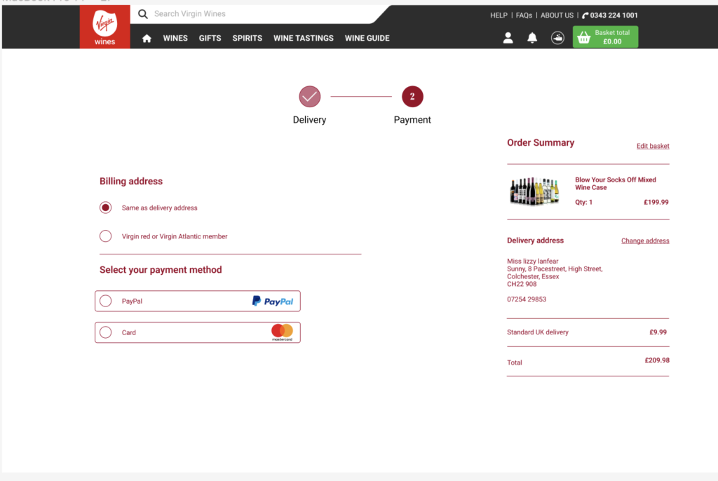
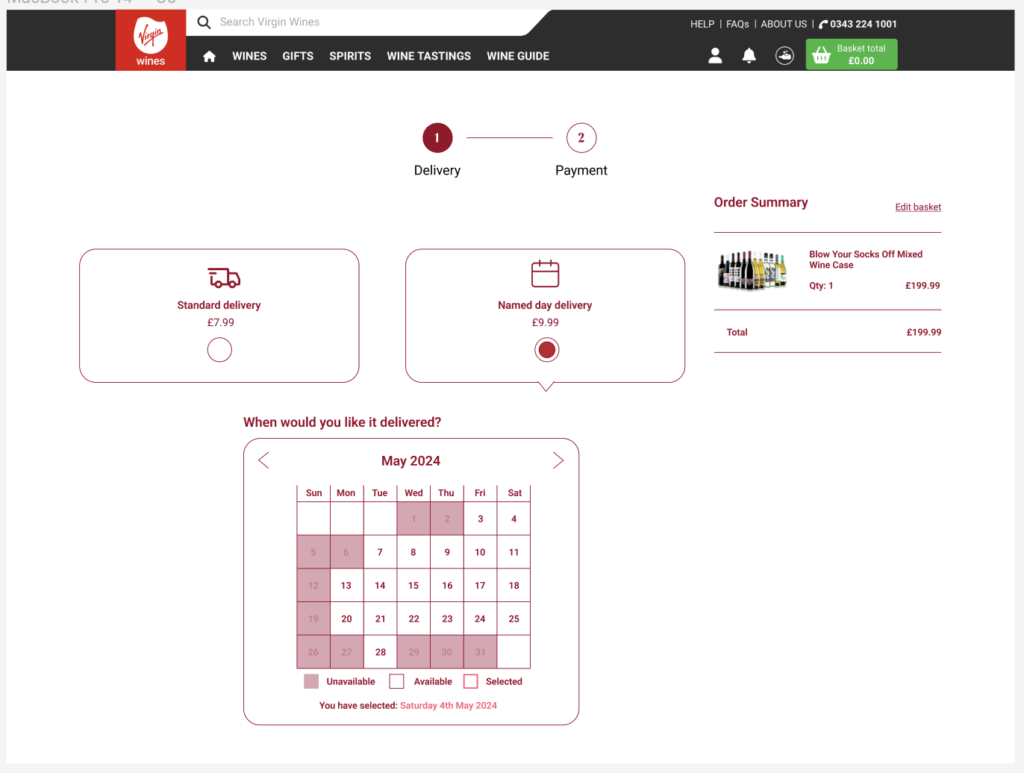
I take pride in the final design of the checkout process, which I led. It reflects our shared objective of achieving streamlined clarity and ease of navigation, transitioning seamlessly from our research phase goals.
Through our research, we unearthed critical insights, revealing the cluttered nature of the existing site and the potential for user distraction leading to dropouts—an issue we aimed to rectify. Feeling compelled to initiate significant change, I diverged from the current site’s approach, opting for a complete overhaul rather than incremental adjustments.
To address the user experience concerns, I innovatively implemented collapsible buttons for the steps. This approach minimises the perceived complexity of the process by eliminating the need for users to navigate through multiple pages, thereby enhancing the flow and efficiency of the checkout process. Reflecting on this journey, I’ve gained valuable insights into the importance of user-centric design and the significance of bold innovation in achieving optimal outcomes.
Below, are my desktop designs for the checkout process.