

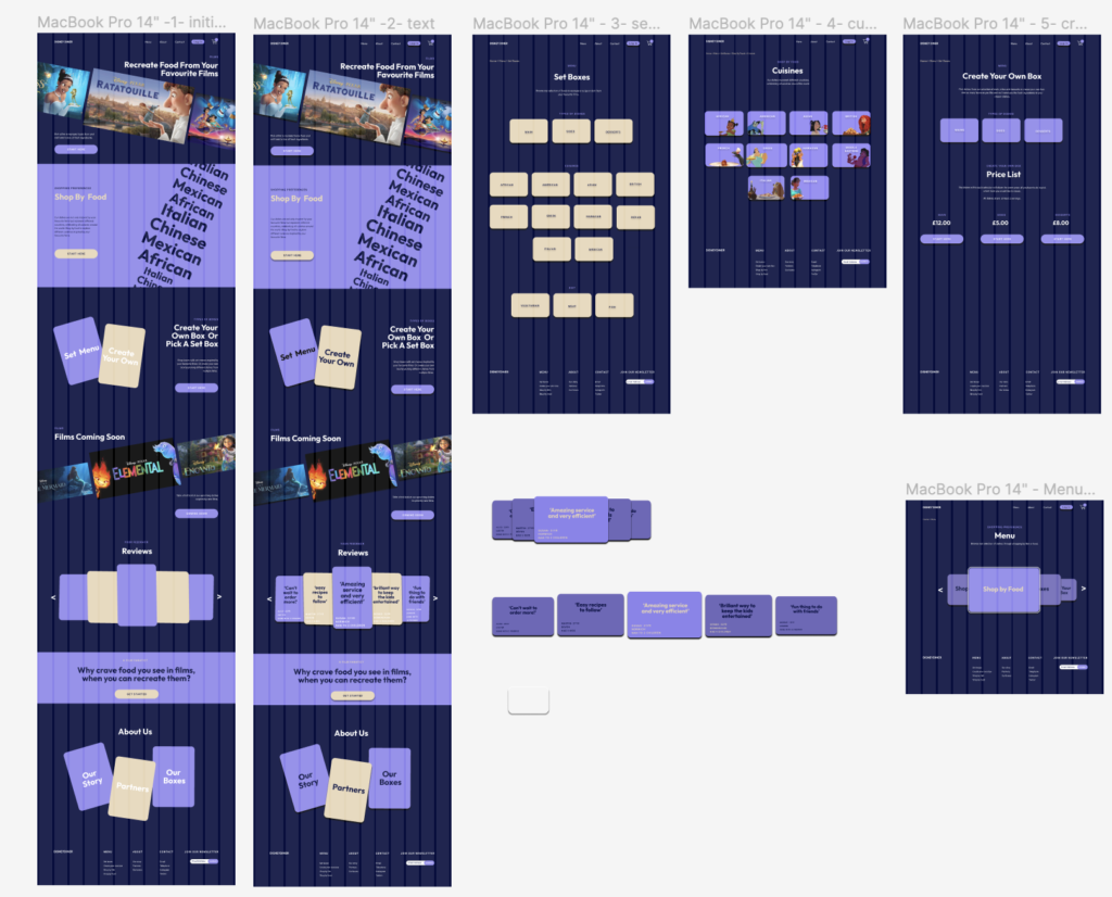
Firstly, when starting my design process for project 3 I began experimenting with different composition layouts for text, design ideas and images. Here I explored how I wanted to present different page options for navigation categories. This included my idea of using cards to mimic ‘disney cards’, creating a playful and fun environment. These designs would be positioned on a tilt and when hovered they would slightly shake or tilt in the opposite direction to express the action the user is making. However I found that this also looked chaotic as pages seemed compacted, leading to users not focusing on specific and important aspects. This also led to users having multiple routes/ journeys and so reflecting on this, I felt that there was too much choice for the user to be given on a homepage as they wouldn’t know which journey to take due to being overwhelmed by various options that ultimately led most actions to the same page.
Additionally I then looked at then using a more landscape approach with buttons to reflect the Disney website and mimic film covers. However, I still found that this looked to compact and would make the user feel overwhelmed, especially when the landscape actions listed as text would take up less room.
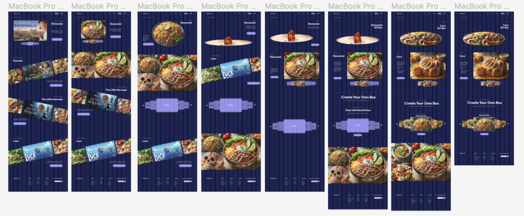
Meanwhile, here I experimented further with layouts when led to the page for individual products. This page consisted of product images, text and information on the product, options to customise set boxes, a gallery


No Comments