

Furthermore; from my evaluation of my existing website ProSwimwear I began the process of editing the websites design. As previously mentioned I found issues with the navigation bar, due to repetitive categories, overwhelming amount of brand logos and how the navigation doesn’t clarify what competitive swimwear and racing is. To resolve these problems I re-designed the layout and composition of text within the navigation bar, this was achieved by listing brand names instead of a mega menu of brand logos, however I liked the concept that the user can quickly identify where they need to click by having visual images to express a brand. Therefore to achieve I added a side category of ‘Best-Selling Brands’ when hovering over brands including the top 8 brands used on the company to minimise the amount of logos shown.
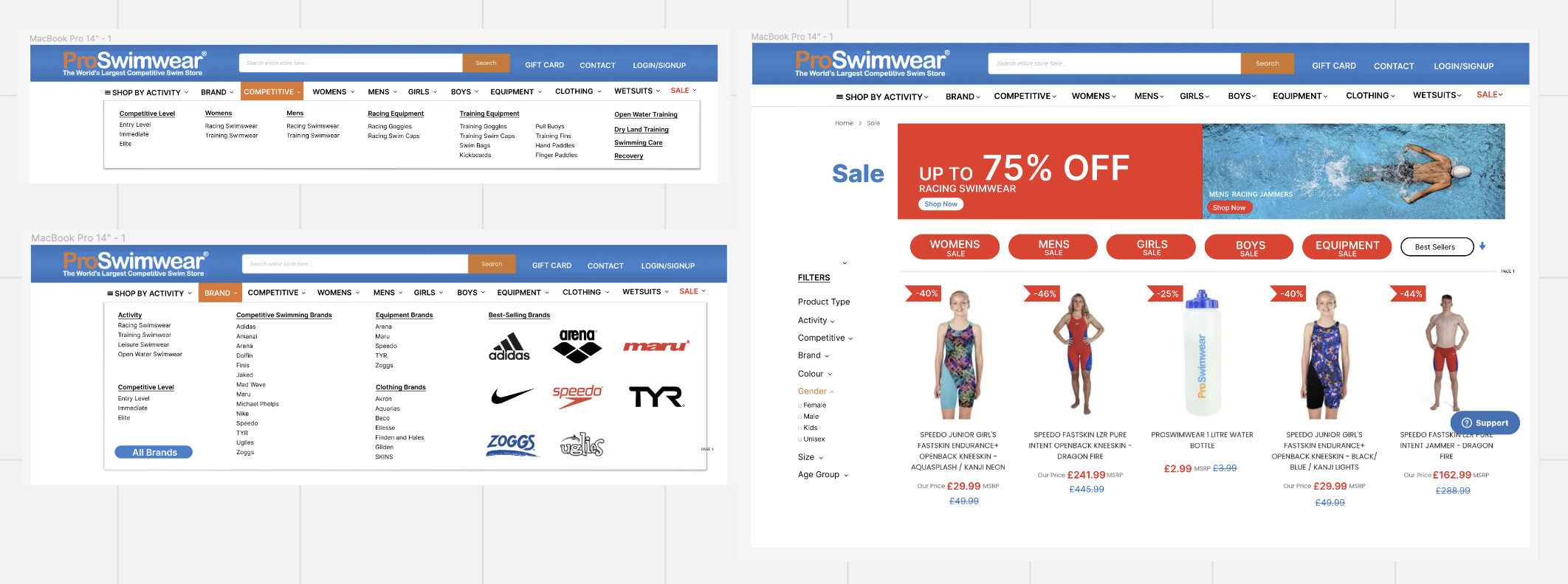
In addition to this, when iterating ProSwimwear I discovered the lack of colour or theme when opposed with the ‘sale’ page. The website included a purple thin box that spread across the page which looked random and off theme with the brands identity as it didn’t link to the websites and users stereotype of using red for ‘sales’ as well as leading away from the brands prominent blue and orange colour theme. In response to this I added more red to exaggerate the fact its a sale as the concept of ‘sales’ to the user as this develops a feeling of being intrigued or excited. A result of this, I enlarged the banner for sale percentages per product to capture the audiences attention and lure them in with these percentage figures, I also changed the size and colour of the prices, editing old prices to blue to mimic the brands identity, as well as making sale prices bold and red to reflect the sale. To add to this, I added red category buttons at the told of the new sales page as I found when evaluating the original sites sale page that they had numerous filtering options and so moving the basic/ main categories of; men, women, girls, boys and equipment to the top reduces the amount a user has to scroll through on the filtering system.


No Comments