
This column was our final step into completing our research board where Rob, Hashry, Sihina and me collaborated to investigate any problems in our designs through user tests and if so we could illustrate some solutions by generating more ideas. Rob, Sihina and myself each conducted one user test whilst Hashry completed prototypes for the user tests. Once this was completed me and Sihina carried out research on each user text by evaluating what works/ doesn’t work well.
Preparation for User Tests:
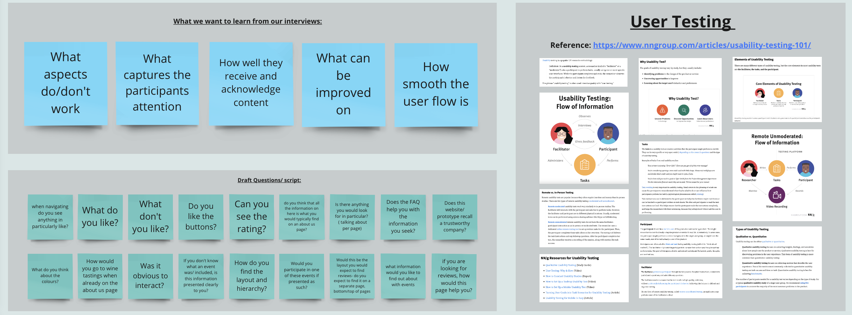
Firstly, for this section of our research board I created post-it notes to identify what we wanted to learn from our user tests. This is including:
- What aspects do/don’t work
- What captures the participants attention
- How well they receive and acknowledge content
- What can be improved on
- How smooth the user flow is
After this myself and Sihina produced some draft questions which we could ask the participants, for example ‘How do you find the layout of information?’ and ‘If you are looking for reviews, how would you do this?’.
User test example:
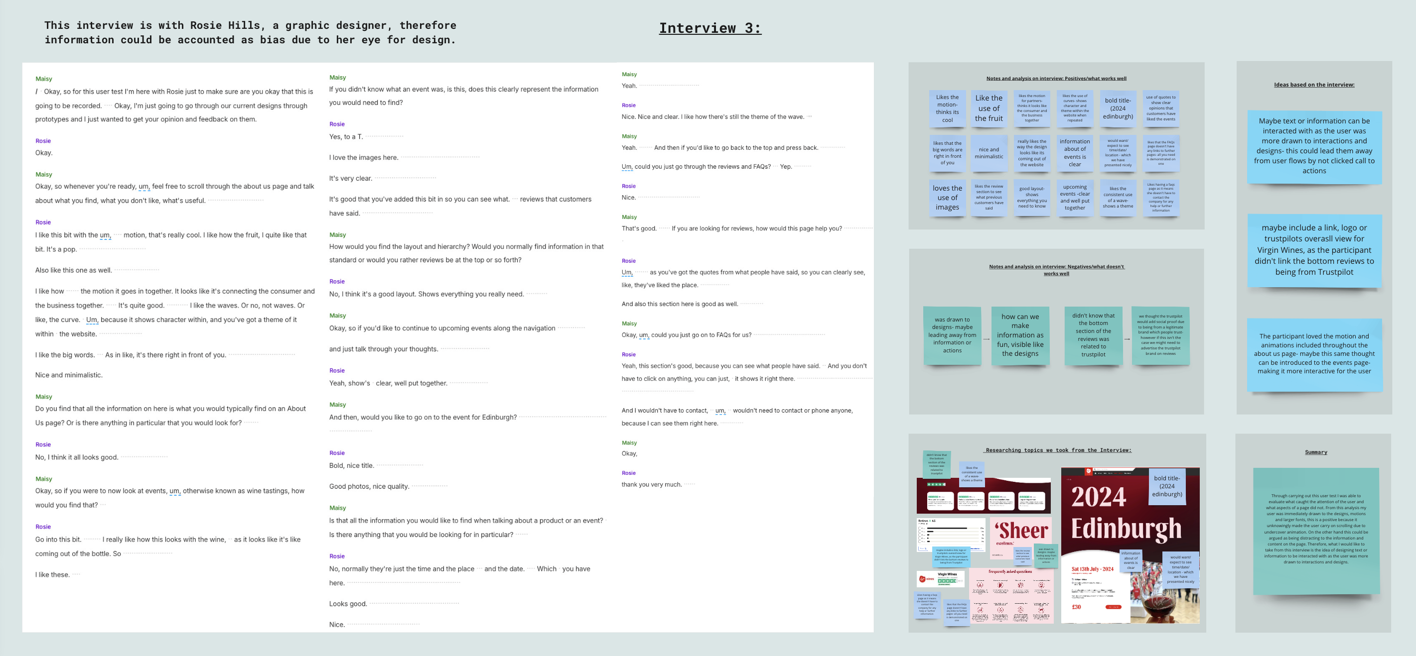
Here is my user test I undertook with Rosie Hills, a graphic design student at Norwich University of the Arts. Through our user test, I evaluated aspects of our designs which worked and which did not. Here are my summaries:
- Thanks to this user test, we were able to find loads of information, that need to be fixed, regarding various aspects in both design and animation. Overall, he appreciated the addition of these last-mentioned making the site alive and fun. The layout and the hierarchy gave a positive feedback.
- Through carrying out this user test I was able to evaluate what caught the attention of the user and what aspects of a page did not. From this analysis my user was immediately drawn to the designs, motions and larger fonts, this is a positive because it unknowingly made the user carry on scrolling due to undercover animation. On the other hand this could be argued as being distracting to the information and content on the page. Therefore, what I would like to take from this interview is the idea of designing text or information to be interacted with as the user was more drawn to interactions and designs.
Pleasure & Pain Points:
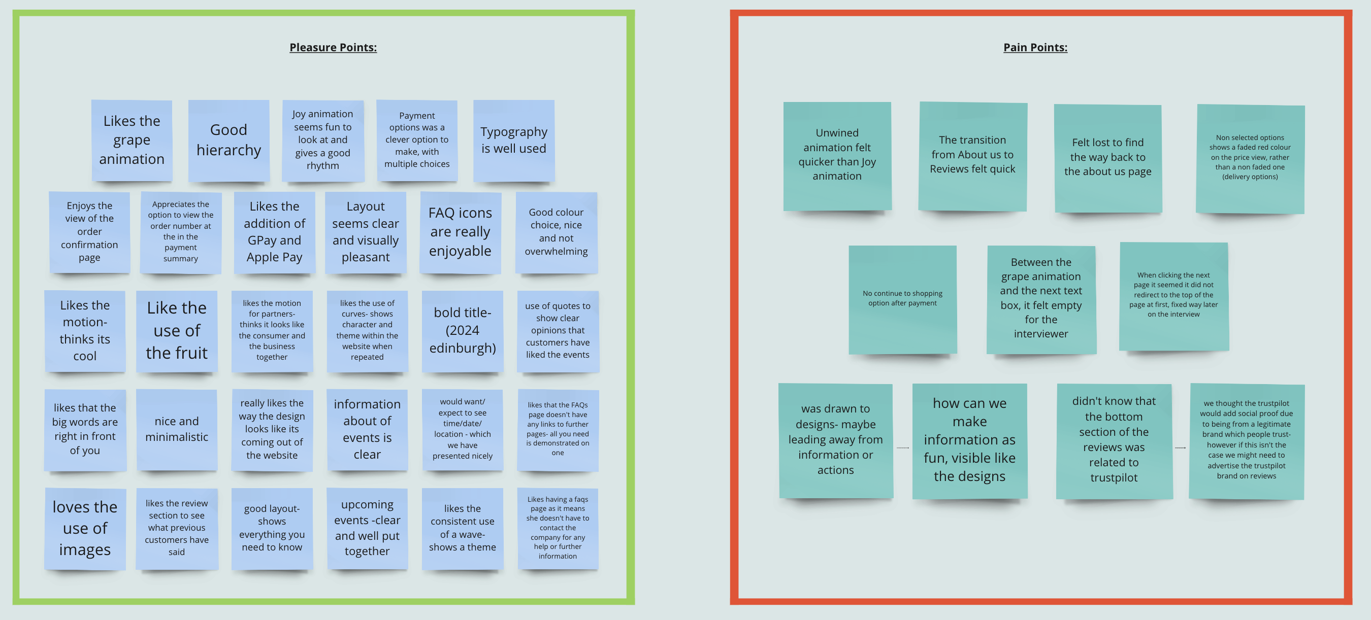
We also analysed the checkout design and functionality. Although a prototype, we added what was crucial at that moment. This is because we want to let the user feel like he is actually buying something. The outcome came pretty handy in giving positive feedbacks to follow up with our ideas. The critiques here were really useful, getting to know more about their needs is what we seek in doing.
From this I generated pleasure and pain points to showcase the positives vs the negatives about our current work. We found this useful as it quickly summarised problems within our designs.
Outcomes:
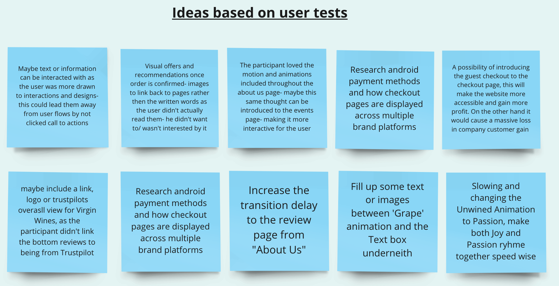
As a result of our research and user tests we were able to create some solutions to any problems we found, this was to adapt our designs for different users and examine any areas which we may of overlooked, these ideas are presented above.
No Comments