

For my evaluative research on project 2 I analysed and tested an existing website called ProSwimwear.

Above is a quick summary of the website ProSwimwear where I illustrated the goal orientated behaviour. This evaluates the basic user flow through the website by demonstrating the actions, choices and results you get when browsing on the website and continuing a checkout process when buying a product. I found that the users journey was a simple shopping process, however this was intertwined with innumerable filtering options which sometimes became overbearing for the users.
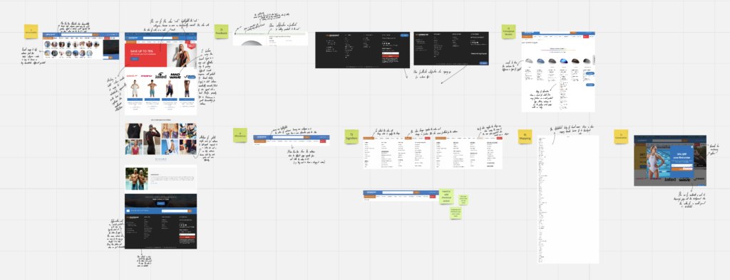
Secondly, I analysed the Don Normon’s 7 Design Principles when explored my chosen existing website. These principles consisted of discoverability, feedback, conceptual models, affordances, signifiers, mapping and constraints.
From my research I found that this website portrays positive discoverability, especially through the use of brand logos. This is because I believe using brand logos is an easy and effective way to express the range of brands this website has to offer, which ultimately gives the customer a variety of choices when browsing. Additionally, the use of logos is one of the largest aspects of brand identity a customer associates or would immediately think of when opposed with a particular brand in mind. Therefore presenting brand logos on ProSwimwear is great discoverability also allowing the customer to take a quick and more efficient journey through the website as this filtered down the products shown on the website massively.
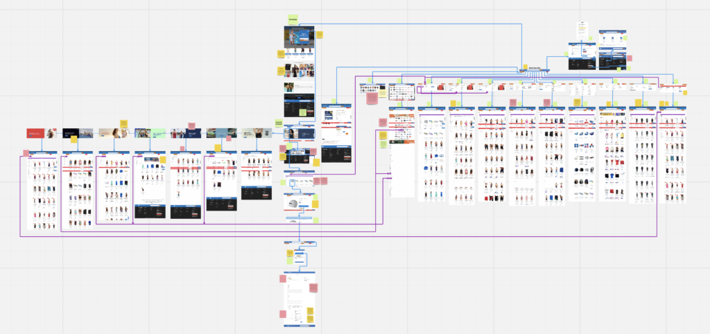
Above is my representation of a sitemap and heuristic markup for the ProSwimwear where I captured the most frequently used parts of the website. I annotated pages using post-it notes on a Miro board in order to identify problems and express elements which I think are designed and executed well. I used blue arrows to clearly indicate the direction of the user flow throughout the website, while also annotated with purple arrows to show multiple scenarios may lead to the same page.
Personally, I found that this was a clear and useful way to depict ProSwimwear as it portrays the overall architecture of the website, also expressing how pages vary, yet stay consistent with its design functions.

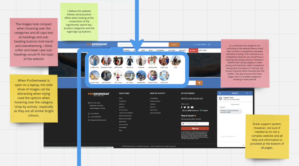
Here are screenshots which are zoomed in on the sitemap and heuristic markup. The main concepts I wanted to illustrate was the function and user flow of the navigation bar as well as its mega menus. In particularly I evaluated and analysed the mega menu when hovered over ‘Shop by Activity’. From this I discovered that the images look compact when hovering over the categories and all caps text as headings and sub-heading buttons look harsh and overwhelming. As a result I think softer and lower case sub-headings would fit the topic of the website. Furthermore- as a swimmer the categories are confusing as the website doesn’t clarify what competitive swimwear and racing is. This is because as a competitive swimmer you would have a training and racing costume, therefore I believe their racing category is titled wrong and should be called ‘competitive’ having both the option of ‘training’ and ‘racing’ costumes when hovered over the button. This also ensures that these pages aren’t in multiple categories, making it more precise and less compact.
However, when researching functionality and design within websites using lawsofux.com, I found the website following the serial position effect. This is demonstrated when looking at the composition of the logo/brand, search bar, product categories and the login/sign up buttons. This makes it clear for a user as it seen across numerable platforms by flowing typical website design rules.


No Comments