
For this, I decided to look at a few different things in order to make sure that my research covered lots of areas. I didn’t know a great deal about archeological digs, and I wanted this research to make me an expert on the topic, as well as on different user based sites.
Primary Research for Experience Websites
For this, I used 3 different webpages, some for museums and others just of experiences surrounding my user group, or simply ones I thought were fun!
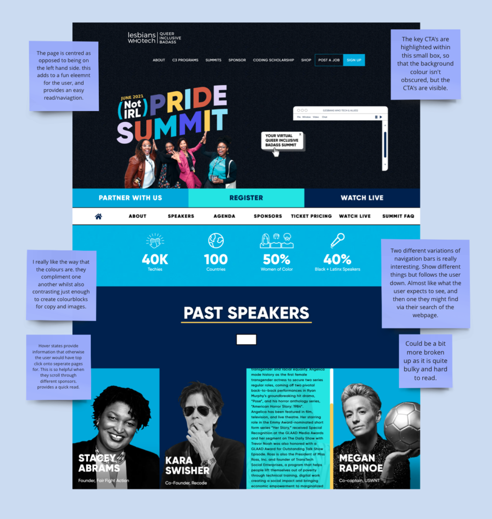
The Pride Summit is a social event that I wanted to look into due to it being a very vibrant and fun to navigate website. The centralisation of the page makes the user focus on a different form, as they don’t follow the Z or F flow of reading, and the key CTA’s are laid out all over the webpage to intrigue and ask the user too dig deeper, this is literally what we want our users to do – explore! Different hover states provide the user with a route where they can learn without having to click, almost an insight, pushes them to want to learn more. An identified negative of the webpage however, was how bulky it felt. Whilst this might have been valued within their primary goals, for a webpage based on discovering something, I definitely do not want my webpage to feel this full. It doesn’t feel as easily discoverable because all of the information is shoved at you in a way.

The Tate Modern website on the other hand was so bland! If you wanted a completely different outlook on websites, this is one of them. As mentioned on the board, for a website dedicated to an art based museum, full of life and colour, this website was boring, bland, and did not make me feel like I was about to walk into a gallery as famous, well known, and ambitious as the Tate. The negative space was boring, and the websites flow was harsh and not easy to navigate with so many different nav bars and headers. The parts I did like where the scroll to find map with various directions, as well as the small icons that ran along the bottom (I did think this could have easily been followed through.)
I also looked at websites that provided in an experience within their website interaction. For example, the Donuts website was bold and bright, implementing colours that popped against one another, as well as a nice flow that navigated the user through spinning components and moving body copy.

Research Into Thrill and Food
What does thrill actually mean to people? How is food brought into that? These were what I hoped to explore within this research.
Miro Boards : https://miro.com/app/board/uXjVNU5os7A=/?moveToWidget=3458764569089200385&cot=14 and https://miro.com/app/board/uXjVNU5os7A=/?moveToWidget=3458764569089200386&cot=14
For this, I stripped them down to their most basic form, and literally researched the idea of ‘food,’ and of ‘thrill.’ I found that what people find thrilling is very dependent, but that it tends to be something to do with trying new things or being adventurous. Within the food sector, I noticed that people tended to divide things up by country of origin as oppose to taste or flavour etc, and I thought that this would be a good fit for a thrill seeker, trying foods from different countries, or perhaps, getting a dish they didn’t know they were ordering.

Thrill to most, when I conducted some user interviews, was as I mentioned before, dependant on the person, and so, my user interviews where of 3 different age ranges. 18-21, 22-27, and 30+. The reason I did this was to cover the ground of 3 very popular generations when it comes to looking for users within a market.
All of this research helped me a great deal, and it was soon time to move onto creating wireframes!
