Research : Responsive Design

This was from an online lesson on zoom.

The navigation of software is consistently changing. 2 years ago, Adobe XD was the top application for building webpages, however now, Figma is the one to beat. Figma on the other hand, cannot publish websites, only design the websites. This is why Webflow is such important software pieces that we need to look into. There is however, a really advantage software that can allow for the cross over a Figma file, called Framer. Framer does not need the follow through of auto layout, which is useful for designers needing to get a website done quickly.

Below is a Figma autolayout layout playground file in which I used to gather some more knowledge on the subject.

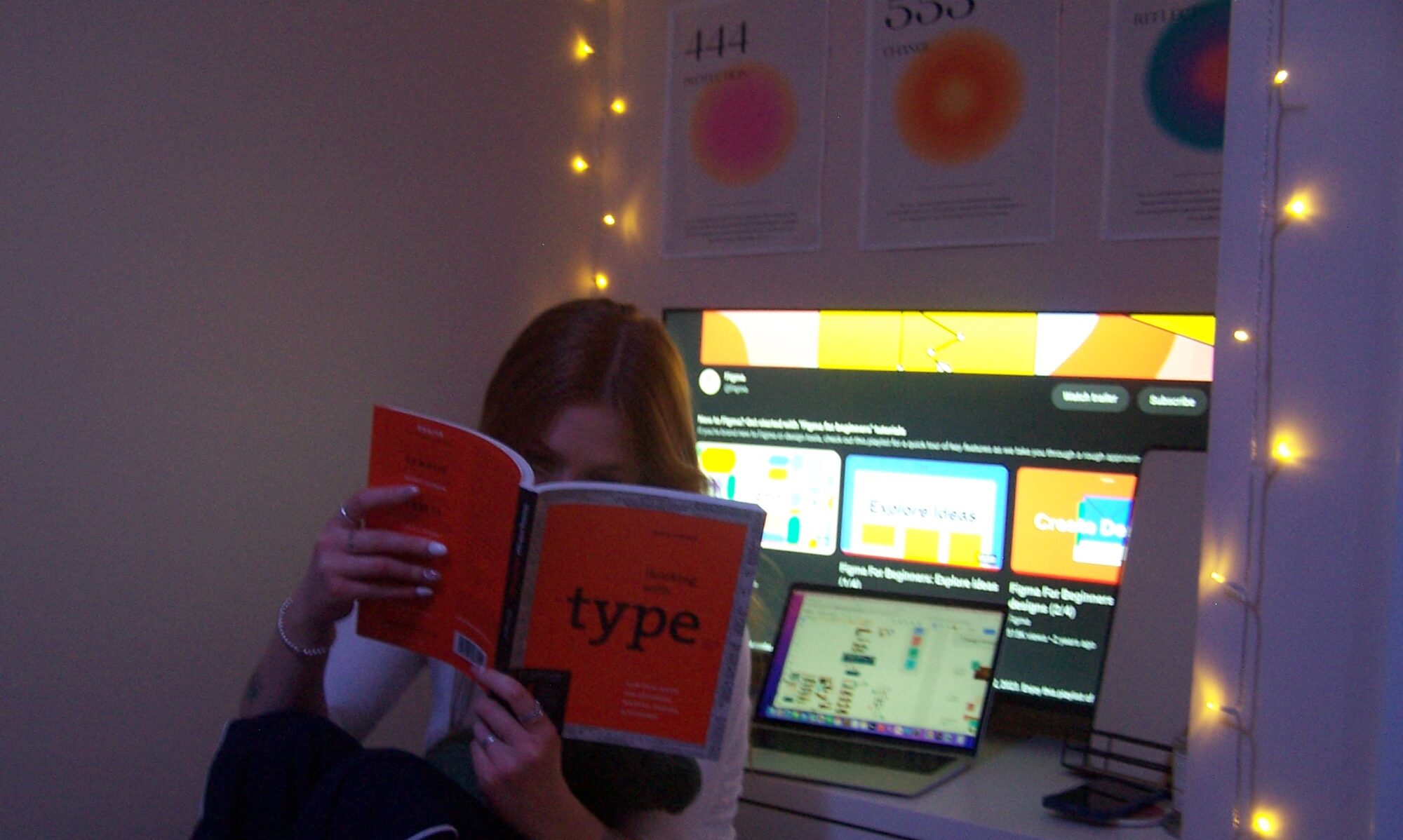
From the workshops, to the building of different components within Figma, and learning different sections on my own via YouTube or Figma’s tutorial platform, I think my Figma skills are quite good, and feel comfortable enough to attempt to transfer my project onto Framer!

Research : Mismatch by Kat Holmes

Described to a point as barriers facing us when interacting with the world around us, a mismatch situation is like ordering off of a menu in a language foreign to our own. Mismatches may seem threatening at first, but they are the building blocks of every inclusive piece of design we know.

“Ask someone what it means to be included and you will receive 100 different answers. Ask them what it means to be excluded and you will have one uniform response. To be left out.”

Mismatch ; Misfits by design ; Page 4

A person can easily adapt their situation in order to feel more included, however, when faced with the challenge of adapting to suit a product, a mismatch can not always be so easily solved. This failure falls on the shoulders of the designer.

As people, we must recognise exclusion, learn from human diversity, and then solve the problem for one, and expand to others.

In a way though, exclusion is cyclical, as it is constantly renewed by our choices. There are 5 key elements to these choices that we make.

  • How we make ; solutions explored by the problem solver.
  • Who makes the solutions ; who will be held accountable?
  • Why we make its ; focuses on motivations innate to the problem solver themselves.
  • Who uses it ; these are assumptions that the designer makes about the user.
  • What we make ; there solution!

Research : Layout Grids

To make this website feasible, and also accessible, it had to be responsive amongst mobile, tablet, and laptop interfaces. This was something I had never done before, and whilst it took em a while to figure out, I got there in the end with the help of the Figma Tutorials Chanel on YouTube (https://www.youtube.com/channel/UCQsVmhSa4X-G3lHlUtejzLA).

A key fact I learnt to help me maintain a responsive web flow was the use of grids within design, and especially, the use of the multiple of 8 within that grid design. Vertical grids should always have the same properties regardless of screen sizes, the video noted, but horizontal grids can be changed to adapt to a size.