Minor Details
Throughout the project, using both user research and user interviews, and then followed up by user testing, I had minor details placed throughout the product that validated its use as a checkout service as well as an experience.
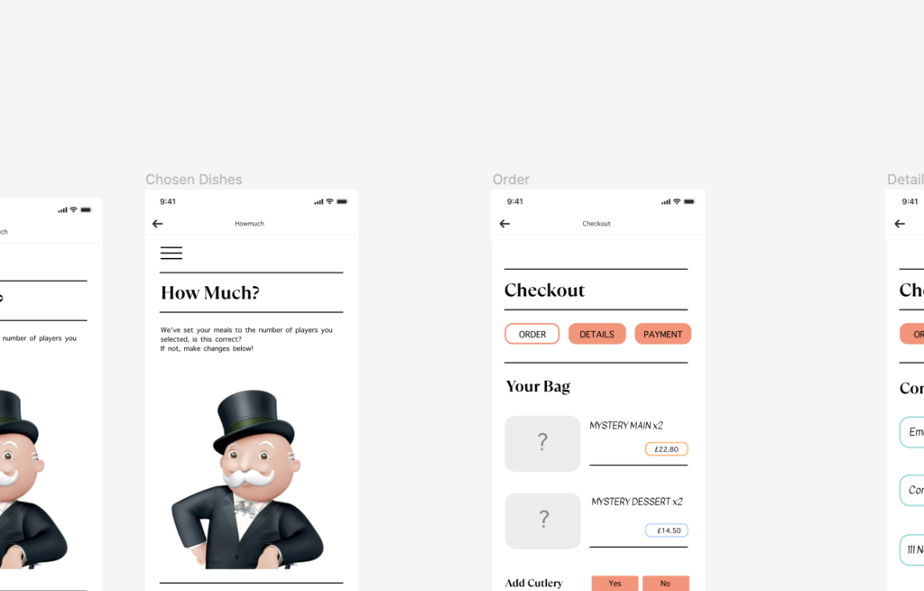
The use of a sand-which filter throughout was imperative in guiding the user and giving that authentic feeling. However, it was also really important to gain an understanding of when perhaps to drop its use – such as when the user is checking out , to push them into that final part of the process, and minimise them going back on themselves. This can also be followed up by the user of highlighted features throughout the product. The highlighted boxes presented action fro the user to take, which helped then to move them forward in the checkout process, as they followed a key of ‘order,’ ‘details,’ and ‘payment.’
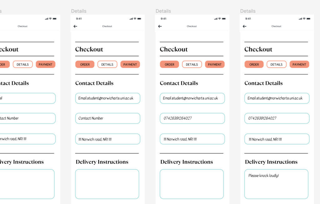
The softer edges used felt similar tot hat of the slightly curved edges of the monopoly design systems and the colours were a mix of both what people saw as ‘thrilling,’ as well as the monopoly colour theme. The images used were taken directly from the monopoly go game, as monopoly as a company moved towards 3D illustrations when creating online gameplays.
Whilst these were not all of the small details I added, these were some of the important ones in making the user feel comfortable in the checkout process!