Here I made note of some of the little changes that I made to my design to make it flow easier, or just make it all work as a cohesive design.
Onboarding Signifier
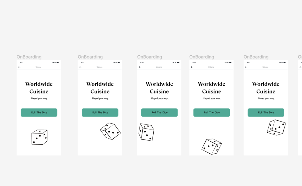
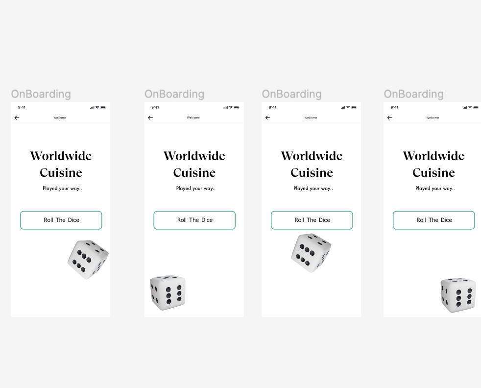
Here I wanted to give the action some sort of affordance, so that the user doesn’t think they messed something up when they have clicked the correct button. To do this, I changed the ‘Roll the Dice,’ button so that it would have some sort of corresponding action when clicked on at first.
The Checkout Process
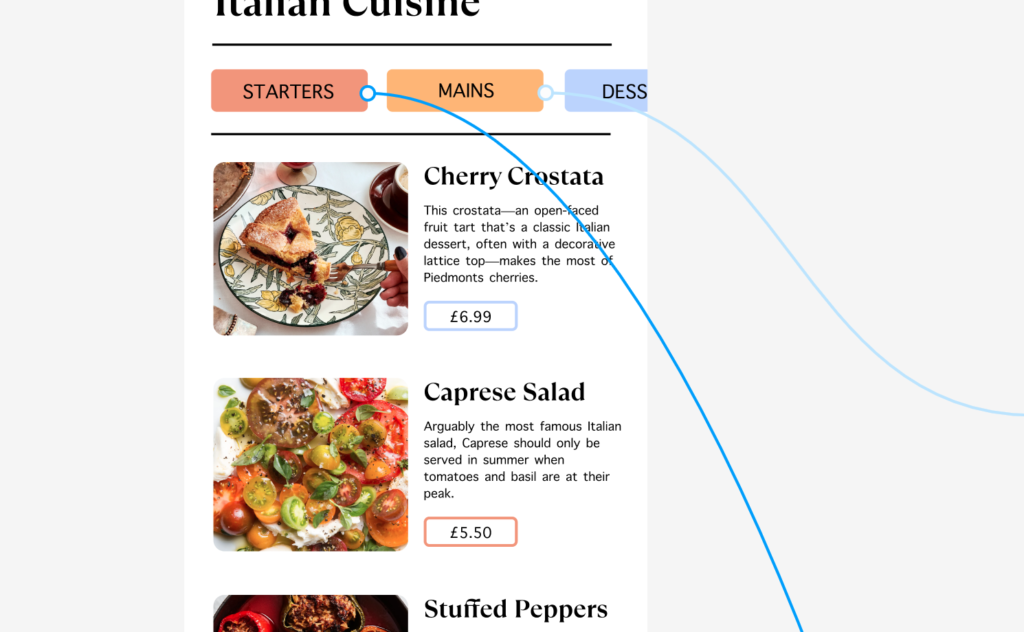
I had refined this process quite well, because I had looked at a few other checkout processes previously in Project 2 – however, there were still a few things I had hoped to change when I came around to designing it, or things that didn’t work as well as I thought. For example, below, I had created a process to input information so that the user could write in their emails etc, however, at the bottom, the ‘continue’ button allowed for them to skip the process, something I did not want them to do. To counteract this, I decided to remove the continue button until the user got to the part that was optional ie, the delivery instructions.
Favourite button
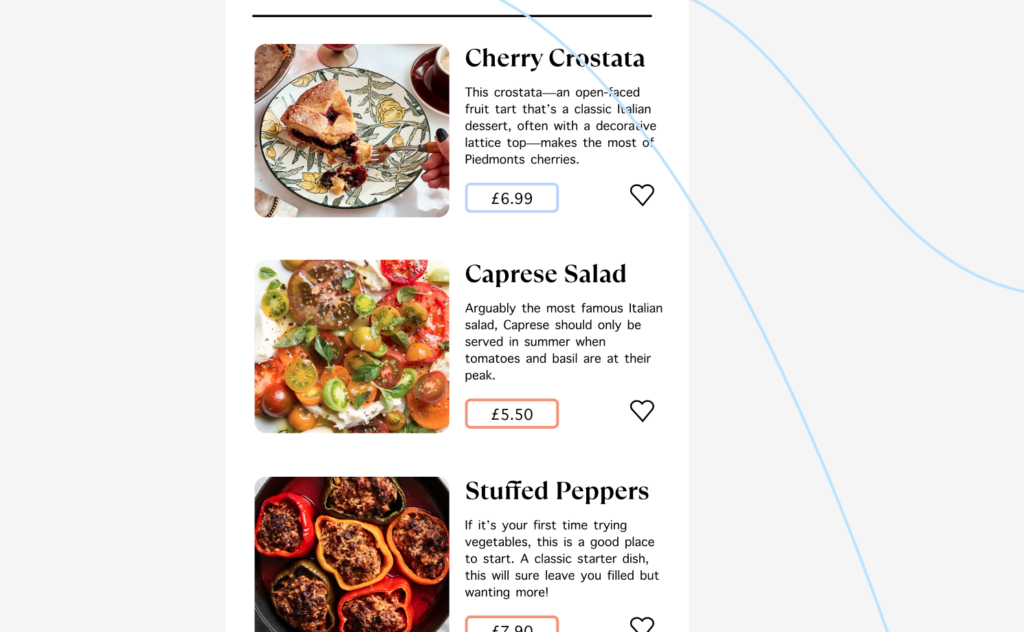
The favourite button is a key part of the process when it comes to ordering your food via this app, and the concept relies on it working efficiently and well. I originally planned on only having favourites in the section within the larger click of the items, however, I wanted some sort of shortcut for the user. If they know they like Caprese salad straight off of the bat, why make them click and waste their time? I did this by adding a favourite button to my component to make them all even.
Illustrations
When researching the different kind of things to put into this section, I had drawn out a few different illustrations of the monopoly man to be used within the design. This was to reinstate the idea that it was ‘monopoly,’ themed. However, after my work in Sync the city and using 3D illustrations, I decided I wanted to use them in order to bring the design system. bit more to life and interactive.
The prototyping section definitely took me the longest out of all of them, as I wanted to make the filter completely interactive so that people could experience the webpage to the fullest extent.
Scroll System
In order to do this, I first wanted to make my scroll systems interactive, however, I stumbled upon a few challenged as I went along.
The scroll bar literally would not work!
I had a few ideas as to why this could be:
Groups and Frames
ou will need to group your elements together before adding the frame. Use auto-layout to space your elements evenly. To make the frame scrollable, you need to put the group inside a frame.
Select the Filter group, Option+Command+G to add a frame selection, rename your layer
Drag the right side of the frame until it hits the side of the screen
Do the same thing for the gallery frame but drag the bottom side of the frame until it hits the bottom of the screen This will limit the view of the content to only be visible within this section
Layers
Figma will only scroll top level objects, so if your object is obscured by other layers, then it will not scroll at all.
Content Clip
To make something scrollable, make sure to check the clip content option. Clip Content will adjust the content to fit within the frame so it doesn’t exceed the width of the screen. When scrolling within the selected area, the view is displayed within the frame, which is something that I had to check before moving forward. It is also important for the frame to be around the items you want displayed.
After I had looked into all of the different reasons, I finally created the scroll system that would work on all of my filter bars, in which I could copy and paste onto different slides. I originally had it slightly curved, however after some design recommendations, I did lower the curve on the sides so that the rectangles were slightly more present – as it was commented on that round shapes felt ‘safer,’ and not as thrilling.
Components Part Two
I needed a fair few different components for this project, and I am glad that I looked into a lot of different methods of doing so, as it really helped me to develop the way I use and create smart components for projects.
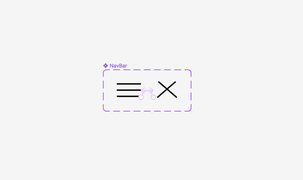
The first thing I needed to do was to create a nav bar for the home page, so that the user can easily get back to the home page if they need to, or to edit their favourites cart and pay. I did this by using a very simple hamburger navigation bar, as I felt the simplicity of it matched the design I was going for, and used a smart animation to create a cross for the user to then close the navigation bar when done.
I then built this into a component so that it could be used within my design multiple times at the same size and dimensions.
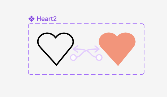
I then had to look into a heart tool so that the user could favourite their meals and in turn, gain some sort of signifier that they had completed that action. I felt as though a signifier was important, because it means that the user knows for sure that they have put something in their cart, saving time and energy.
I used the colours from my design and made the original heart to match the style of my design system. The shape was common in most web design, as I felt a more rounded out approach maps the component in a way that is similar to peoples expectations.
In theory, this should have worked, and for the slightly larger hearts, it did completely work really well, however, upon testing my prototype, the hearts within the components did not want to work for the life of me, and whilst I attempted to move them outside of the component, recreate the heart entirely, and even add it as a separate frame, nothing wanted to work. It turns out that the reason for this was that it was being tested in preview mode, so only the main animation moved – so start prototype viewing gin present mode !!
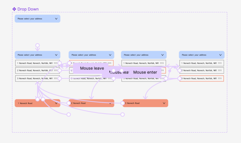
I also wanted to create some sort of location selection tool for the user so that they can input their address at the start of the process. For this, I created a drop down menu with different addresses on so that the user could find their house number or name from a previously input address.
Similar to the one I had previously made, I wanted the user to be able to put their preferences into the website as to avoid any incorrect items on their menus. I made this very simple so that the signifier from the click is obvious enough, but doesn’t change the state of the component too much.
Adding Noodles
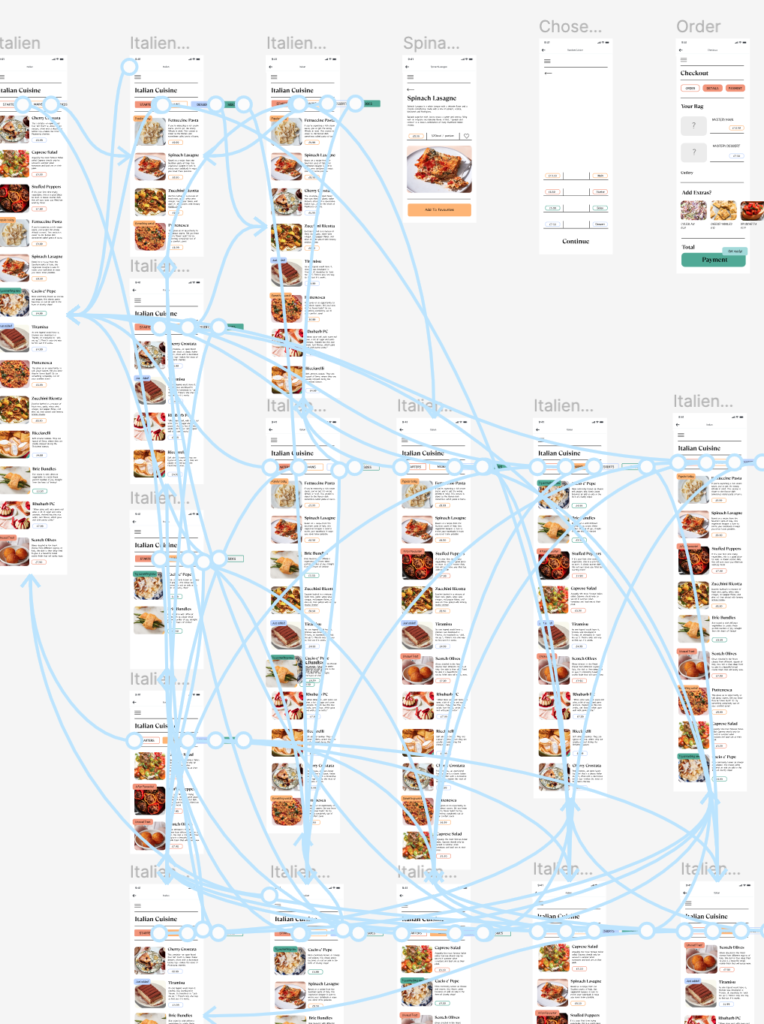
After I had done this, it was time to Strat adding the prototyping noodles in order to connect different frames within my design. I began by using a written down system to see how many different filter selections I needed to create, and highlighted each one appropriately, before going one by one and connecting them all, making sure to include the back arrows at the top of the page. Below is the (somewhat chaotic) final image of that section that I had completed.
Whilst designing this, I didn’t feel as though I liked the work I was producing, almost like it was lacking something, but not in the idea itself, just in the way I was designing it. And so, I went back to my wireframes, had a little play around nay looking at what people had said about ‘thrill,’ and ‘food,’ and rejigged the way I had laid out my frames, to make the experience a little bit more thrilling. The concept / idea that I had (with the help of Rob) was to fully make the process of receiving your meal, from start to finish, as mysterious as possible. The user in the original concept could choose what they liked and didn’t like, and whilst that remained a key idea, the whole process was flipped to be that of a mystery basket, as the user could favourite meals or whole cuisines into their liked, and from there, the website shuffles and finds meals for them to be delivered, with the user not having a clue what they have actually ordered. When I asked people what they found thrilling, their general response was ‘something new,’ ‘something spontaneous,’ and ‘something they weren’t expecting.’ I feel as though this concept, if done correctly, could represent all of these things, and to start this, I built a few base components. However, I felt as though it didn’t quite match the concept of thrill seekers, so I looked into a different option, which was ‘Gamers.’ I researched different elements of ‘games,’ and landed on the concept of board games, which I eventually chose to focus on monopoly, because it has a strong design system and I felt as though the jargon of ‘rolling the dice,’ and ‘taking a chance,’ would work really well. Below is the process of going from the original idea, to the latest version to carry on with in the ‘Prototyping’ post.
Components Part One
These elements below were a part of an idea that I didn’t continue on with, from here on out, I focused on the components under the post ‘Prototyping’ found here : https://www.nua-ux.design/hanley-whelpton/blog/uncategorized/design-an-experience-prototyping/
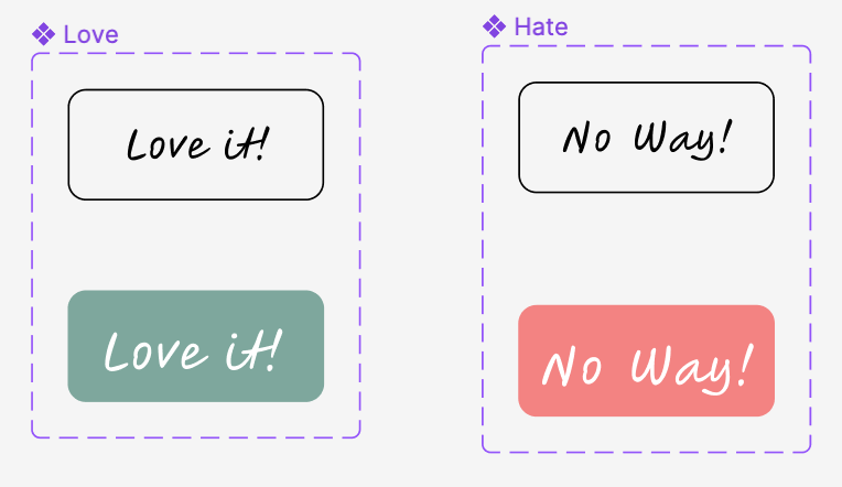
I settled on a tinder swipe system in order to create a section where the user could choose their preferences. In order to begin creating this, I had to first make a stack of cards that could be used throughout the webpage. I settled on a rectangular shape with curved edges to match the theme, messed around with type for a little bit, and chose two different colours to add a bit of depth to the stack. I used a handwritten type as shown in the Design System (link) to test some buttons for the user to click, but felt as if it gave away the interactive motion of swiping, which prospective users mentioned they liked the idea of due to the nature of literally throwing something away.
Above are these versions of components, before I decided to change the layout slightly, by placing the emphasis purely on swiping, and having the buttons only pass through the screen when the user interacts as shown below.
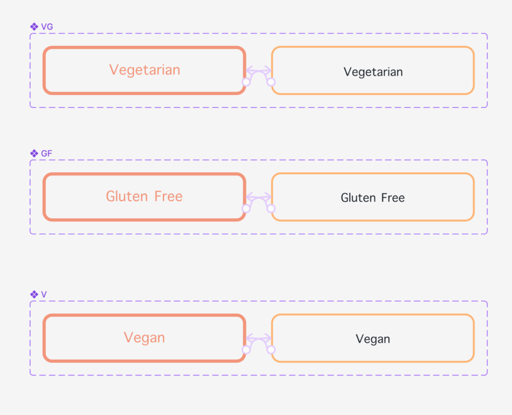
I also followed this up by developing some more components that I thought to be useful, as well as ones on the wireframes that followed the Heuristics, such as the clicked state of the navigation bar, giving the user a signifier of their actions. I also created clicked state buttons for the vg, gf, and v options on the page, so that the user could select any and all at the same time, even removing ones previously chosen.
Sliding Interaction
To create the sliding interaction, I first placed all of my componants on the page, and used instances to change their names, add photos to them and create the variations needed to show different ingredients to the user. I then stacked all of these, minimising each one as they went down, to provide an extra elements of growth as the user swipes through. It was important to then make the ‘love it,’ and ‘hate it,’ buttons invisible until the interaction occurs. I originally created the buttons to be ‘love it,’ on the right, and ‘hate it,’ on the left, similar to that of the way that you would swipe on any other device, following the consistency and standards ideology from Neilson’s 10 heuristics. However, when swiping, the user would have less time to be shown this, and so, I swapped the way that the buttons were, and tested it to see if it worked.
I eventually changed the style of this, and the way that the slides looked, however, the process was the same. I looked into swiping left and right after just giving the user instructions, as well as buttons, to see which worked best for the user. I asked 3 people to look at the products prototype, and see which they preferred. I found that. a lot of people went to naturally swipe when they saw the way that the page was designed and laid out.
Wireframe’s Put Against Principles
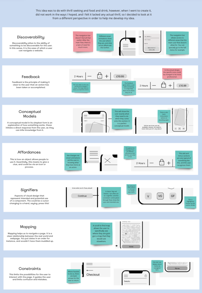
The wireframes that I had created for this product were really strong, and I kept the design style of them as they seemed to be quite strong mid fidelity wireframes. I put them against the 7 design principles to check they had the aspects needed, and I continued to do this throughout the process to check my components.
The miro board link for this process : https://miro.com/app/board/uXjVNU5os7A=/?moveToWidget=3458764568471496712&cot=14
Updated Research
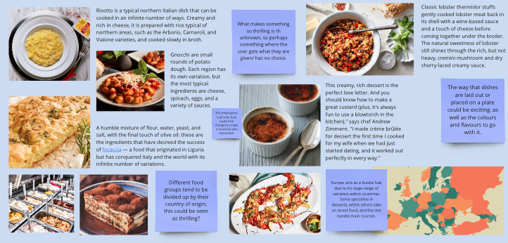
I continued to look at food and drinks, as well as what would be considered different ‘gaming,’ techniques etc. This was my research for these sections below!
Below is some research for the ‘monopoly,’ central section, where I looked at different design systems, drew up some quick sketchy illustrations to tests style, and looked into concept of character and their history a little bit.