
After completing the project, I took to user testing to validate all of the research I had done, and so used the three original users in order to see if what they had told me in the user interviews matched up with the product and service I had created.
The Miro board detailing all of the interviews, and my notes on them in more finer detail can be found here: https://miro.com/app/board/uXjVNU5os7A=/?moveToWidget=3458764570464890851&cot=14
Changes I made based on the users experience
One of the main changes that I made was where the back button was placed on each page. Rob had identified it as being too small, and when Sky was doing her user tests, it was made very clear that she struggled to see it when searching, as it took her 7 seconds, significantly longe then average. Rob noted to the back button being assumed to always be ‘to the top left,’ and whilst I couldn’t do this due to the titles, I made sure it was focussed on at the top.
On top of that, all 3 users noted that people go to click the text, as opposed tot he pictures, and so moving forward that would be important. To combat this I made the prototype able to click the copy to move forward.
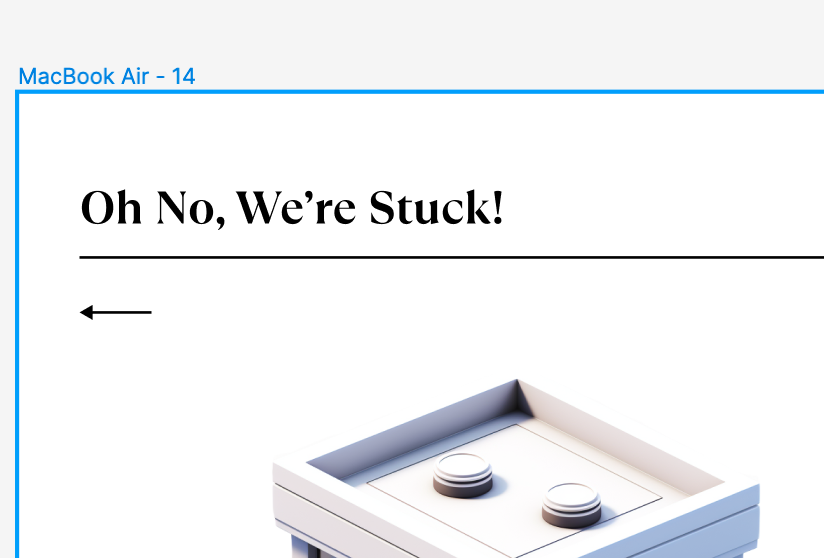
As seen below, the copy stated ‘oh no were stuck,’ when the user needed to input an address. The copy was a main part of the project, and was very important tot he user as Max mentioned it being well linked tot he game and very mysterious/fun. I changed this to state ‘where are we delivering too’ in order to add that aspect of ‘delivering,’ to give the user more of a clue as tot he process.
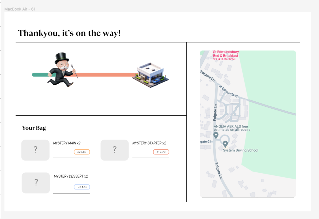
Rob pointed out to me that he would prefer some sort of method of tracking the delivery, just to add and confirm hat it is on its way. This would also give a lot towards the element of trust In a webpage, that I had asked the users about prior. Below is the updated page I added, inclusive of a tracker, the items ordered, and a visual representation of where the delivery was at in the process. This links back to the 7 principles for the user.
Finer details like the fact that Rob was unsure on clicking a button due to it’s colour was solved by removing the massive fill that it had, outlining clearly the colour system in the brands.