
Design an Experience : An Overall Summery

Minor Details

Throughout the project, using both user research and user interviews, and then followed up by user testing, I had minor details placed throughout the product that validated its use as a checkout service as well as an experience.
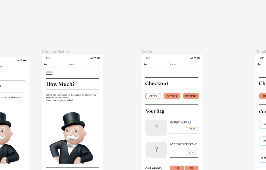
The use of a sand-which filter throughout was imperative in guiding the user and giving that authentic feeling. However, it was also really important to gain an understanding of when perhaps to drop its use – such as when the user is checking out , to push them into that final part of the process, and minimise them going back on themselves. This can also be followed up by the user of highlighted features throughout the product. The highlighted boxes presented action fro the user to take, which helped then to move them forward in the checkout process, as they followed a key of ‘order,’ ‘details,’ and ‘payment.’
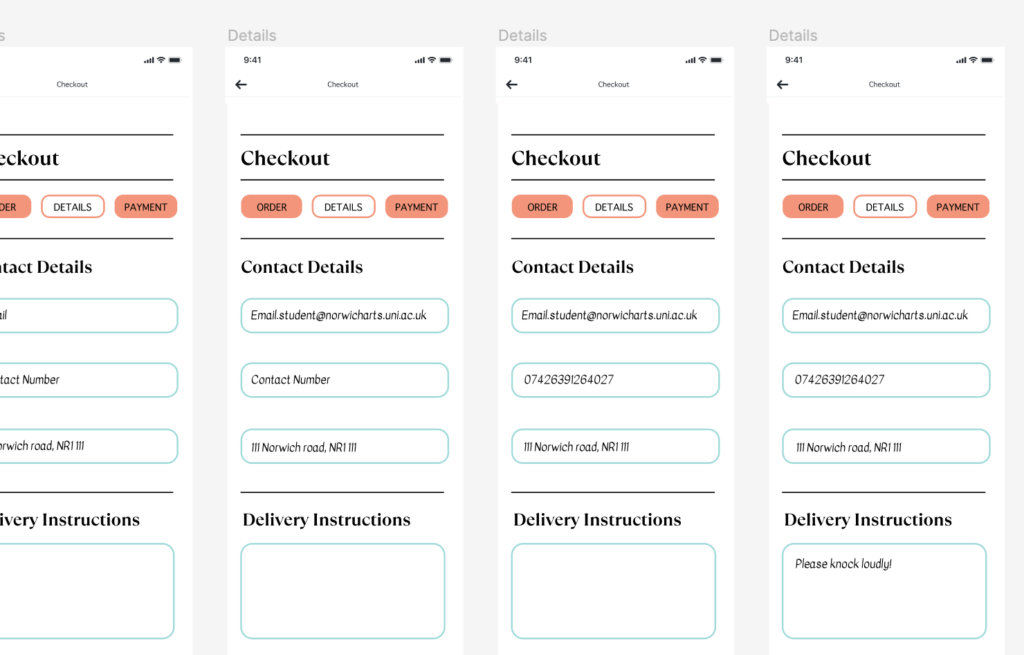
The softer edges used felt similar tot hat of the slightly curved edges of the monopoly design systems and the colours were a mix of both what people saw as ‘thrilling,’ as well as the monopoly colour theme. The images used were taken directly from the monopoly go game, as monopoly as a company moved towards 3D illustrations when creating online gameplays.

Whilst these were not all of the small details I added, these were some of the important ones in making the user feel comfortable in the checkout process!
Design an Experience : User Interviews

To gain a better understanding of my users, I wanted to interview three different people. The first was Sky Anna, who regularly goes to a Gaming Cafe to play both board games and video games with her friends, she was an expert in the field of gaming. I then asked Rob, who didn’t know a great deal about gaming but did enjoy a thrill. The final one user was Max, who had a really good grasp of both. Of course all of them loved food and had that in common!

Max

Max was a really insightful interview because he had a really good understanding of all of the different concepts. And there were a couple of key things that Max highlighted for me in the interview.

  • Being young is all about adventure, which we established was thrilling. Thrills are then linked to the outdoors as is childhood. It is all about learning something new, doing something new, and that is what brings thrill around. These were concepts Max brought around that really got me thinking about the way users interact with a youthful product.
  • The action type of shooting is physical, the sound could be thrilling, the idea that it isn’t something you do everyday (or no one really does), a new experience is what brings that thrill around for the users of games.
  • There ​is ​a ​frustrating ​aspect ​to ​monopoly, ​so ​adding ​the ​maybe ​unknown ​and ​the ​idea ​that ​you ​might ​win ​or ​lose ​is ​a ​really ​fun ​concept ​to ​play ​with for the idea of the product.
  • The ​idea ​that ​maybe ​its ​a ​a ​win ​or ​lose, ​positive ​or ​negative ​experience ​that ​could ​occur ​is ​also ​really ​thrilling ​to ​people. ​
  • The ​concept ​of ​there ​being ​a ​different ​result ​everytime ​you ​interact ​witht ​he ​product ​could ​be ​looked ​into. ​This ​would ​be ​fun, ​a ​swipe ​system ​that could go a certain way or could go another way.
  • The ​idea ​of ​knowing ​where ​you ​are ​going ​and ​having ​that ​familiarity ​with ​it ​is ​really ​useful. ​The ​game ​could ​be ​exciting ​but ​the ​actual ​checkout ​needs ​to ​be ​recognisable ​to the ​user. ​

Rob

Rob didn’t have a great depth of knowledge regarding games, so this was a really important interview about what else brings people thrill.

  • When asked about thrill, Rob mentioned silly games that were almost a fear of being hurt: How does this present anything towards the project? Throwing rocks at each other is imaginable to be sharp and painful – it is that unknown and the feeling that brings thrill. This is important to understand.
  • Monopoly has no relevance to Rob, but what does show relevance is the desire for competition within the game and how it challenges people, and that tends to be what people remember about the game.
  • Th ease of movement between the purchasing and the start is really important and needs to be relatively quick.

Sky

Sky enjoys video games, but doesn’t necessarily care for the idea and concept of thrill. She plays every other day, and enjoys video games as well and board games, having attended gaming conventions as well as gaming cafes.

  • Th genre of a horror game is often seen as thrilling because it almost encompasses the human fear of the unexpected. You never know what is coming your way, and Sky brought this up a couple of times.
  • Sky associates thrilling colours with red, yellow, and orange. These are colours most associated with flames and fire, or more importantly – heat.
  • The idea of banking and trading is fun, and it adds to the thrill aspect, but the main advantage of this is the interactivity aspect, and the possibilities a game could lead to.
  • Sky likes the idea of there being a challenge, soething to achieve from the service you are being offered  makes it a game to remember. There is something people like about doing new things – trying new things, or even the same concept in a new light. It is what people enjoy about board games.

Design an Experience : User Testing

After completing the project, I took to user testing to validate all of the research I had done, and so used the three original users in order to see if what they had told me in the user interviews matched up with the product and service I had created.

The Miro board detailing all of the interviews, and my notes on them in more finer detail can be found here: https://miro.com/app/board/uXjVNU5os7A=/?moveToWidget=3458764570464890851&cot=14

Changes I made based on the users experience

One of the main changes that I made was where the back button was placed on each page. Rob had identified it as being too small, and when Sky was doing her user tests, it was made very clear that she struggled to see it when searching, as it took her 7 seconds, significantly longe then average. Rob noted to the back button being assumed to always be ‘to the top left,’ and whilst I couldn’t do this due to the titles, I made sure it was focussed on at the top.

On top of that, all 3 users noted that people go to click the text, as opposed tot he pictures, and so moving forward that would be important. To combat this I made the prototype able to click the copy to move forward.

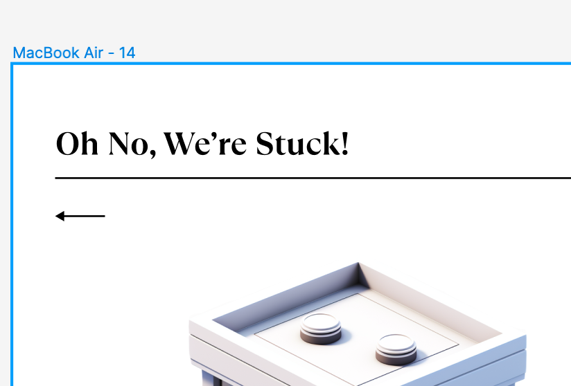
As seen below, the copy stated ‘oh no were stuck,’ when the user needed to input an address. The copy was a main part of the project, and was very important tot he user as Max mentioned it being well linked tot he game and very mysterious/fun. I changed this to state ‘where are we delivering too’ in order to add that aspect of ‘delivering,’ to give the user more of a clue as tot he process.

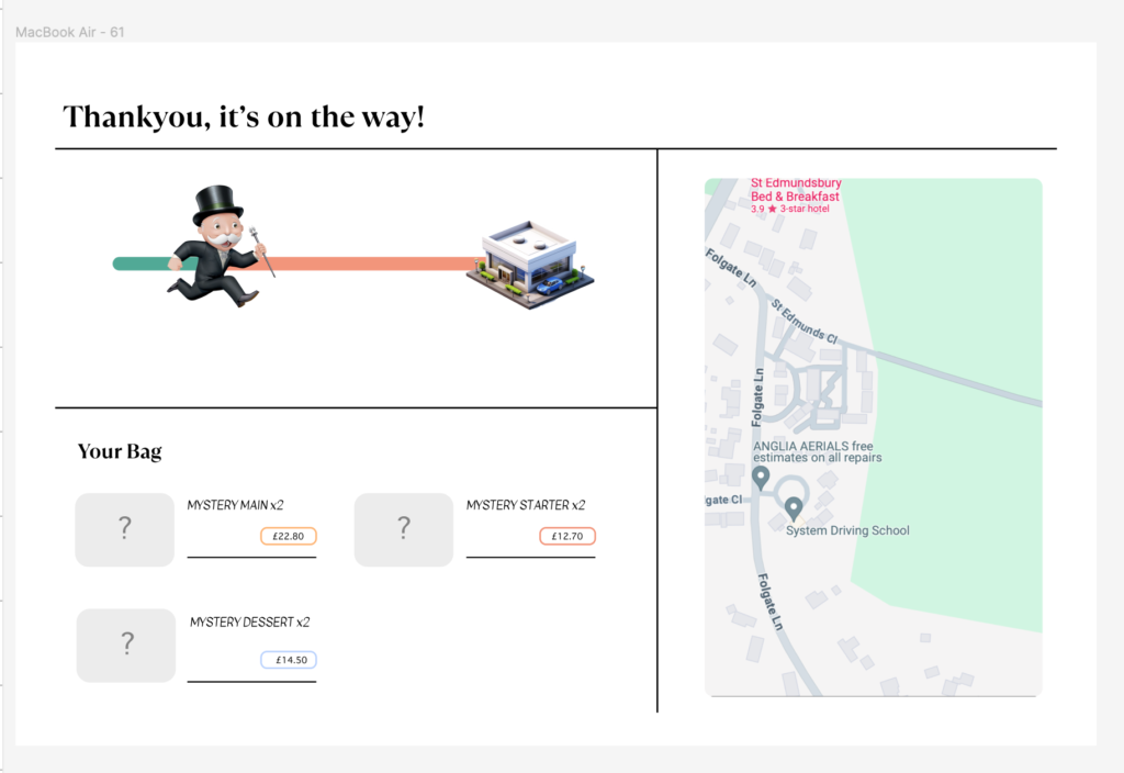
Rob pointed out to me that he would prefer some sort of method of tracking the delivery, just to add and confirm hat it is on its way. This would also give a lot towards the element of trust In a webpage, that I had asked the users about prior. Below is the updated page I added, inclusive of a tracker, the items ordered, and a visual representation of where the delivery was at in the process. This links back to the 7 principles for the user.

Finer details like the fact that Rob was unsure on clicking a button due to it’s colour was solved by removing the massive fill that it had, outlining clearly the colour system in the brands.