
Within my redesign of the website, I knew I needed to include different areas of the festival experience that felt left out amongst others. There was a clear idea of the colour schemes being based around the sun, sand, and sea, and yet, people were confused about the festival being both a surf competition, and having musical artists perform.
Micro animations, I felt, was a good way of expressing these ideas, by using small movements to represent different things. In my initial ideas, I looked at the sun, and the idea of it being a loading bar, or waves and how they could move across the page when a section is highlighted. Even though I knew I may not use this is the final wireframe, it was fun to look at different ways of being able to use smart animations!
These can be found here : https://miro.com/app/board/uXjVNbWB2lE=/?moveToWidget=3458764566885013893&cot=14
Testing
From here, I tested different ideas in Figma, some of which worked out well, and others didn’t work at all! It was through these tests though, that I developed my skills in Micro-animating in Figma.
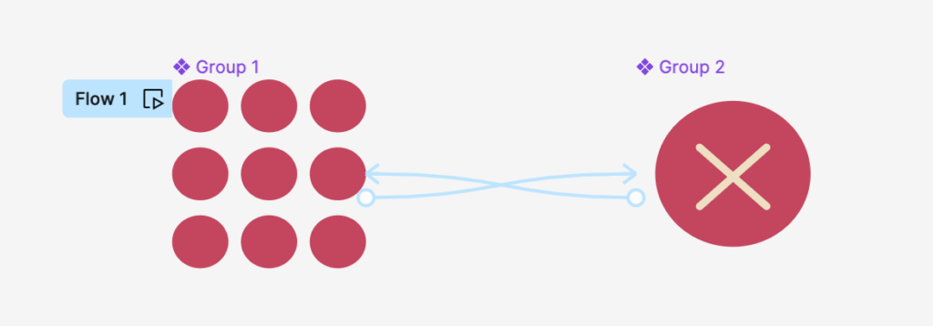
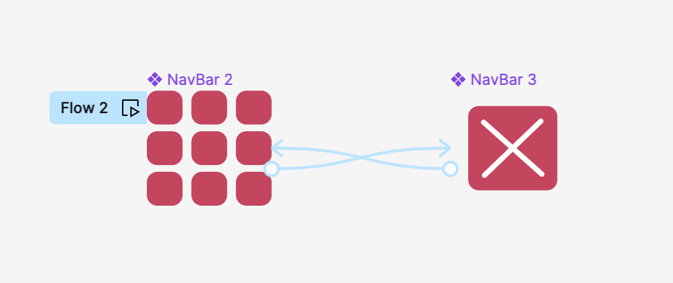
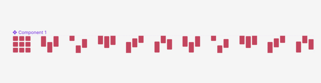
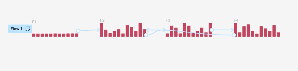
Above are some of the animations I tested, from loading bars, to hover states on navigation bars. It was, however, in looking at the moving sound bars that I had the idea that I hoped to carry through onto the website.
Loading bar
The user struggled to connect the idea of both music and surfing, the two main reasons any festival goer would attend Boardmasters. To help achieve this connection, I wanted to use different things people thought about music, and about surfing, that joint the two. During initial idea generation, a few notable ideas were of movement, energy, and waves.
I thus, decided to look into beat waves as a loading bar form, and possibly to be used throughout the rest of the webpage – as the movement of a beat mimics the wave movement, creating the connection.

I thought about the way that the beats could move both up and down, as well as what beat to use. Boardmasters doesn’t have a soundtrack or a specific song connected with it, so at first, I struggled to find a beat to use.
Boardmasters does, on the other hand, have a promotional video, that users commented on not neccessarily caring for when large and a key focus on the websites landing page, and probably only clicking on it when shared with them, or promoted to do so. This felt like a waste of space, and so I had the idea to use it as a pop up. By using the sound of the promotional video, there was the opportunity to provide a link for it, all whilst promoting ideas of the surf competition and the artists performing.
The promotional video had 3 different layers of sound as well. The music, the waves, and the sound of people enjoying both. These 3 things felt really important, and could join together to create a beautiful and meaningful Micro-animation.
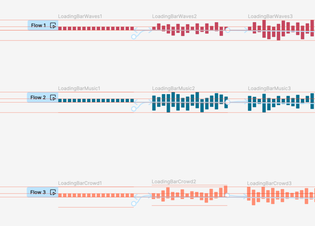
By the end of the process, I had created 3 different component sets in order to provide the user with a loading bar that offers not only a signifier of their waiting time, but also a message of music and ‘vibes.’
Along the way, I did stumble at a few different things. The notable ones were small mistakes that could easily be fixed, but did take me a while to comprehend, as such small changes were not always on my mind as the biggest problems. Below is one of them, as I tried to use two different names to flow a component, meaning that Smart Animate didn’t understand that it needed to animate between the two points.

This process really helped me develop my skills in Figma, and defiantly made me more confident to move further within my designs!
Navigation Bar
I then attempted to use the same theme to create a fun navigation bar – however, upon finishing my first design, including a hover state and a clicked state, it did not look very professional or well put together on the webpage itself.
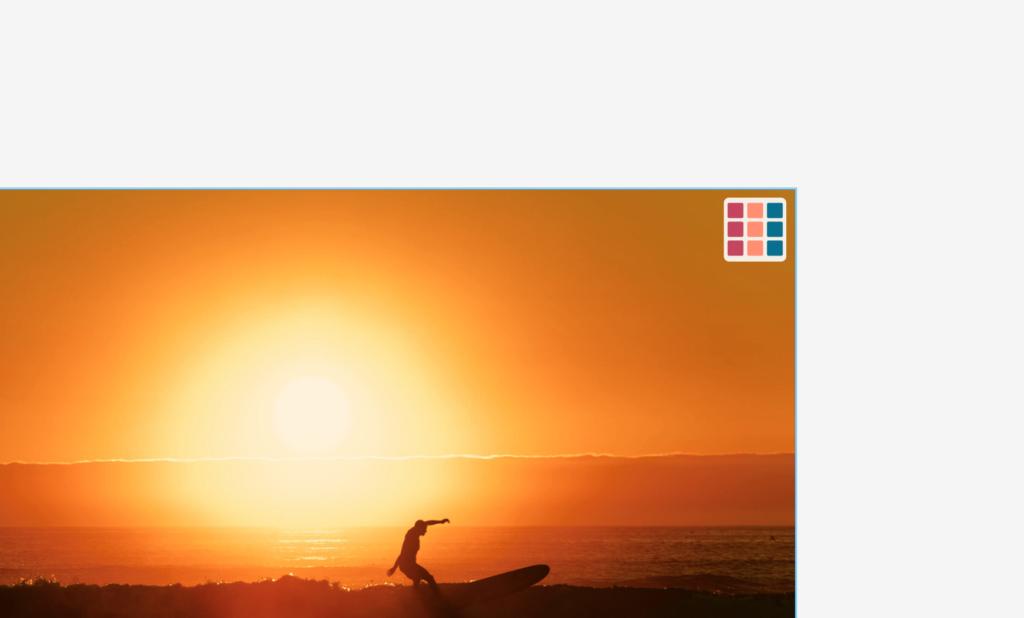
It took me a while of generating more initial ideas to come up with the idea to use the Boardmasters logo font as inspiration for the shapes in the Navigation Waffle/Hamburger. I wanted to make it look sophisticated and clean, whilst maintaining some sort of hover state micro-animation and movement to emphasise the users journey.
Sponsors
The sponsors section was one part of the webpage that was really poor when it came to layout, styling and just overall excess of negative space. I decided I wanted to use a carousel system for the showcase of the brands, and to do this, created a separate component so that I could reuse the system throughout the webpage.
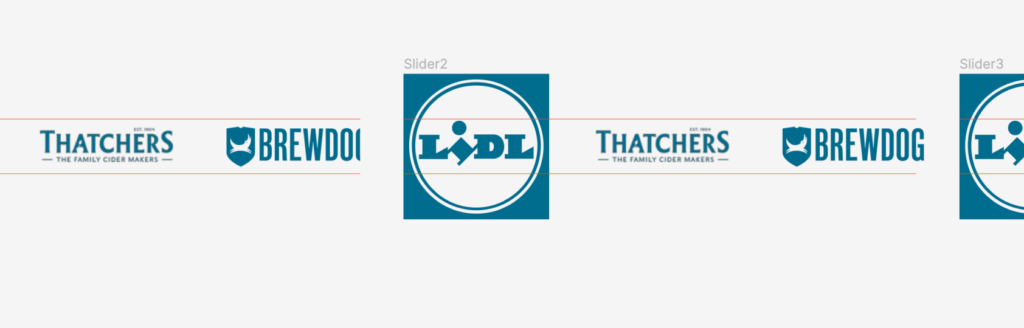
This was not all used in the final version of my prototype, and when I had used all of them, I accidentally deleted them without realising I could have handed them in on a ‘sandbox,’ page – rookie error there.