Evaluate and Iterate : Sprucing Up Boardies

There are clearly, from all of the research I had done, some key issues with Board-masters that means that it fails to navigate a user from A to B – dropping sales and losing consumers through its poor design. And, as shown by the Synthesis (found here: https://miro.com/app/board/uXjVNbWB2lE=/?moveToWidget=3458764566662132129&cot=14?) there was a lot that could be done to change what the larger and more frequent issues were.

One of the main problems that Board-masters faced was the inability to get a user to purchase or prebook tickets. They couldn’t get back from the website they were transferred onto, they didn’t like the change from text input to buttons, they didn’t like the theme and how it didn’t flow, or how bland it was compared to Board-masters itself. A user who knew little about Board-masters would therefore not understand what it is. So this is what I chose to focus my changes on.

Low Fidelity Wireframes

I first had to wireframe the elements in order to make sure that the user would be able to follow them through, as well as to include everything the user made commentary on. Below is an image of the updated wireframe against what it previously was.
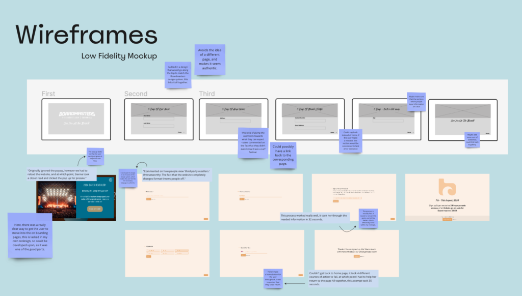
I firstly, wa need the popup to fade, this meant the user couldn’t actively get it off their screen without paying attention to what it actually said, something ignored by most users. Next, I developed the design to be inclusive of the design system, which makes the user feel like the secondary webpage is authentic.It was commented on how people view ‘third party resellers.’ as untrustworthy. The fact that the website completely changes format throws people off, so this was a clear change I would need to make. Even including the design system images would work. I also thought about jargon. I wanted to give the idea of hints towards what the user can expect – users commented on the fact that they didn’t even know it was a surf festival, so making sure it was focussed on as well as other aspects was valuable.

There were some parts that I believed I could have developed upon, such as maybe adding some sort of slideshow which could link back to gallery at the end, which would focus then on another issue Board-masters had that could be solved. This led me to my final prototype.

Adding Detail

Some comments I made regarding this redesign include:

  • The typefaces that I chose for this project reflect that of the actual boardmasters design system, and in following this, look to be a part of the webpage itself.
  • I used phrases that showcased the event, talking about the surfing, beach, music, and other aspects in short snappy headers that draw the user in.
  • One of the issues I needed to solve was the users lack of knowledge regarding some aspects of the festival, so I believed were they not to know about aspects like this, this leads them on that journey.
  • Link back to the homepage gallery allows the user to look further into the images -sets up that want to go. 
  • The text boxes are created in such a way that when clicked, it is clear what the user is doing – that affordance helps the point made regarding boxes and being unsure of what to do.
  • The shape I chose to use follows the Boardmasters logo shapes, tying it all together. This gives it the authentic feel the users wanted.
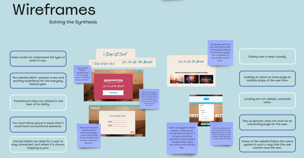
I then placed the finalised version against my synthesis, to make sure that everything I had included presented value tot he user, and if I hadn’t included anything by mistake, that it was changed.

Overall, this project I believed turned out quite well. it helped me learn a lot about different component elements as well as problems and how they can be solved. Some things didn’t go quite to plan, but like the Board-masters website, they could easily be fixed with a little bit of user testing and research.
Evaluate and Iterate : Heuristics and Design Principles

Beginning the project, I wanted to focus on a webpage that was not too large as to be too much work, but to have a fun design system already in place, with an event that I was interested in. For this, I chose Boardmasters, a festival in Cornwall based around surfing and music. Whilst the webpage was developed by a design team from Project Simply, it felt like it lacked basic design principle thought, and there was an inability for simple principles such as the ability for Error Tolerance and Ease of Navigation.

Heuristic Markup

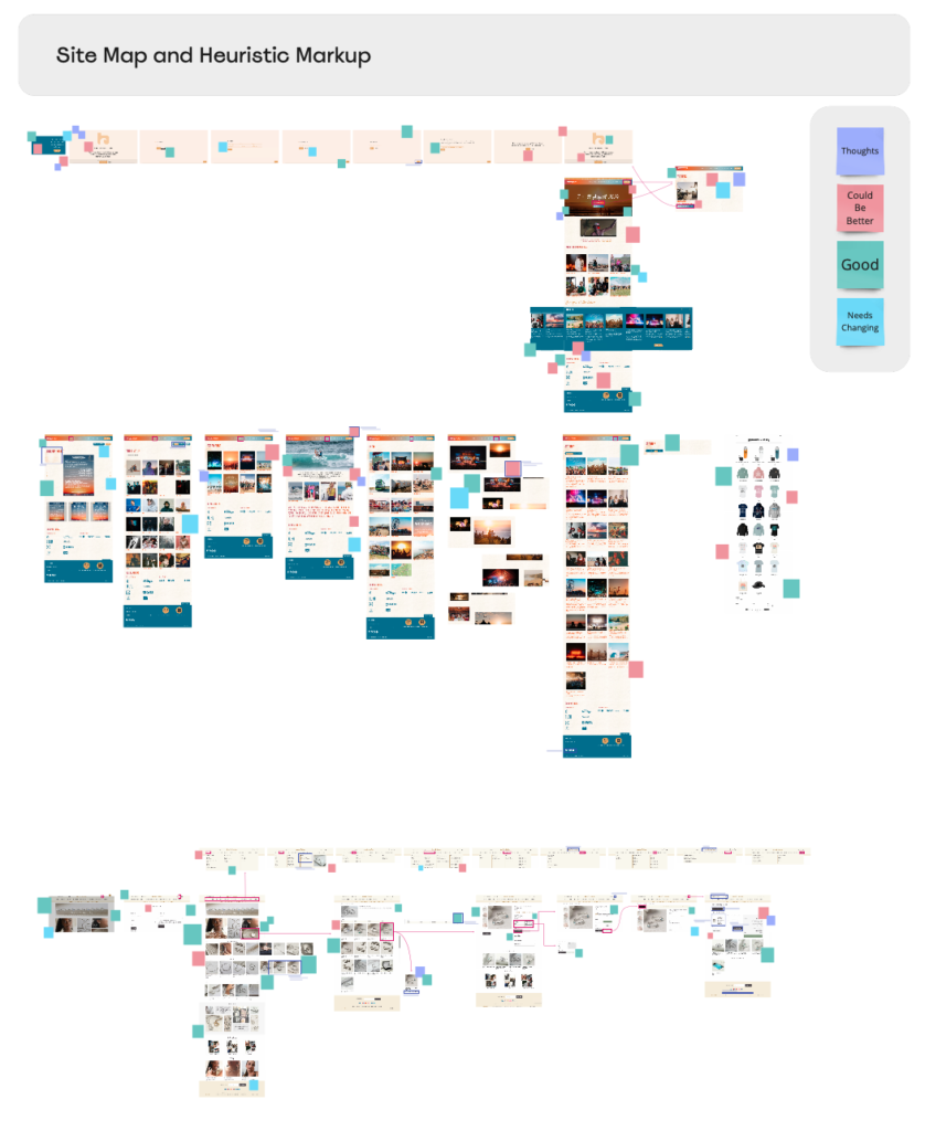
Based on a sitemap and Jakob Neilson’s 10 Heuristics, I noted points of development, positives, negatives, and just general thoughts on the images of flows. These all could then be linked back to the 10 principles, which can be found in my further research (link). Markups are simply short ideas and notes, and so I was not too worried about lengths of explanation but just getting the issues pointed out on the web flow.

I also looked at the selling of a physical product, and where that webpage provided different things that the Boardmasters site could not, be this due tot he nature of it being an experience and not a product being bought, or simply lack of thought in the design of the flow. the physical product webpage, Martha Jackson Jewellery, was beautifully laid out, and provided a steady and easy to follow flow, inclusive of affordances, signifiers, and strong mapping.

Miro Board Link : https://miro.com/app/board/uXjVNfSA41M=/?moveToWidget=3458764566228654072&cot=14

The Seven Design Principles

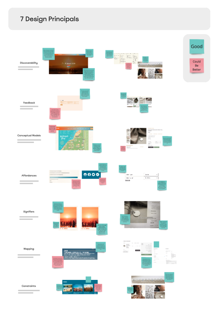
This provided me with the ability to then pull apart both of the websites and look at where they meet and failed to meet the Seven Design Principles as created by Don Norman (link).

The Boardmasters website notably had less of the principles within it’s components, however, this did not mean it lacked all of them, as some of the principles, such as Discoverability and Signifiers, were followed precisely, and made the website easier to navigate.

Miro Board Link : https://miro.com/app/board/uXjVNfSA41M=/?moveToWidget=3458764566229830754&cot=14

Evaluate and Iterate : User Testing

When User testing, there are a list of things that should and shouldn’t be done within the tests. These could include prompting the user towards a certain answer, or showing them how to do something. The usability test should make sure that there is an honest reaction toward what is happening.

Within these tests, there are two different forms of information gathered:

Quantitive

Quantitative data is data that can be counted or measured in numerical values. Within the sense of this however, it means data that is factually correct. This is NOT an opinion or a guess.

Qualitative

By definition, Qualitative data is non-numeric information, such as in-depth interview transcripts, diaries, anthropological field notes, answers to open-ended survey questions, audio-visual recordings and images. Within this, it is an opinion or something stated by the user in passing.

User Profiles

In order to do this, I gathered a group of 5 users, people that I believe would have the intent to use the website, simply viewing it or purchasing tickets for the event.

I split these up into two different groups, 3 of those are users who have never been to a festival before, but would be interested in going, and 2 of whom have been to festivals and so understand the event to a greater depth, as well as having an understanding of how tickets are purchased. All of the group have used the internet to purchase some form of ticket for an event.

Using a script as stated below, I guided the users through a few different journeys and asked them to comment on what they felt and saw, collecting Qualative data, whilst screen recording in order to present some Quantitive data.

Script

Hello User Name

You probably have a good idea as to what you are about to take part in, but I will run through it anyway in order to clarify any details for you. The first thing I would like to make clear is that we are testing the site and not you, and that this is most likely the one thing you will do today that is never going to be wrong. We welcome any mistakes made, and ask that you voice your opinion on them whilst moving through the website in order to help us understand your thought process better.

Please ask any questions as we go along. Even though I may not be able to answer them, I will try to guide you where I can. As you go through the website, please tell me what you see, what you are doing and how you feel about it as a whole – and please be honest!

This session is being screen recorded as well as voice recorded, but no one will be bale to see you or me, and all that will be used is me asking the questions, you answering, and where the mouse is going on the screen. This is just for accuracy and helps us out greatly.

So, have you ever been to a festival?

If yes > And did you purchase those tickets online?

If yes > How was that experience?

And when you go to purchase any tickets for any event, do you do this via other websites such as Fatsoma or from the seller?

Would you please begin by signing up to the ticket presale for me?

Feel free to put in a random email/phone number.

Please leave this page and go back to the home page.

And scroll down slightly for me please. Would you usually watch the promotional video on a webpage?

Please find the sponsors of the event.

Can you find the photographs for me?

What do you think about this page?

If I asked you what you thought about this festival, what you think its focus is and what you would expect upon arriving there, what would you say?

Results

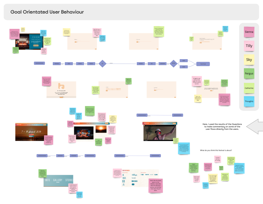
From the recordings I gathered, I gained a strong overall opinion of different aspects of the website. It was using this that I then created flow charts in order to note the different pain points along the journey. Whilst most of what I thought from my heuristic markup came up, some parts didn’t, and some comments I made about what I didn’t like personally, a lot of the users stated as values to the website. this only proved further to me how important user testing is.

After mapping out the pros and cons stated by different users, I was able to begin my further research.

Miro Board Link : https://miro.com/app/board/uXjVNfSA41M=/?moveToWidget=3458764566238010877&cot=14