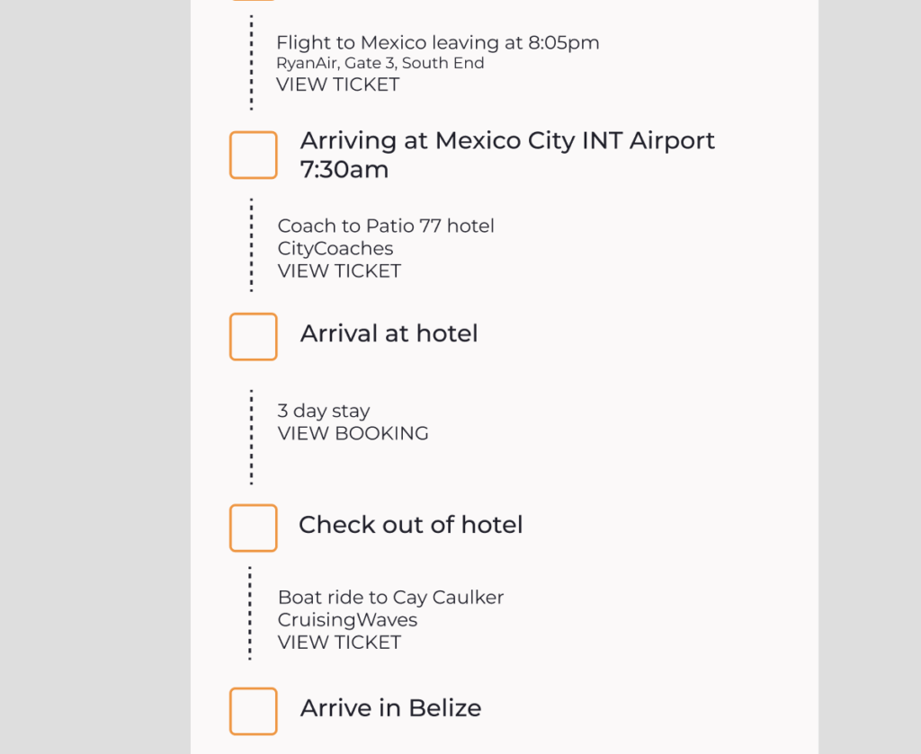
After completing the project, I took to user testing to validate all of the research I had done, and so used the three original users in order to see if what they had told me in the user interviews matched up with the product and service I had created.
The Miro board detailing all of the interviews, and my notes on them in more finer detail can be found here: https://miro.com/app/board/uXjVNU5os7A=/?moveToWidget=3458764570464890851&cot=14
Changes I made based on the users experience
One of the main changes that I made was where the back button was placed on each page. Rob had identified it as being too small, and when Sky was doing her user tests, it was made very clear that she struggled to see it when searching, as it took her 7 seconds, significantly longe then average. Rob noted to the back button being assumed to always be ‘to the top left,’ and whilst I couldn’t do this due to the titles, I made sure it was focussed on at the top.
On top of that, all 3 users noted that people go to click the text, as opposed tot he pictures, and so moving forward that would be important. To combat this I made the prototype able to click the copy to move forward.
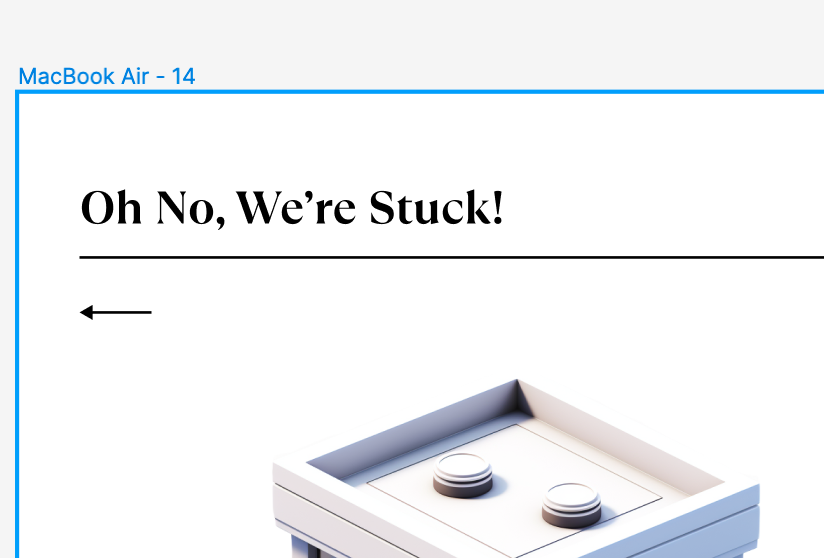
As seen below, the copy stated ‘oh no were stuck,’ when the user needed to input an address. The copy was a main part of the project, and was very important tot he user as Max mentioned it being well linked tot he game and very mysterious/fun. I changed this to state ‘where are we delivering too’ in order to add that aspect of ‘delivering,’ to give the user more of a clue as tot he process.
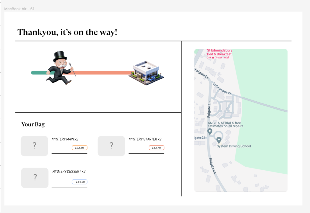
Rob pointed out to me that he would prefer some sort of method of tracking the delivery, just to add and confirm hat it is on its way. This would also give a lot towards the element of trust In a webpage, that I had asked the users about prior. Below is the updated page I added, inclusive of a tracker, the items ordered, and a visual representation of where the delivery was at in the process. This links back to the 7 principles for the user.
Finer details like the fact that Rob was unsure on clicking a button due to it’s colour was solved by removing the massive fill that it had, outlining clearly the colour system in the brands.
In order to build a strong design system, I needed to use the research I had made in order to put together all different aspects of a concept I had gone into great depth of research about. I had to make sure to include everything I had learnt, because something clearly important to a brand was how they advertise themselves. I was told by both lecturers that a brands user or persona that they were trying to hit doesn’t always have to be vast in number. I had developed 3 personas, however just because 3 is a good number doesn’t mean two couldn’t be a primary persona and one slightly less important.
Attempt One
When I had developed my first brand system, it had intended to hit 3 personas all at once – luxury travellers, well rounded professional travellers, and wannabe travellers. It was really difficult at first to try to make room for these 3 overwhelming personality types, even with the affinity map and value proposition already set up. To combat this, I used my research to create a brand system that included everything these 3 potential users would want.
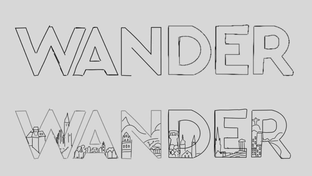
I began by creating sketches of a few things I had wanted to include, and from this, springboarded to my final prototype design. I wanted to go for something fun and adventurous, to allow for a newbie backpacker to feel comfortable – not something sharp and almost daunting. The user interacted best with colourful, bright, and fun branding – not always simple, but willing to work within different examples of the system – something adaptable.
The users wanted a fun and creative onboarding system, and a lot of the projects that I took the users through to show them as competitor research included bright and bold illustrations, especially with icons and different screens. I had already had laid down a really strong design for the logo, which included different elements mentioned above, and so I based this off of the colour scheme and style I had chosen.
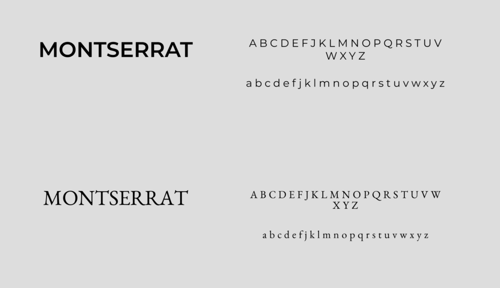
I used the typefaces below:
I knew I wanted to use Montserrat, because on its own it is a very strong font to use, as it has a great depth of weights and can be used very versatile within the product. I also chose to use Benne (the bottom font), so that there was an air of luxury throughout, due tot he research I had done on different types and their relevance.
However, after a conversation with both Dave and Rob, I chose to try and develop on this, as Benne as a font didn’t necessarily fit in with the rest of the designs, especially when I had moved the project onto a real prototype. Because of this, I chose to change it up a bit and see where it would take me.
Attempt Two
I changed the different typefaces to Montserrat, so that there was only one cohesive type being used throughout the system, editing minor details such as the weight of the font and where those were placed throughout the platform. I used brighter photos, editing them to match the colours I finalised on for the brand system!
Testing the System
Naturally, I wanted to test the system before I took the prototype any further. Because I had built in styles it was quite easy for me to change typefaces and fonts, but I didn’t want to have to replace different images and illustrations, so I thought it best to review them before I moved further on with the process. To do this, I brought back my five original user interviewees in order to establish what they liked and disliked, what could be changed and what they felt value in throughout the design. This was mainly because all of them ticked my target market, but also because they had previously been interviewed about the different brand systems before, and so they would have a good grasp at what they liked and disliked regarding this.
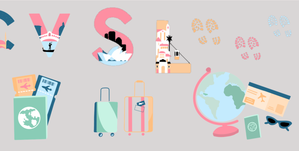
Joey stated that she likes the idea of the buildings within the logo, and thinks that it is fun and different, and not something you see often, but that the footprints don’t really fit the solid colour theme of the illustrations – and maybe to put them on a coloured background.
Catherine mentioned that she likes the illustrations, that she thinks they work really well within the colour scheme and make the product stand out against tother platforms. However, she did think that the colours were too pale against the bright white background, and putting this against my research, I chose to change this to a slightly paler grey.
Holly stated that he really liked the colours I have chosen they remind her of an italien little houses with a nostalgic sense. She also mentioned that she likes the different letter work, how I’ve done different letters that arn’t in the actual word WANDER, the ‘C’ and the ‘L’ for different examples.
A comment that stood out from Ollie was this: ‘Maybe try adding a different like outline to the letters, that could make them stand out more?’ After giving this a go, I found that it looked a little bit off, and placing the structures within a box almost defeated the purpose I was going for.
After sending in my essay for Dave to look at, he sent me back a list of things that I could improve on, which were very helpful (thanks Dave!), and also very silly things that realistically I should have genuinely thought of before I sent it. The first one was my bibliography that was only partly finished, this was purely because I needed to know if I had done it correctly, and whilst Dave only commented on the fact it wasn’t completed, I will assume this meant it was okay for an example of what I had to do.
When I mentioned the silly stuff, this was it. For some reason I had managed to rebrand AirBnB as Air B&B, Air BnB, and at one point even Air Bandb. To absolutely no ones surprise, this has to be changed in order for me to continue, so I pressed command F, found the mistakes and solved them. I also did the same with my apostrophes, something I am deeply ashamed to admit I have yet to get the hang of.
Dave also mentioned some words I used that didn’t make sense such as ‘endorsed,’ In which is now refined. Trivago refining their website does make much more sense than them endorsing it, so I am glad he picked up on that one better than I had. And jurisdiction has been changed to ideology.
Dave also mentioned my review on AirBnB, which I can understand does flatter them. They do have a website dedicated purely to their design so deserve to be flattered however I can also understand the unbiased POV needed for this essay. And so, I went back and changed some of the language I used, as well as analysing what they did a bit more In depth.
Previous Section
The design system, as mentioned prior, gives room for conceptual real-world images to aid marketing purposes, all whilst keeping in regard the customers need to understand where they would be against other attractions and excursions, achieved through Nielsons heuristic ‘match between system and the real world’ (Neilson, 1994).
Updated Section
The design system gives room for conceptual real-world images to aid marketing purposes, pushing user centred design which we can confirm due to the unchanged nature of AirBnB in it’s 16 years of activity. Figure One shows the first iteration of the company site and places a map in the bottom left corner as its own heading – defining the importance straight away. Next to this is the next iteration, enlarging the conceptual image to the forefront of the user’s screen. The fact that this has remained proves its own worth to aiding the user when navigating the page.
After this, I added in some more images to help prove my points better, developed a few statistics to prove that the point was valid, the reason this was not on this section was due to the nature of my statistic. I needed to wait and see if the traffic grew within the trend of luxury fashion, or if it did not, luckily for me, it did as predicted and grew by a few thousand from the month of December to January.
One thing I did however struggle to develop on one Case Study 2. I had made what I believed to be a strong choice of argument, and it all flowed well and was backed up by some good evidence. Dave mentioned avoiding using heuristics, however to change it all would be to rip apart the point I was making. The mention of the heuristics was backed by statistics and quotes, and whilst I understand a markup is usually weak and done to develop, it followed the reasoning I had gone for, and so I chose not to change that specific section, and instead of focus on all the other points Dave had made.