There are clearly, from all of the research I had done, some key issues with Board-masters that means that it fails to navigate a user from A to B – dropping sales and losing consumers through its poor design. And, as shown by the Synthesis (found here: https://miro.com/app/board/uXjVNbWB2lE=/?moveToWidget=3458764566662132129&cot=14?) there was a lot that could be done to change what the larger and more frequent issues were.
One of the main problems that Board-masters faced was the inability to get a user to purchase or prebook tickets. They couldn’t get back from the website they were transferred onto, they didn’t like the change from text input to buttons, they didn’t like the theme and how it didn’t flow, or how bland it was compared to Board-masters itself. A user who knew little about Board-masters would therefore not understand what it is. So this is what I chose to focus my changes on.
Low Fidelity Wireframes
I first had to wireframe the elements in order to make sure that the user would be able to follow them through, as well as to include everything the user made commentary on. Below is an image of the updated wireframe against what it previously was.
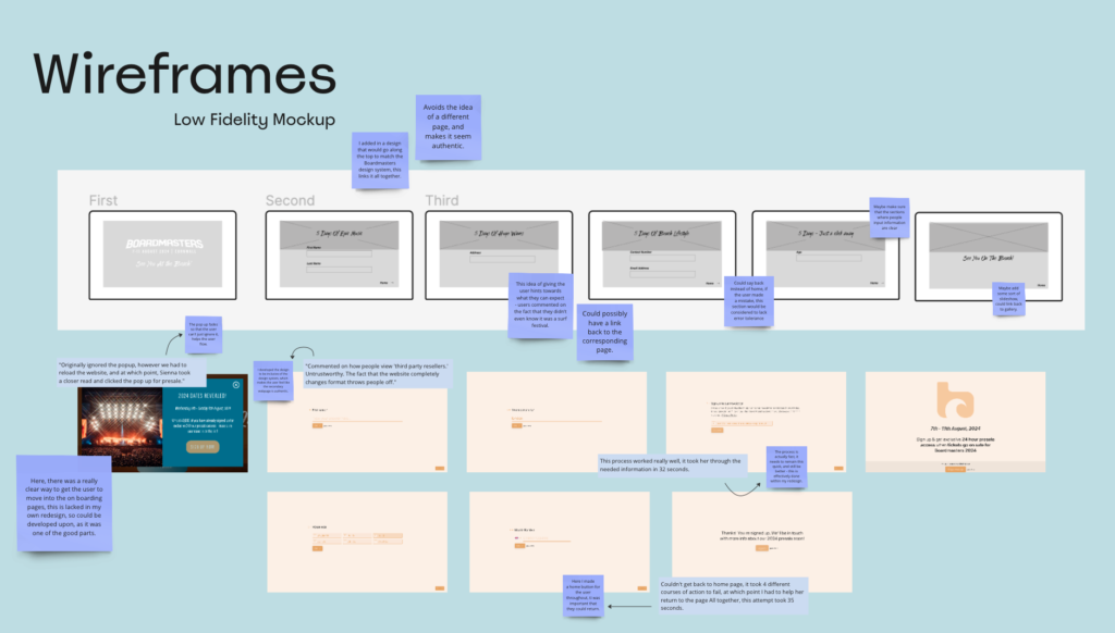
I firstly, wa need the popup to fade, this meant the user couldn’t actively get it off their screen without paying attention to what it actually said, something ignored by most users. Next, I developed the design to be inclusive of the design system, which makes the user feel like the secondary webpage is authentic.It was commented on how people view ‘third party resellers.’ as untrustworthy. The fact that the website completely changes format throws people off, so this was a clear change I would need to make. Even including the design system images would work. I also thought about jargon. I wanted to give the idea of hints towards what the user can expect – users commented on the fact that they didn’t even know it was a surf festival, so making sure it was focussed on as well as other aspects was valuable.
There were some parts that I believed I could have developed upon, such as maybe adding some sort of slideshow which could link back to gallery at the end, which would focus then on another issue Board-masters had that could be solved. This led me to my final prototype.
Adding Detail
Some comments I made regarding this redesign include:
- The typefaces that I chose for this project reflect that of the actual boardmasters design system, and in following this, look to be a part of the webpage itself.
- I used phrases that showcased the event, talking about the surfing, beach, music, and other aspects in short snappy headers that draw the user in.
- One of the issues I needed to solve was the users lack of knowledge regarding some aspects of the festival, so I believed were they not to know about aspects like this, this leads them on that journey.
- Link back to the homepage gallery allows the user to look further into the images -sets up that want to go.
- The text boxes are created in such a way that when clicked, it is clear what the user is doing – that affordance helps the point made regarding boxes and being unsure of what to do.
- The shape I chose to use follows the Boardmasters logo shapes, tying it all together. This gives it the authentic feel the users wanted.
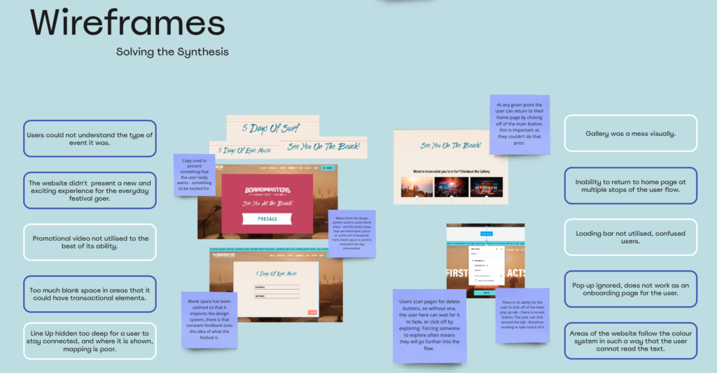
I then placed the finalised version against my synthesis, to make sure that everything I had included presented value tot he user, and if I hadn’t included anything by mistake, that it was changed.
Overall, this project I believed turned out quite well. it helped me learn a lot about different component elements as well as problems and how they can be solved. Some things didn’t go quite to plan, but like the Board-masters website, they could easily be fixed with a little bit of user testing and research.