
Competitor Markup:
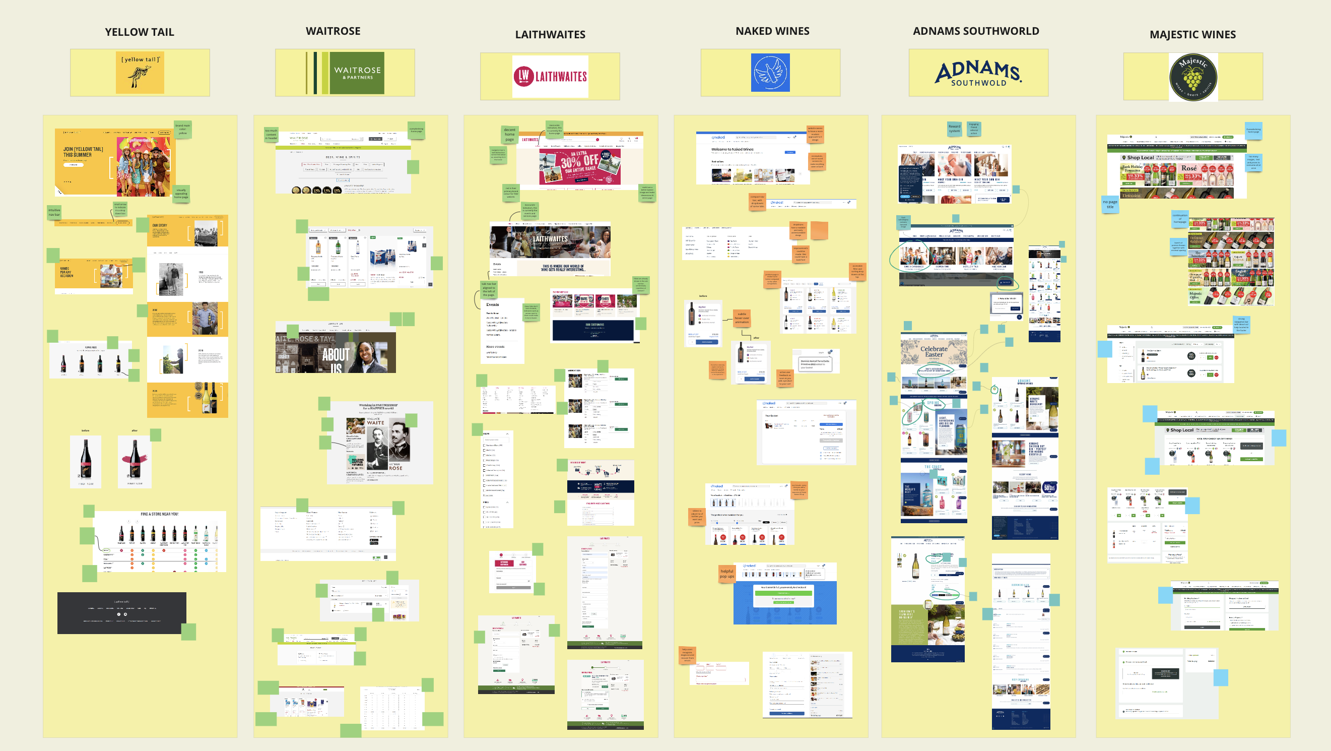
By examining websites and applying the 10 usability heuristics, we gained insights into important design elements and effective practices, forming the groundwork for how should design strategies be applied when it comes to refining certain parts of a website.
We would like to focus 3 key points now:
- Minimalistic, smooth, intuitive design is what we’re aiming for.
- Focusing on attention to detail. e.g. subtle hover over animations, transitions and motion design.
- Making it simple.
Yellow Tail:
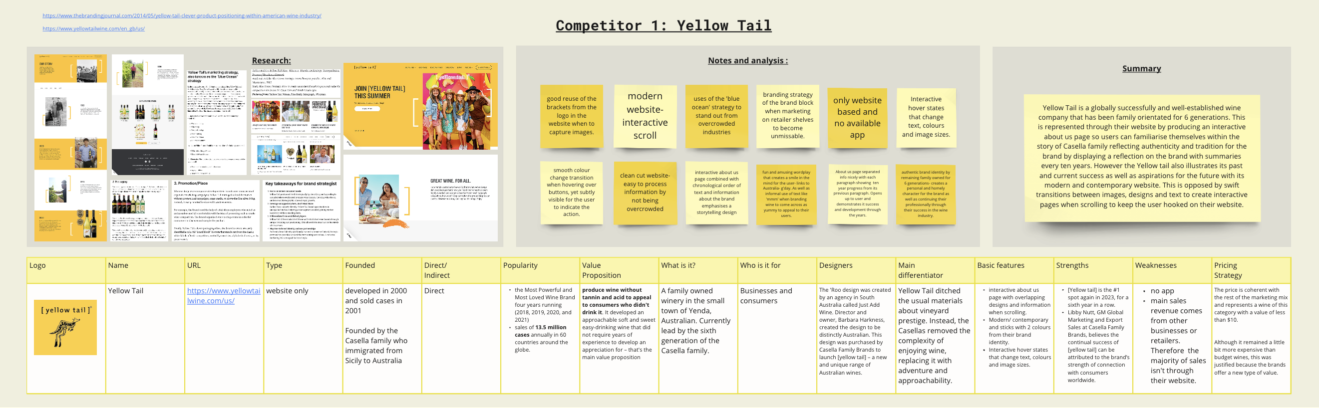
Yellow Tail is an Australian brand of wine produced by Casella Family Brands, Yellow Tail, as well as Casella Family Brands as a whole, are both based in Yenda, New South Wales.
Yellow Tail is a globally successfully and well-established wine company that has been family orientated for 6 generations. This is represented through their website by producing an interactive about us page so users can familiarise themselves within the story of Casella family reflecting authenticity and tradition for the brand by displaying a reflection on the brand with summaries every ten years.
However the Yellow tail also illustrates its past and current success as well as aspirations for the future with its modern and contemporary website. This is opposed by swift transitions between images, designs and text to create interactive pages when scrolling to keep the user hooked on their website.
Waitrose:
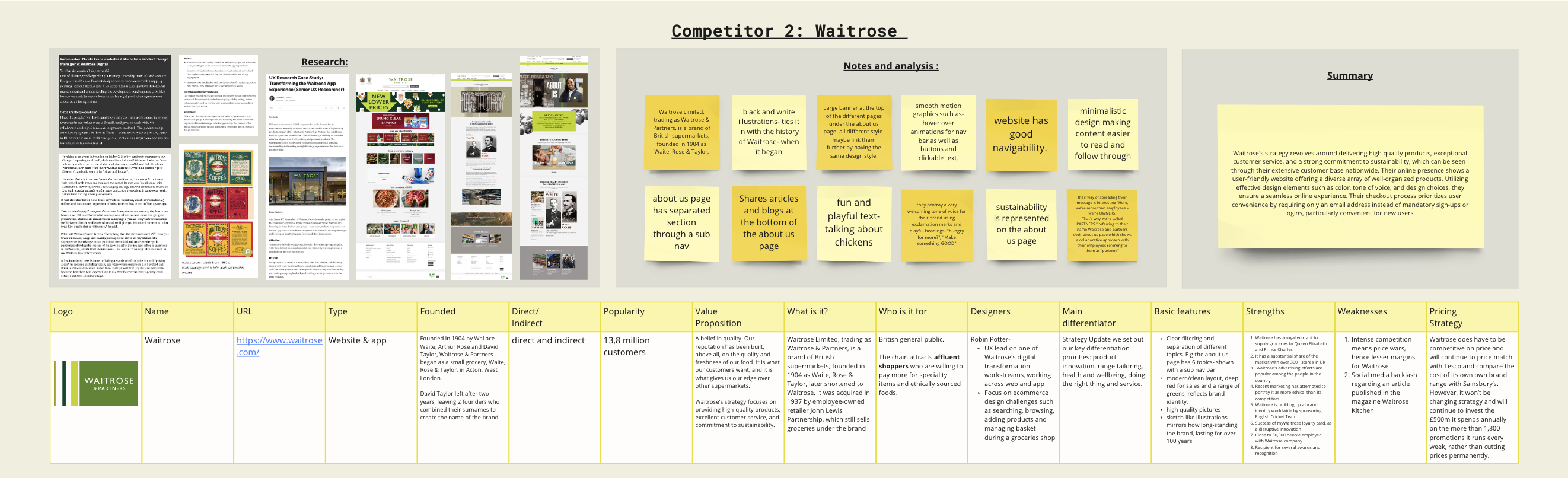
Waitrose Limited, trading as Waitrose & Partners, is a brand of British supermarkets, founded in 1904 as Waite, Rose & Taylor, later shortened to Waitrose. As at April 2023, Waitrose & Partners has 329 shops across Great Britain and the Channel Islands, including 65 “little Waitrose” convenience shops.
From my research, I found that Waitrose’s strategy revolves around delivering high quality products, exceptional customer service, and a strong commitment to sustainability, which can be seen through their extensive customer base nationwide. Their online presence shows a user-friendly website offering a diverse array of well-organized products. Utilising effective design elements such as colour, tone of voice, and design choices, they ensure a seamless online experience. Their checkout process priorities user convenience by requiring only an email address instead of mandatory sign-ups or logins, particularly convenient for new users.
No Comments