
My next part of the project was to create the slides for the communication of what we had created. At this point, we had a user flow, low fidelity wireframes and a lot of research to back up points we had wanted to include, but I was unsure of exactly what it was we had to make the points about, so it was mainly (to begin with) my job to set up the slides, and make a visual code for the whole thing. I wanted to begin with something good that draws in attention, and so I hoped to script the virgin in a visual animation in order to present the work, as well as building a strong research deck to back up our choices.
Max worked on the research deck, gathering information, and so I began with the visual aspects. Using the virgin logo, I edited together an animation on After Effects. (The logo unfortunately changed half way through so I never got to use this animation LOL).

With this as the beginning of the communication slides, presenting an animated exploration of our changes from the very first moment of the presentation, I hope the viewers see our insights as useful.
It was mentioned that Graham doesn’t necessarily care for research based design choices, but it was really valued by our team, and we believed throughout the process that anything that was done should be backed up by research. This helped me divide up the presentation, beginning with the bread crumbing of what we would be going through, as well as creating small smart animations to show our work off in a better light, communicated through a well designed presentation. I used virgins red colour and witty tone, using circles to co-ordinate the shape seen throughout the virgin site and logo.
I presented research in this moving way to help understanding of the efforts undergone to prove certain design choices. This then allowed me to move onto showing the design choices in the same style, ending With a conclusion.
Along the way I wrote notes of a script to aid the team In writing a thorough version, and made sure the presentation flowed smoothly. As we already had a strong design team creating the fidelity mock ups and prototypes, I was the one working on the slideshow, and I was really happy with how it came out, as well as how the rest of the team liked it.
Research Section
In the research section, we wanted to show the key findings from each of our points. These needed to be done in a way that then could be simplified further to find the even more key points of the key points!
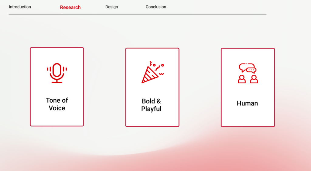
These were done using icons that could be drawn through, and cards to mimic the concept of the card sorting actives we conducted. The presentation needed to feel atmospheric – and this was done throughout.
Design Section
I wanted to showcase the teams work off to the best of my ability, and we were all of the understanding that showing key sections or details wouldn’t prove the extent of research backed design decisions and detailing we put into the pieces, and so with the help of Max, I used mockup’s on Figma to create videos of the products, so that those who designed them (and know the details best) could talk about them in the presentation. We didn’t want to include too much text within the slides, so kept it to a minimal where we could – just as we had done through the research section.
This could then be rounded off really well with the conclusion which would draw together all of the key design criteria and confirm how we used them and faced those issues.
Side Quest – The Virgin Wines App!
A smaller parter of the brief was to create an app that would link tot he platform somehow, and through very basic tests it became clear that there is no need for a virgin wines app, as all of their sales come from the site, and a user will be significantly less likely to purchase from an app they have to download (adding time onto their checkout). We decided to create an app that went hand in hand with he Events that Virgin Wines do – and due to timing and the fact that it wasn’t necessarily a NEED for the project, we left it until last.
As I had extra time, I took on some wire framing and a final mockup to present in the presentation, which I based off of the research from other sectors of the website.
