
To finish off the projects UI, I needed to user test, and to do this, I found some different users, as well as some users who had previously done interviews for me. I wanted a different perspective and to see if they could navigate without any interference from myself.
To do this, I needed some questions for the users to answer, in order to then have them really identify what they like and disliked about he product, as well as tasks for them to complete. I asked for two users to complete the same runs of a product as to compare them, in two different ways. Some were shorter tasks and some longer, however they all connected to help me understand any flaws my product might have.
I asked two of the users to navigate their way to the trip named ‘A Run Through Asia,’ in order to look in depth into the booking and checking out process to understand if there was any faults there that could be addressed. I asked another two users top generate their own trip, and to do this on their own. The final two users I had just go through the app as they wanted, and asked them to tell me what they thought, navigating on their own.
Some of the things I noted can be found below!
- Movement throughout the app was liked by the user, and without need for interference, the user moved throughout the product from th4e home page to the booking page and onwards within the first 50 seconds.
- The detailed parts in short and understandable jargon were liked by the user, and could follow through in all aspects if not done already.
- The prototype made the user unsure, as well as the icon button with the camera, which could be labelled upon entering the ID photo for error tolerance. (This was developed upon below)
- Minor elements mentioned were really important features to the user, and helps promote the product on smaller levels.
- The user was able to clearly identify different aspects very quickly, and mentioned this a few times, being able to find the next button to access further flows almost instantly.
- A fun design was something a persona really wanted, and so for a user to confirm this, some of the value was added to the brand system.
Changes Made to Iterate
I had to, from this feedback, make a slight few tweaks to the design that would allow for a better user flow, and give the user more of an experience when using the product. A good, simple, but really useful example of this is shown below.
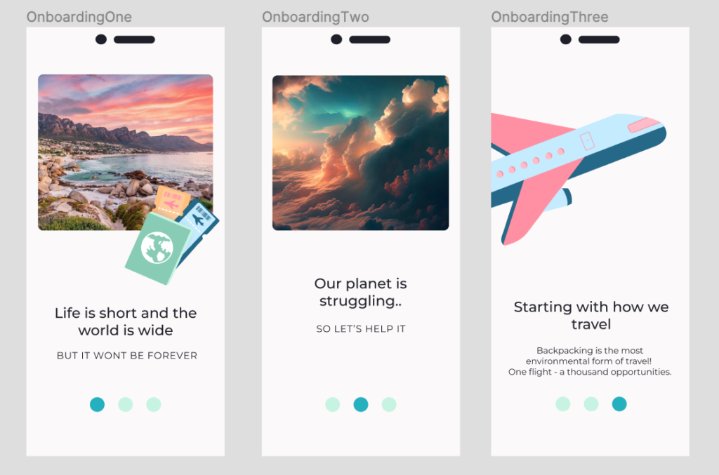
One user commented on being unsure of whether to click or swipe, so I made both actions possible within the product. The branding system was really important to the users when interviewed, and all of them spent triple the amount of time on the second page, this was due to the attempt to understand the negative illustrations and wordier copy. I changed this to be simpler, removing the illustration to keep the theme light and airy. The Images were seen as ‘downhearting,’ and a bit too much focussed on the negatives by the lecturer, and so I changed them to feel more like the brands later system.
The onboarding process was already good and strong, however, certain eleemnts stuck out to me as congusing during user testing.
View more changes, and the Miro Board here: https://miro.com/app/board/uXjVNCv7uts=/?moveToWidget=3458764575557071086&cot=14