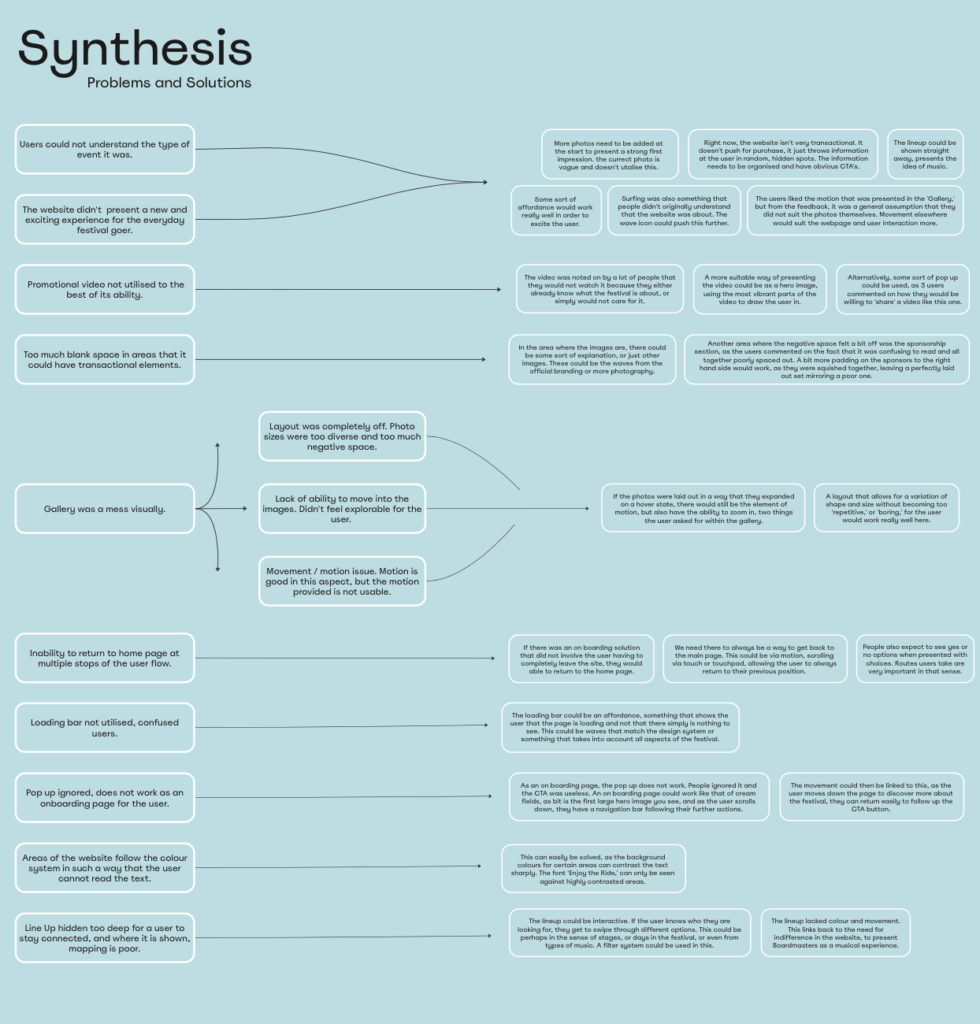
After doing different user tests, site maps, and a heuristic markup of the Boardmasters website, I created a synthesis chart to list out in final detail how all of the different areas mentioned in the User Behaviour tests could join together to possibly become one larger problem that could be solved.
Initial Ideas
For example, a lot of users mentioned the negative space surrounding the webpage, and as a result, it felt boring and bland. This means that if the webpages structure improved as a whole, there would be no need for the blank space, as shown in the research on cream fields ,(https://miro.com/app/board/uXjVNfSA41M=/moveToWidget=3458764566657652161&cot=14) suggests.
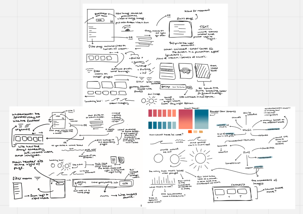
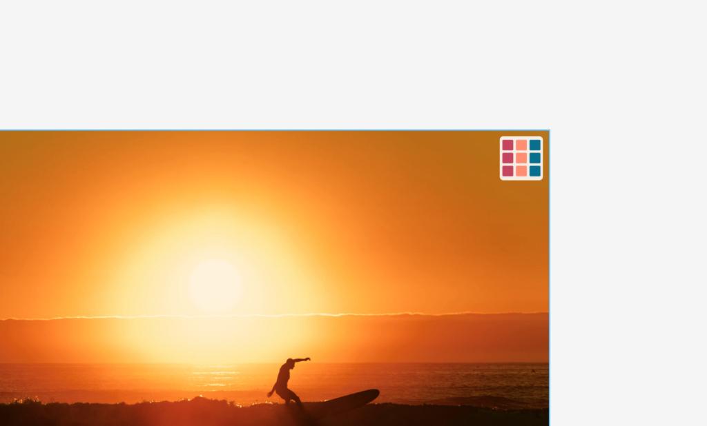
Above is some of the initial sketches I did into concepts I pulled from the synthesis chart. With this, the main things that I wanted to look into was planning the Gallery to be a bit more playful, but keeping it professional looking to show off the beautiful images, as well as the most important feature, the creation of a method for error tolerance, as the user needs to be able to successfully book tickets without having to leave the webpage completely to return home.
Design System
This was what I chose to focus my redesign on, the ability to prebook a ticket effectively with the user being able to return to the home page when done. I wanted to make sure I included all of the design system used by Boardmasters to make it feel more colourful and less of just a blank space, which was commented on by my users, and so to do this, I began by making a board based on the design system.
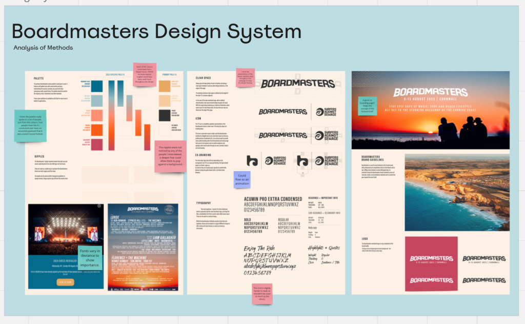
Found on the Miro board : https://miro.com/app/board/uXjVNbWB2lE=/?moveToWidget=3458764568814375381&cot=14 , this was a simple pull together of all of the components used by Boardmasters, as a way to help me understand how they lay out their design, so that it correlates, something that is a part of the 10 heuristics of design. Without a corrolating backdrop, or colour scheme, the design would not flow, and it could confuse a user, especially if the final design is a separate page.
This was something else I looked at. Could this be a pop up? Would this help the user understand the idea and be able to click off at any given moment? This was something I was to look at later in my wireframes.
Existing Websites
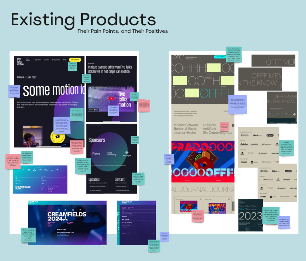
Using all of this information, I gathered three other websites that I could analyse, all of which have similar themes (two being festivals and one being a music event), that could be used to help design idea generation and add creative flare to the ideas I already have.
I thought about things that were said by the users during user tests in order to help me understand why certain things were useful in websites. For example, on the ‘Five talks motion’ website, there is a lot of movements, which creates depth, which could be linked to commentary about how some of the users couldn’t understand what Boardmasters actually was – however, for a festival about movement and motion, the depth of this movement was perfect! This could also be a negative thing however, as there was a large focus on the video on this webpage, something the users confirmed they would never usually pay attention to.
After my research into these websites, pulling different things that I both liked and disliked, I was able to collate all of my research in order to present my Synthesis.
Miro Board Link : https://miro.com/app/board/uXjVNfSA41M=/?moveToWidget=3458764566657652161&cot=14
Synthesis
I am very aware that this section in particular is overly worded and a lot to look at, but having done a few UI/UX projects before, I always found this method really helpful when it came to looking at where the exact problems were, so correlating my ideas, then speculating methods of solving them. One reason this helps is because things always interlay. So one problem may be caused by another, and by solving one, you solve a group. A synthesis ‘chart’ helps me to therefore link these and find a root cause to solve based on my research. Below is my chart, where I looked into elements the users wanted solved, and how best to do so. It helped me focus my idea on one flow, or more specific elements.