Personal Planning : Portfolio Website

As part of project 8, we had to set up a portfolio website in order to market ourselves as designers, researchers, and product developers.

The Main Needs

I went through a lot of different designs when it came to my website. I wanted something colourful but also meaningful to me, something that was really bold and drew people in but displayed the work well enough to keep them there. I knew I wanted to use the typeface DM Display serif, because it was bold but had a playful kick via the serif elements of it, which are curved and could be adapted to join any other secondary typeface. For the next type I chose Montserrat. It’s simple and it’s never failed me before so why should it start now was what I was thinking. It pairs well with the main font and doesn’t overpower or downplay it (it also comes in about 20 different weights).

Finally, I chose Caveat to add a playful swing to my design. I knew I wanted to be impressionable, and if I’m being honest I don’t actually enjoy website design as much as I do the research behind it, and I am pretty sure I would like to be an account manager, and so I wanted to express my character within the site and make it interactive. Caveat was used to do this, a handwritten script font that plays against the bold of DM display serif. Then I moved onto colours. I knew I wanted the colours to be bright, but in the end I decided to stick with just one contrasting colour to use within caveat. This was a red/pink mix that was vibrant and held well against both black and white. More colours could be devised later, however right now I am happy with this choice. 

The background is not pure white, as it felt criminal to place such vibrant colours against it, and instead is a slightly deeper off white that contrasts the other pages well.

Landing Page

I then had to decide on the main landing page and how it would express what I have mentioned prior. To do this I thought about making multiple pages with different elements, possibly adding a light box to change the elements colours around. However in the end I wanted to make it simple. I wanted my work to be displayed on one page, with the option to then go back and follow on the journey of relatively poor work to getting better (not that I think my work was ever poor, but I think it has definitely improved). I removed the navigation bar, and put project links in large boxes at the bottom, with hover states clearly labelling them, as well as a contact section.

However, I did add back a navigation bar in order to scroll to section, which doesn’t take the user off of the homepage, but keeps them on track and adds some error tolerance.

I then added a clickable button that brought up a light box with my ‘about me section’ detailing the things I enjoy using as well as a little bit about who I am. I thought this was fun and added to my idea of being personable as opposed to just putting it all at the top and having someone click through them. 

I had a few different ideas for concepts of the cover page.

I printed off some of my favourite photos from some of my favourite memories and tore them up, collating them onto a page and then scanning that in to use as my background! I thought this worked with my copy writing, as it asks the viewer (hopefully a client) the question of who they are and what (user) experiences make up their brand. It added personality but also kept to the point, which was what I had wanted. 

Another idea I had was a colourful background that moved around as the user stayed on the page. This gave the page character, as I also wanted to make it clear that my designs catered towards people, not just ‘users.’

I did this using an after effects motion tile and gradient, using the colour scheme to work within itself and build on the brand identity!

Organisation

I organised the different projects using a divider system, and a hover state that highlights where the user is, as well as an animated photo reel that moves through highlighted images from the projects.

In the future I hope to link these up, however, for right now – this was all I managed to do!
Design for Good : Communication

As part of the project, we had to create some App Store posters, a showreel, and a slide deck to present tot he rest of the group. In order to do all of this, I finished my prototype, retrieved videos of it, and collected all of the brand system into one place.

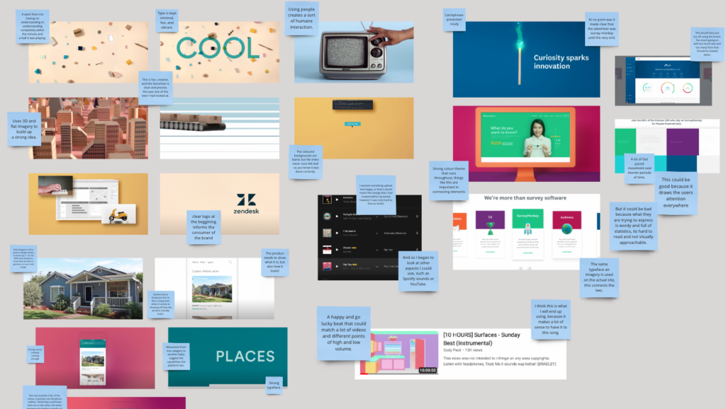
I began with he research. As shown below, I looked into different communication videos, and how they worked, as well as what I thought (as a first time viewer and therefore consumer) they did well, and what they could do better on. Like most things, what some videos had, others did not, and few and far in-between. It was valuable to do this research in order to help me understand the video, as well as make my own.

I ambitiously planned the video, and whilst it didn’t all go to plan, and it isn’t something that I am the most proud of, considering it was one of my first times using After Effects, I really enjoyed the process and thought what I got out of it was definitely a stepping stone for future projects.

I then moved onto attempting to creating the App Store promotions. Highlighting the key images and functions that my product had, I made sure to make the promotional posters just as bold and bright as the design system itself.

The last part of this section was the showcase slides, which I made on Figma to allow for some short but fun animations that mimicked the way my product was cerated. I wanted a cohesive feel, for everything to go well together, and this allowed me small micro-animations that worked well. (And were, in the presentation, commented on by Tom as being highly valuable tot he presentation of the brand!)

View the whole Miro board here: https://miro.com/app/board/uXjVNCv7uts=/?moveToWidget=3458764575557404741&cot=14

Presentation to the group !!!

I needed to present the products to an audience via a presentation video as well as a slideshow reel. To do this, I used illustrations from my product as well as creating new ones in order produce a slide deck. Below is the script I produced for this!

Script

This is wander 

And it started off with a huge problem. 

The planet. 

And I know what you’re thinking, that’s ridiculous. What I can guarantee your not thinking is about how you travelled here this morning, or your waste and where it should actually go, or even something as small as whether or not you left a switch on in your house. All of these things can amount to so much environmental damage. And if it were 30 years ago, I would tell you not to worry. But between 2020 and 2023 alone, there had been an increase of young people’s interest in the environment by just over 450%. 

To utalise the potential of this interest, it was critical to find an untapped problem space and produce a service worth pushing out. To do this, I set out a clear process to aid my journey. 

Research. This sourced me my issue, and gave me the opportunity to look at Statistics, competitors in the market, and the confirmed the need for the product. 

The user. This included interviews, testing, and asked the most important group of people to the project, what their wants and needs were. 

This was answered with a user flow,

Followed by wireframes, which were continuously tested for the value aspects added to the product. 

A final prototype was then created, 

Before I marketed it to the user. 

What am I even marketing you might ask? 

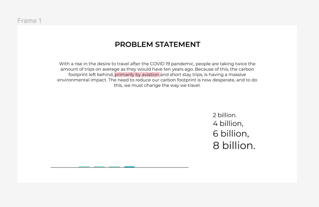
Well, (read probelm statement) that’s quite wordy. So we can break it down. 

Primarily by aviation. when I conducted my research I found a ton out about our carbon footprint. And if I asked you what contributed to it the most, there’s a lot of answers you can give me. But I think (like a lot of the users I asked) you’d be wrong. Deforestation – just short of 2 billion tonnes a year. Landfill, 4 billion tonnes. Construction 6 billion tonnes. Aviation and human transport? 8 billion tones. 

Short stay trips. Short term trips produce 78% more carbon than a multi destination vacation.

Changing the way we travel. With 82% more travel in 2023, and a 67% increase in sustainable travel searches, now is the time to mirror a users wants as a designer to produce something not only great, but practical. 

But surely there is something already out there that solves this problem? 

No. 

With competitors being noted as ‘hard to use’ ‘untrustworthy’ and ‘flawed’ by the users, there is a major market gap that needs filling. Speaking of how the users feel, who are they? I divided the users up into three different personas, two primary and one secondary, all of which the product 

meets in various elements of its design. 

The wannabe traveller, prioritising an easy user flow, with a trackable aspect. 

the experienced backpacker, someone who wants just as much thrill from booking as they do the journey, with a range of choice. 

the luxury traveller, wants to know what their getting is good, without the hassle. 

I then interviewed an expert. A travel executive named Charlie, who tracks peoples movement through websites and lets the call centre know when to push for a purchase. Charlie helped me understand a lot about how people navigate webpages, a s well as the sheer amount of effort goes into nudging people to actually purchase, and with 82% of carts abandoned, I can understand why! But there were a few other key insights. 

Through all of the research, interviews and detailed analysis, I came out with s value proposition.  (Read) This was followed through with a strong brand system, as you can see here, beginning with the creation of the logo, 

followed by colours and a typeface mimicking famous city palettes which followed through onto the apps copy. 

And what is a product without its key features, and how they solve the users needs. 

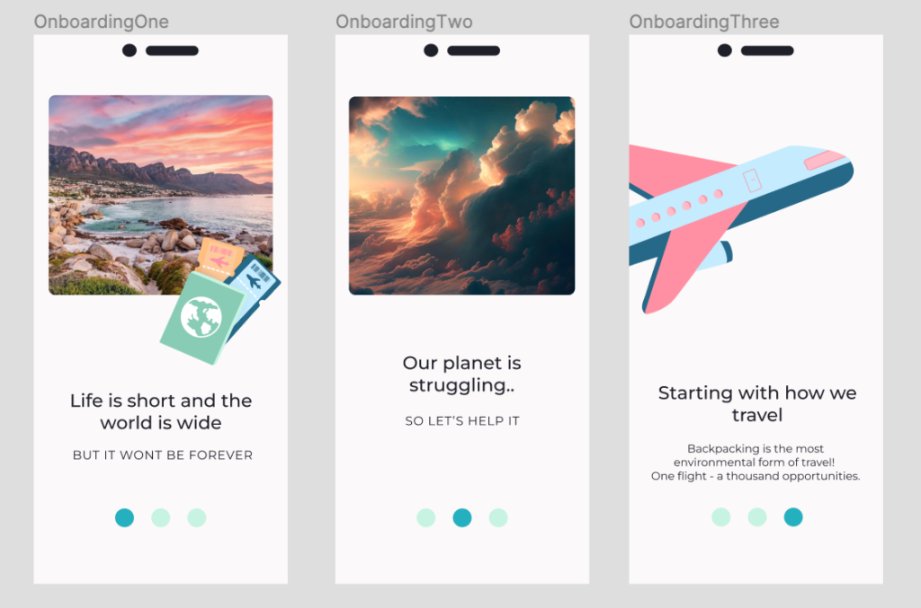
An onboarding service gives the user all the insight they need. Offering fun animations as well as reaffirming the brands identity. 

Safety was a major concern throughout all of my interviews, and to help aid this issue, Wanderers can’t sign up for the product unless they provide an ID photo, which is checked in an AI operated system, and instantly refers them onwards in their user journey. 

No worried! Unlike any product or service on the market currently, Wander lets the user base their trip completely off of their needs. The date, airport, destinations and duration can all be adjusted and edited in a carefully created search system,

 as well as pre planned trips for the first time Wander’ers.

After selecting or creating a trip, the user can instantly access all information they need, 

With the ability to view each stop, photos of their destinations and reviews, as well as a guide next to the booking button to help further. 

A live booking system tracks the users trip from start to finish, inclusive of tickets needed, and where and when the user should be at any given moment. 

As mentioned earlier, the user has the ability to both create or select pre booked trips. Offering worldwide varieties. 

At any mention of a stop, the user has the ability to add an excursion, easily guided through by icons and added instantly to their cart. 

A key feature of the product, a Wanderer can book instantly with another person simply by selecting ‘share trip’ upon checkout, as well as having the option to create a message board with their friends to guide that previously mentioned 82% of journeys out of the basket and into reality. 

Finally, some users may want luxury. With the option to select your own hostel or hotel, a layer of added luxury allows for indifference, which through research, proved to be a luxury users wants. 

But don’t take my word for it. 

Have some user testimonies instead! The branding functionality, design, and features were all highly rated within user tests. 

The final part of the process was to create meaningful communication. To make the potential users both understand and want the product. Here are 3 of the App Store promotional posters, showcasing features that are unfound in competitor websites, and displayed in the same adventurous and bold way the brand identifies. And if that hadn’t convinced you, have a promotional video to Finish the job! 

Feedback Given

During the presentation I was given some feedback from the Both Tom and Dave. They commented on the graphs and the need for further explanation, as well as some of the emphasis on certain elements. To help communicate this better, I changed some details, adding statsitcs to the graphs, as well as highlighting some key elements that were not previously highlighted prior.

Design for Good : User testing

To finish off the projects UI, I needed to user test, and to do this, I found some different users, as well as some users who had previously done interviews for me. I wanted a different perspective and to see if they could navigate without any interference from myself.

To do this, I needed some questions for the users to answer, in order to then have them really identify what they like and disliked about he product, as well as tasks for them to complete. I asked for two users to complete the same runs of a product as to compare them, in two different ways. Some were shorter tasks and some longer, however they all connected to help me understand any flaws my product might have.

I asked two of the users to navigate their way to the trip named ‘A Run Through Asia,’ in order to look in depth into the booking and checking out process to understand if there was any faults there that could be addressed. I asked another two users top generate their own trip, and to do this on their own. The final two users I had just go through the app as they wanted, and asked them to tell me what they thought, navigating on their own.

Some of the things I noted can be found below!

  • Movement throughout the app was liked by the user, and without need for interference, the user moved throughout the product from th4e home page to the booking page and onwards within the first 50 seconds.
  • The detailed parts in short and understandable jargon were liked by the user, and could follow through in all aspects if not done already.
  • The prototype made the user unsure, as well as the icon button with the camera, which could be labelled upon entering the ID photo for error tolerance. (This was developed upon below)
  • Minor elements mentioned were really important features to the user, and helps promote the product on smaller levels.
  • The user was able to clearly identify different aspects very quickly, and mentioned this a few times, being able to find the next button to access further flows almost instantly.
  • A fun design was something a persona really wanted, and so for a user to confirm this, some of the value was added to the brand system.

Changes Made to Iterate

I had to, from this feedback, make a slight few tweaks to the design that would allow for a better user flow, and give the user more of an experience when using the product. A good, simple, but really useful example of this is shown below.

One user commented on being unsure of whether to click or swipe, so I made both actions possible within the product. The branding system was really important to the users when interviewed, and all of them spent triple the amount of time on the second page, this was due to the attempt to understand the negative illustrations and wordier copy. I changed this to be simpler, removing the illustration to keep the theme light and airy. The Images were seen as ‘downhearting,’ and a bit too much focussed on the negatives by the lecturer, and so I changed them to feel more like the brands later system.

The onboarding process was already good and strong, however, certain eleemnts stuck out to me as congusing during user testing.

View more changes, and the Miro Board here: https://miro.com/app/board/uXjVNCv7uts=/?moveToWidget=3458764575557071086&cot=14