
In order to build a strong design system, I needed to use the research I had made in order to put together all different aspects of a concept I had gone into great depth of research about. I had to make sure to include everything I had learnt, because something clearly important to a brand was how they advertise themselves. I was told by both lecturers that a brands user or persona that they were trying to hit doesn’t always have to be vast in number. I had developed 3 personas, however just because 3 is a good number doesn’t mean two couldn’t be a primary persona and one slightly less important.
Attempt One
When I had developed my first brand system, it had intended to hit 3 personas all at once – luxury travellers, well rounded professional travellers, and wannabe travellers. It was really difficult at first to try to make room for these 3 overwhelming personality types, even with the affinity map and value proposition already set up. To combat this, I used my research to create a brand system that included everything these 3 potential users would want.
I began by creating sketches of a few things I had wanted to include, and from this, springboarded to my final prototype design. I wanted to go for something fun and adventurous, to allow for a newbie backpacker to feel comfortable – not something sharp and almost daunting. The user interacted best with colourful, bright, and fun branding – not always simple, but willing to work within different examples of the system – something adaptable.
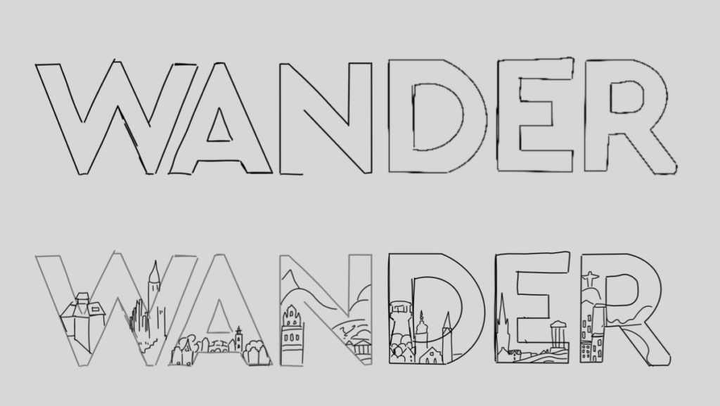
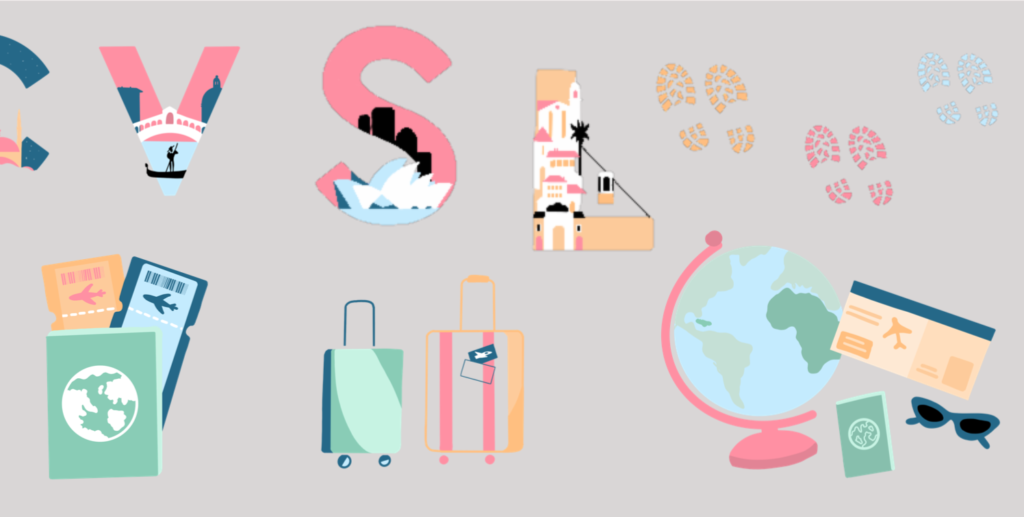
The users wanted a fun and creative onboarding system, and a lot of the projects that I took the users through to show them as competitor research included bright and bold illustrations, especially with icons and different screens. I had already had laid down a really strong design for the logo, which included different elements mentioned above, and so I based this off of the colour scheme and style I had chosen.
I used the typefaces below:
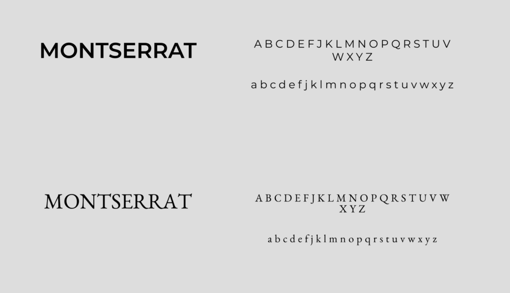
I knew I wanted to use Montserrat, because on its own it is a very strong font to use, as it has a great depth of weights and can be used very versatile within the product. I also chose to use Benne (the bottom font), so that there was an air of luxury throughout, due tot he research I had done on different types and their relevance.
However, after a conversation with both Dave and Rob, I chose to try and develop on this, as Benne as a font didn’t necessarily fit in with the rest of the designs, especially when I had moved the project onto a real prototype. Because of this, I chose to change it up a bit and see where it would take me.
Attempt Two
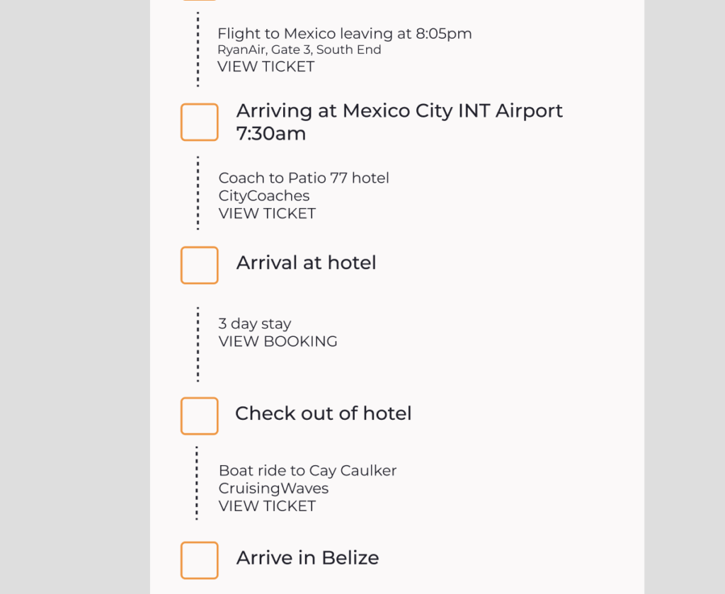
I changed the different typefaces to Montserrat, so that there was only one cohesive type being used throughout the system, editing minor details such as the weight of the font and where those were placed throughout the platform. I used brighter photos, editing them to match the colours I finalised on for the brand system!
Testing the System
Naturally, I wanted to test the system before I took the prototype any further. Because I had built in styles it was quite easy for me to change typefaces and fonts, but I didn’t want to have to replace different images and illustrations, so I thought it best to review them before I moved further on with the process. To do this, I brought back my five original user interviewees in order to establish what they liked and disliked, what could be changed and what they felt value in throughout the design. This was mainly because all of them ticked my target market, but also because they had previously been interviewed about the different brand systems before, and so they would have a good grasp at what they liked and disliked regarding this.
- Joey stated that she likes the idea of the buildings within the logo, and thinks that it is fun and different, and not something you see often, but that the footprints don’t really fit the solid colour theme of the illustrations – and maybe to put them on a coloured background.
- Catherine mentioned that she likes the illustrations, that she thinks they work really well within the colour scheme and make the product stand out against tother platforms. However, she did think that the colours were too pale against the bright white background, and putting this against my research, I chose to change this to a slightly paler grey.
- Holly stated that he really liked the colours I have chosen they remind her of an italien little houses with a nostalgic sense. She also mentioned that she likes the different letter work, how I’ve done different letters that arn’t in the actual word WANDER, the ‘C’ and the ‘L’ for different examples.
- A comment that stood out from Ollie was this: ‘Maybe try adding a different like outline to the letters, that could make them stand out more?’ After giving this a go, I found that it looked a little bit off, and placing the structures within a box almost defeated the purpose I was going for.