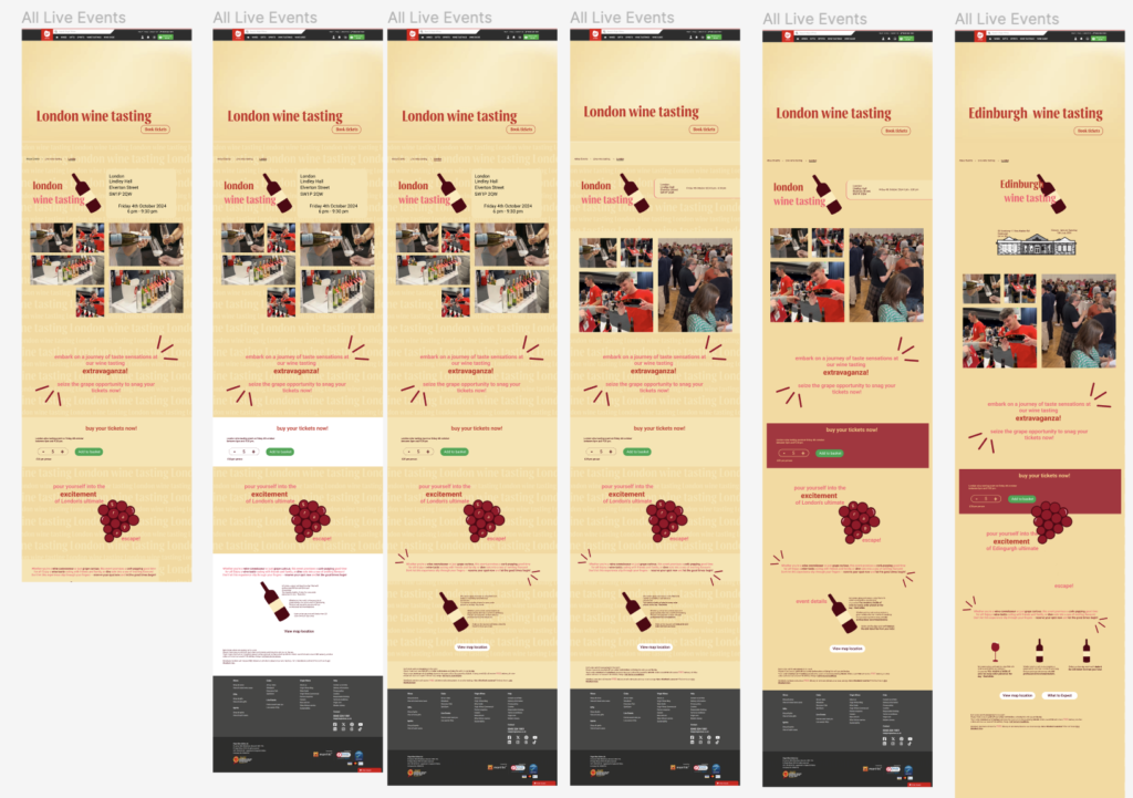
This week I continued to turn my low fidelity wireframes for the individual events to mid/high fidelity. After agreeing to move away from the ticket base style, Emily and I who were working together agreed on a more illustrative approach, staying consistent with the other designs. I designed the page to have a yellow theme, experimenting with different styles that they had in the powerpoint pdf that was on the VLE – like the text background. However the issue with this was the main body text would be hard for people with vision impairments and dyslexia to read, which is why I experimented with different colours backgrounds like block yellow and white.
I chose the colour yellow because it stood out, being much more visually engaging. After discussing with other member of my group, we decided that the yellow wasn’t working and maybe try pink instead. I also experimented with getting rid of the text background, keeping it a plain white as well as the fonts and how I could integrate the joy font with the robot font to make it more fun and exciting. The illustrations and witty text really brought this design to life.
I also created the book tickets section on the page, as well as cutting down and editing the text, making certain key point bold so it would stand out more. Emily added the images and sorted out the time and location placement of text as well as helping me to decide where to place the three small paragraphs of text at the bottom of the page. We both agreed on having buttons that would take us to separate pages for the map location and a what to expect page, that she was designing separately, including all the information about the events that isn’t necessarily important to all customers but still easily accessible.
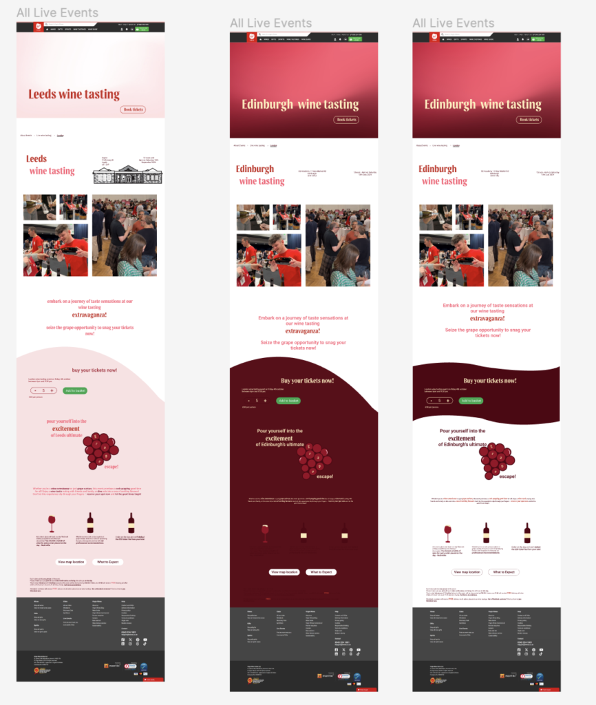
Through my iterations you can also see that the terms and conditions have changed since last week. Instead of it being a bottle next to the term and contains in a box, I removed the box so the layout looked much more slick and clean, still having the important information there but not drawing too much attention.
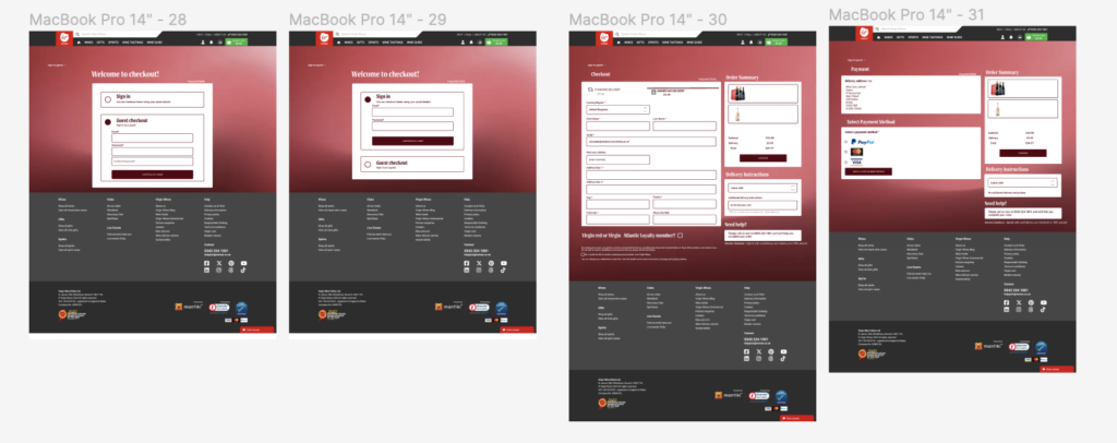
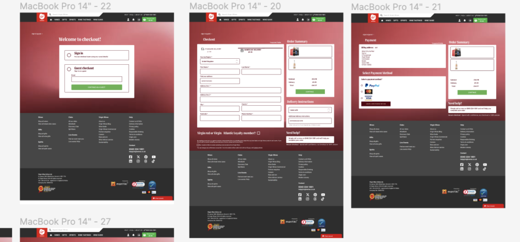
Throughout the week I also helped with the checkout. After Lizzy created a quick low-mid fidelity wireframe, we got feedback from the crit with the client, saying that it would be best to not have a busy image as the background. I then decided to experiment with a few design ideas as well as the layout which is shown on my own fidelity Figma file, taking screenshots for the existing checkout process, ensuring I kept all the relevant information there, giving the boxes curved edges making it seem more flowy and smooth. I also made the point that it would be better if the page scrolled and wasn’t just static, as it allowed for there to be more spacing and padding, making it look more clean and less cluttered as many of the information fields were quite close together. I experimented using a simple red background, to tie in with the rest of our design pages, with white boxes for the information.
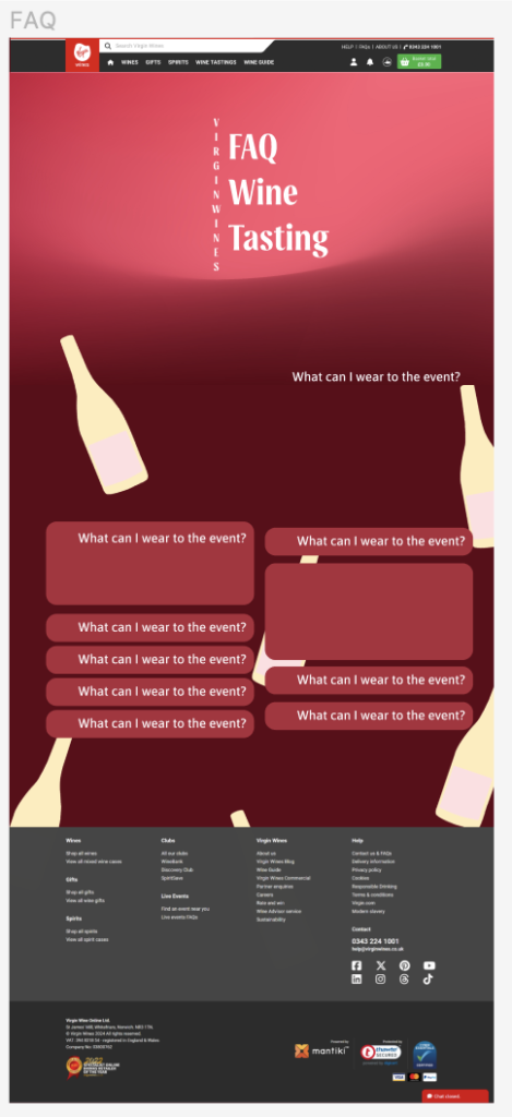
As Ellana was ill and she was designing the FAQ page, Lizzy, Emily and I thought we could help her with some initial design experimentation, to give her a bit of inspiration. I also mentioned that we shouldn’t have the questions with a ‘+’ that would open up to an answer as it being the colour red meant that it looked like a first aid sign. With the others all agreeing we decided that this was something we were definitely not going to include in the design.