With this being submission week I am currently tying up all the loose ends for all of my work. As a result majority of this unit being the group work, it ensured that I was keeping to group deadlines and completing the work, reiterating based off feedback quickly. We managed to finish the Figma designs last Thursday for the presentation, which meant that as a group we didn’t have much to do. However on the Tuesday I created pages with google maps screenshots of what it would look like if a user clicked on open in maps, doing this for both mobile and desktop from the individual events pages.
Over the weekend I made the executive decision to render all my user tests, so they were ready for the group on Wednesday and no one would have to wait for me to completely render 12 videos, 2 of which being over 10 minutes long. On Monday and Tuesday I spent typing up all of my user tests – adding the transcript, general notes, and making any changes that could be improved last minute before the final walk through videos were made on the Wednesday morning. I created a script for the usability test of the web designs we created in which members of my group used to carry out their user tests too, as well as the overall structure of how to present the notes.
For example in one of my user tests it was brought to my attention that it would be best if for the events it didn’t scroll. With there being only 4 events, I would be able to fit them on one page, less scrolling for a user and much more easier for them to see the events – still being agile and easy for virgin wines to add more events, as it still wouldn’t be too much scrolling for the user. The images below show the changes. The left showing before the change, tall boxes meant more scrolling. The right image showing more compressed boxes for less scrolling, as well as the change in buttons
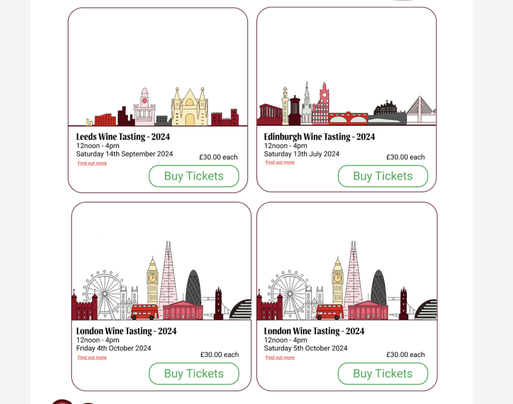
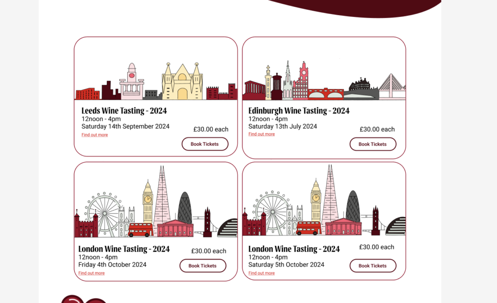
One of my test applicants also brought to my attention that instead of just the ‘find out more’ button taking you do the individual event page, it would be good if the actual event tile would take you there as often users will click on the general tile, not specifically the ‘find out more’ button. Another user test revealed that layout of images on one of the individual events page felt like it was missing an image. Although I didn’t design the layout for the images for these individual pages, I took it upon myself to scale it up slightly to make it look like there wasn’t supposed to be an image missing. These changes improved the overall aesthetic, design and flow of the web pages, keeping a user centred approach.
Overall I decided to conduct 12 usability tests, 2 on the existing website and 10 testing out all our web design pages, only excluding the checkout.
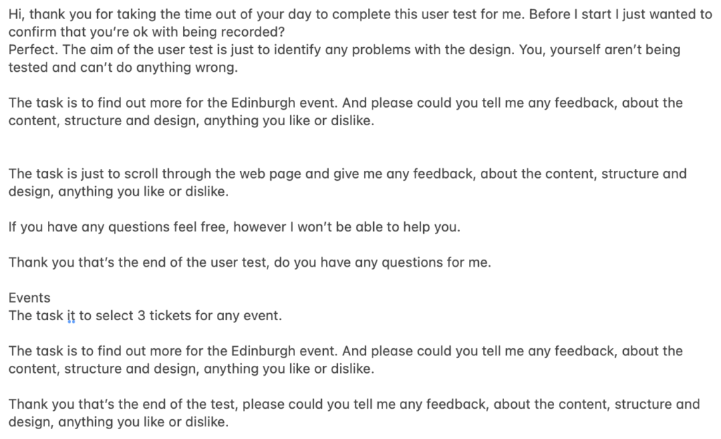
This image is the script I roughly created and was a base script for other members of my group who also conducted user tests – including different tasks for different pages
I decided to test other people’s pages as people in my group struggled to do user tests, but that is where working in a group works well. We all play to our strengths and pick up on where others fall short to ensure we did our research and designs properly. On the Wednesday morning we realised that one of the phone heuristics a member of the group forgot to do. As everyone else was rendering their videos to put in our group folder, I took it upon myself to quickly complete this task before I turned all miro boards into a PDF, later airdropping them to Lizzy to organise the folder. This ensured that all tasks we had hoped to complete on our research board were done. On Wednesday, putting our group work together went pretty smoothly as we had done everything and made sure that we could all focus on our own work.
I was also able to finalise the changes to my research report proposal, making adjustments with the suggestions Dave gave me to improve it further – ensuring that I changed some of my headings, drew away from the history of how designers design with neurodivergent people in mind, focusing more on interface design within neurodiversity. These changes ensured that my research proposal was to the best of my ability, reiterating the sentence structures and removing blocks of text. Through removing big blocks of text, it ensured that I stayed away from accidentally shifting to the actual report and stuck to explaining and outlining the plans I have for the research report and what I plan on doing. I also managed to finish my reflective learning summary which luckily didn’t take too long.
On Thursday I could submit my work, finishing off my portfolio, adding the latest group project and making any changes to my actual portfolio itself.
Overall I believe that this unit has allowed me to really focus on self growth, my softer skills such as collaboration and communication, ability to respond to feedback quickly and understanding that different tasks require different approaches. I have worked in a highly collaborative project as well as spending solo time to meticulously refine my personal work – like report proposal, blog posts and my contribution to the group project. I have also taken a big leap and applied for an industrial placement which I am proud I get offered a job for, a great way to end the unit!