
For our Checkout pages I was not responsible for overall ideas or designs as Robert’s task was redesigning the users checkout experience. Instead I was often asked suggestions and feedbacks with designs before helping with the development of the final outcomes for checkout.
Developing Designs:
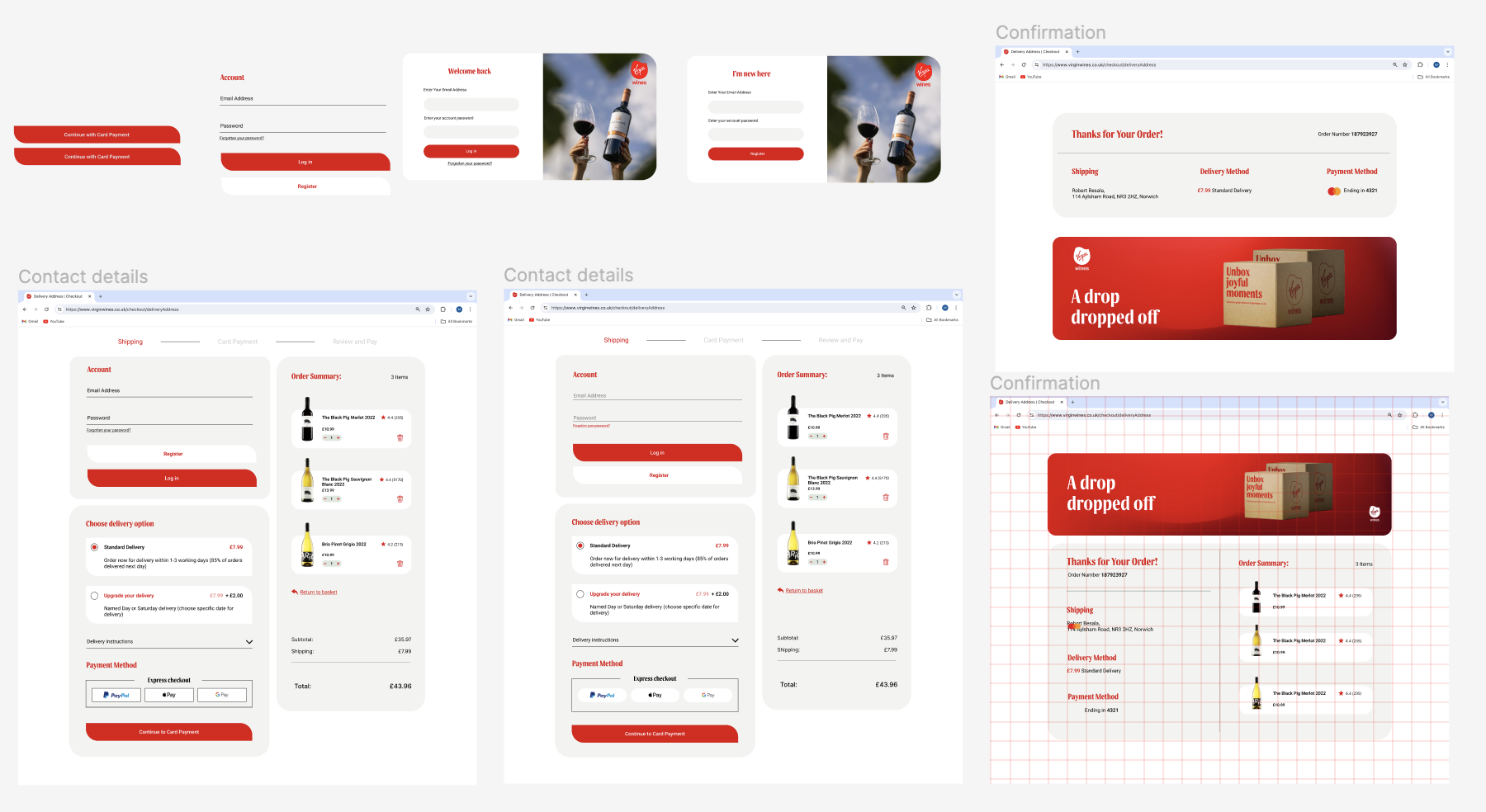
Here we started to finalise ideas and so I was brought into this to give my insight on any suggestions for problems with the user interface. I made sure there were efficient and correct text styles for the different types of copy, as well as checking sizing and of images/content via a grid of 60px.
From my critical analysis I found an issue with the Account Details as I believe the user would struggle to interpretative the previous design. This is because the design Rob made had an action for the user to fill in an email address with below giving an option to log in if they already have an account. I found this to be inaccessible for all users as it didn’t give relevant options or information on signing up or continuing as a guest. Instead the idea was to offer for customers to decide to make an account once purchased items as information can be autofilled.
My response was to still include this feature of becoming a member once purchased items as users would like how they don’t have to fill in more details or info. However I believe other options needed to be presented with the email address as a user would typically expect the option to at least sign up if they don’t have an account. From this evaluation, I created pop ups where users can decide to log in or sign up, but I felt this forced action may make user drop off here as they may want to continue as a guest.
This then resulted in the development of the ‘Account’ section which be displayed as the first action in which the user has to complete. I carried on the rules of text styles and themes, creating a simple clear layout with the re-use of our button design to establish the option to ‘Log In’ or ‘Register an Account’ I also added a ‘continue as guest’ option underneath these buttons which was underlined to emphasis it as an action. I deliberately didn’t make this a button as I felt that it would display too many options as well as sway the user down a user flow that Virgin Wines wouldn’t prefer. This is to ensure that the first options that capture the users attention is related to having an account with Virgin Wines, which could then lead to the user becoming a returning customer due to possibility of then accepting marketing notifications.
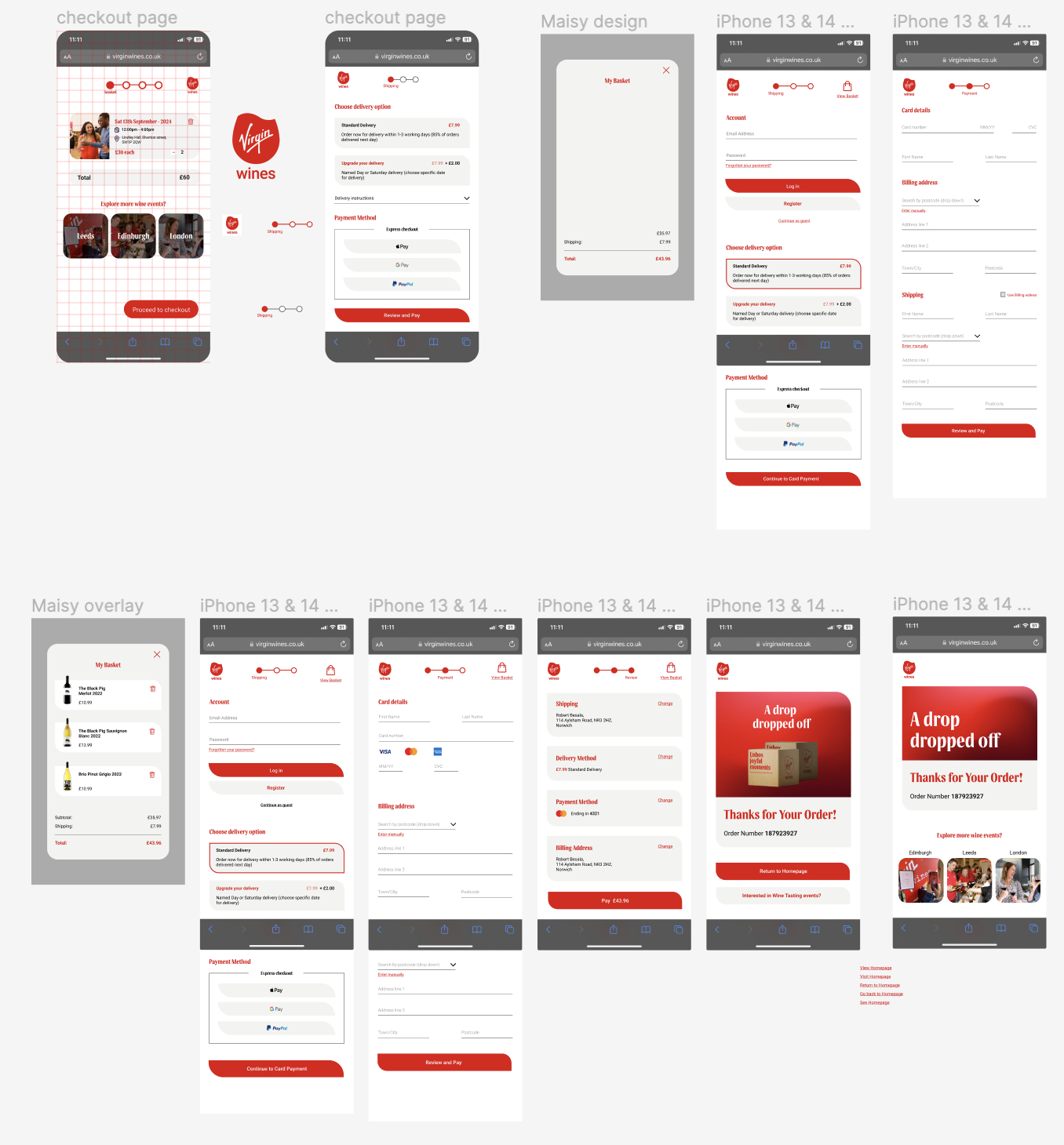
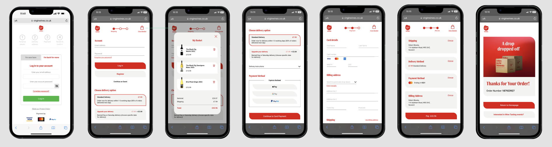
Afterwards, I then evaluated how we could present the summary option shown on the desktop. My solution for this was to add a basket icon in the top right corner. This is where I developed an overlay where I designed a basket to show a quick summary of the users order.
Subsequently from my competitor research I pointed out that we didn’t have a confirmation page, unlike many online retailers. This lead to a discussion with Rob where we both developed a design for an additional page that confirmed the order of the user once all payments have been made. During this time I experimented with compositions, graphics, colours and UX options. This included my insight of linking the final checkout pages back to the Virgin Wines website, this is so user can embark on new user journeys and roam the website which could resort in purchasing an event ticket or saving products to future basket.
Final Outcomes:
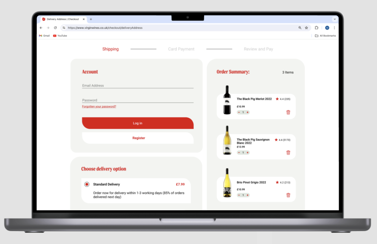
Here are the final outcomes for our mobile and desktop checkout designs, displayed through the use of mockup templates to insinuate how our designs would be interacted with by users on different devices.
No Comments