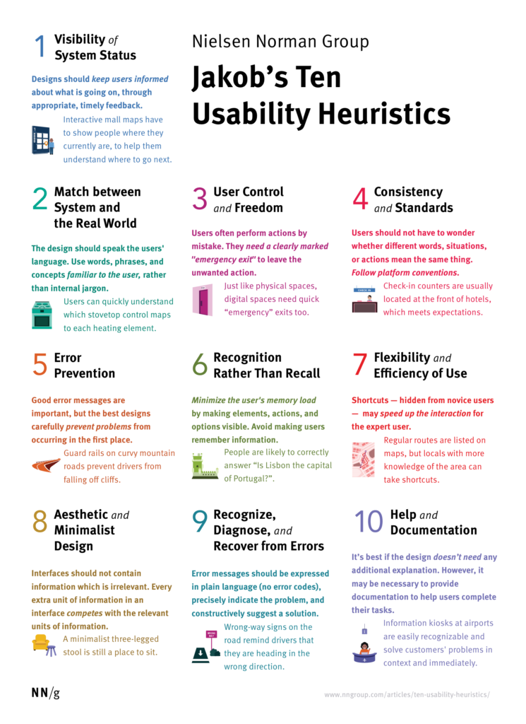
This was from an online lesson on zoom.
The navigation of software is consistently changing. 2 years ago, Adobe XD was the top application for building webpages, however now, Figma is the one to beat. Figma on the other hand, cannot publish websites, only design the websites. This is why Webflow is such important software pieces that we need to look into. There is however, a really advantage software that can allow for the cross over a Figma file, called Framer. Framer does not need the follow through of auto layout, which is useful for designers needing to get a website done quickly.
Below is a Figma autolayout layout playground file in which I used to gather some more knowledge on the subject.
From the workshops, to the building of different components within Figma, and learning different sections on my own via YouTube or Figma’s tutorial platform, I think my Figma skills are quite good, and feel comfortable enough to attempt to transfer my project onto Framer!