Design for Good : Prototyping and Problems

Prototyping this project taught me a lot about Figma – and really helped me up my skills! I began by creating basic components, as I believed this was a good place to begin when it came to the elements I would need.

Component Overlays

One problem that I faced was the navigation overlay. I was determined to attempt this on my own and attempt to figure out if I could do it without the help of a video, and I did manage it (after a while of attempting.) I began by making a ‘swap overlay’ component on a separate page.
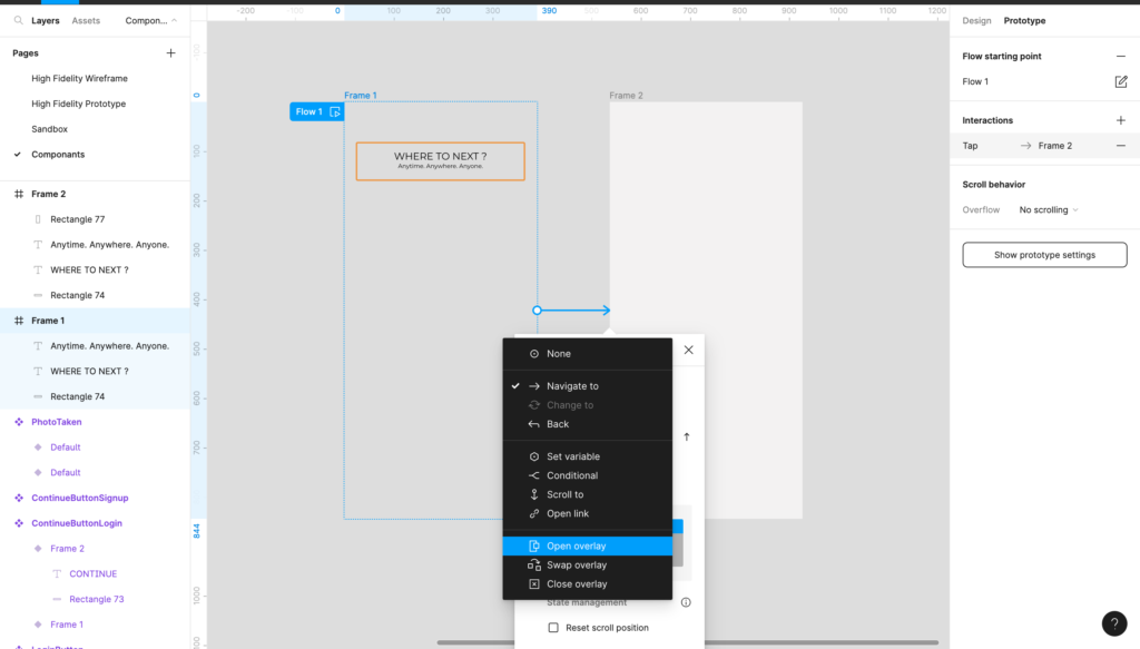
When this was placed onto the original document it came to my attention that the swap overlay could only be as big as the original frame was that it was sat on. This meant if my home page was only 100 pixels long, and I needed my filter bar to be 150px – 50 1/3 of that filter bar would be cut off. This was an issue, as I knew my filter needed to be relatively large due to the research I put into understanding one, and knowing what people needed.

This was an easy problem to get around however, as I simply added more sections to the home page about ‘preplanned trips.’ The main focus of the product is being able to select your places of travel and it creates you a route to backpack – so I thought it best to avoid prototyping every single section and just to stick to the main focus. The issue with length however did mean I had to perfectly align both the home page and the component swap on, as the navigation bar needed to follow the home page to the bottom and sit just right. I didn’t want large white empty spaces, and I also didn’t want to have overfilled pages for no reason.

Fortunately, the process helped me learn a lot about the way components work in Figma – unfortunately the filter bar cause more problems than just this!

Remembering States of Interaction

I wanted the user to be able to select where they want to go, and for the system to remember that and create a journey from it. In order to do this, I needed to make the components that were selected able to remember that selection even when clicked onto another page or element. To do this, I had to build components within components.
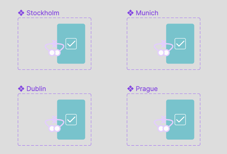
I began by creating selection states, and then duplicating the components (it is important to remember not to use instances, but to create new component sets) for each of the desired places. This means, once clicked, all of the instances of the main component would change, and wouldn’t change back until clicked again by the user.

I also created different heading options to filter the places, and linked them up using noodles, dividing each within the larger component of ‘PickFilter,’ placing the 0% opacity sections over their coordinating image.

The filter bar as a whole was a bit tricky to completed and took a lot of different components to be built within for it to work. Sometimes it would mess up for small reasons such as the hierarchy of layers or something not being within a component properly. But these were easily fixable, and helped me to understand how to build more like this in the future.

Final Details

Whilst in a critical with Rob, he brought some really useful things to my attention that I didn’t think about prior to creating the prototype – all quick changes that could be integrated throughout to make sure my product worked as well as it could within the users needs and wants.

The speak to an agent button was previously just a small blue button with text in, it had not been highlighted yet and there was a somewhat lack of focus within it, even thought it was almost a CTA help button. With the user possibly being a new traveller, and possibly there needing that help, it was a correct assumption to possibly highlight it, as it didn’t affect the hierarchy of the page, all whilst aiding the users journey. I highlighted the box, as shown on the right, and then added an icon to suggest that it was a phone call as opposed to an email etc.
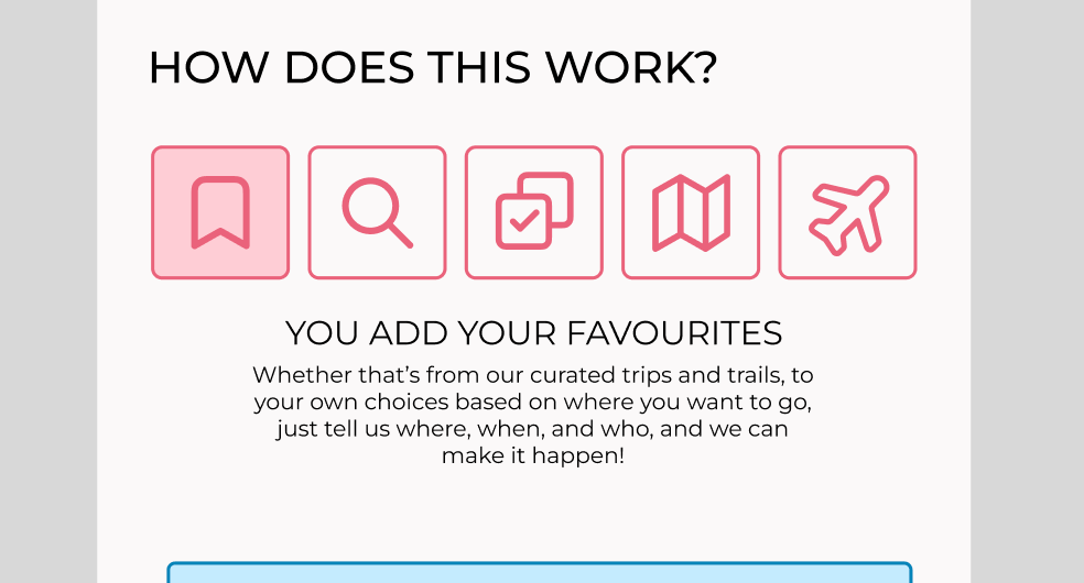
Then, on the informational section where the user gets told what they can expect, almost like a mini onboarding system within the checkout process to aid the users experience, the process began with no text and needed the user to click on it before it began. Rob highlighted this as an issue because the user may not understand they need to be clicked on – which is so true! So I made the component begin at a highlighted section as shown above.
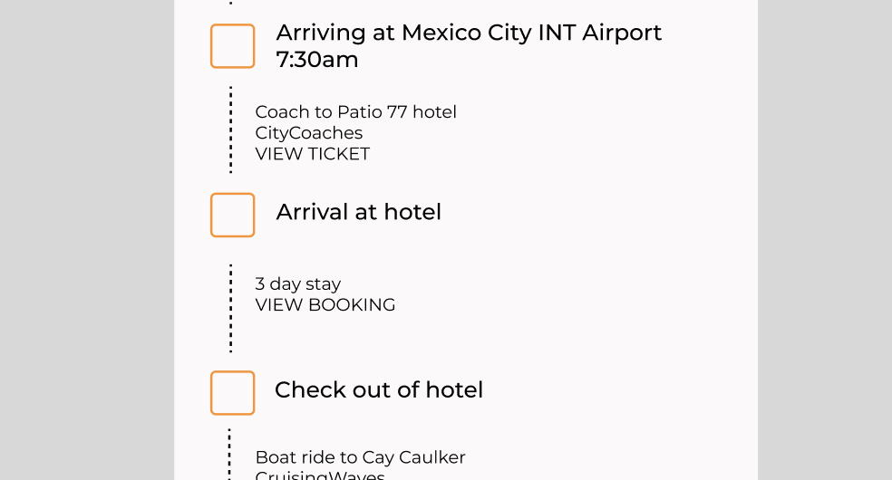
The final thing was edited within the design system section, however it was a good mention here that we made sure the weights of the font where different, as before they all blurred into one another as they were the same.
Design For Good : Initial Research

I began this project based on my problem statement from Project 4. I had hoped to create a finalised working platform for people to explore the idea/ concept of backpacking within their comfort zone. A safe space, where they can track and see their booking, as well as book together. I first had to gather together all of my ‘needs to include’ notes from previous research, which is noted below. I used all of this to then continue on with my work.

  • Quick Booking Process
  • Error tolerence
  • Defined as eco friendly
  • Extra information such as travel times and weather times
  • Surrounding area information
  • Filter has destination search
  • Clear review section
  • Scrollable images
  • Filter for price
  • Map that physically showcases route
  • User checks
  • Ability to multi book between two people

These were taken from user interviews, and so are directly from the point of person who would be using the product, as well as my expert interview, someone who literally sells holidays similar to this concept for a living.

Initial research

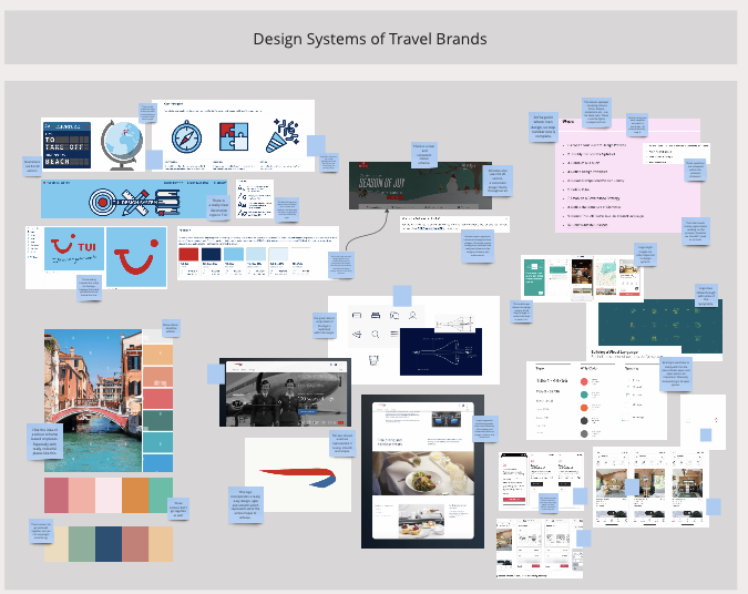
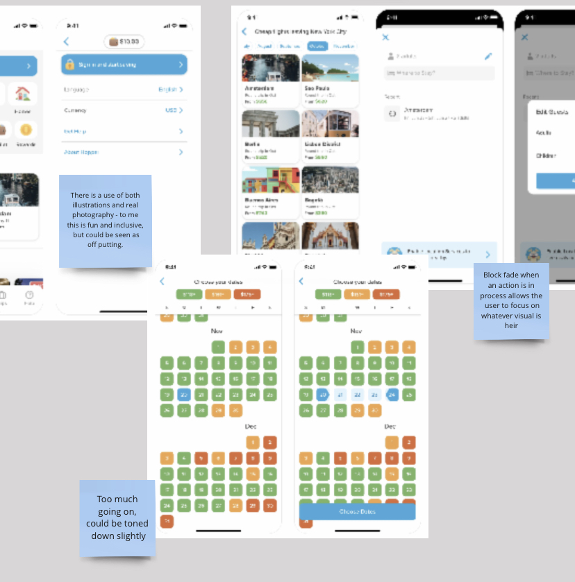
After doing all of my user research, it was time to start developing, and to do this, I wanted to look into the aesthetic design of differing products and how they best tackle problems similar to my own. I had previously done research on some different travel agencies, done a heuristic markup as well as testing them against the seven principles, however I wanted to now take time to look a bit into functionality when met with design appeal.

I looked into different signifying features, such as calendars, how different filter searches were set up, and how the colours and imagery used within them were both positive and negative.

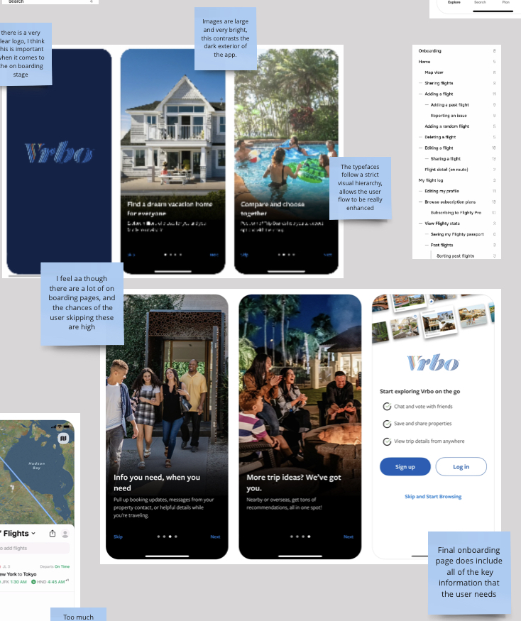
I also looked a lot into on boarding pages, and how these best allow the user to both understand and visualise concept, to move forward in a cohesive flow, and to then avoid errors by teaching them about the product.

Reviews also came up as a massive part of why people not only abandon their carts, but would not choose to backpack. Why backpack if there is no way of understanding how people feel about specific places?

The product itself could fall under booking specific pre planned out trips, or it could be an aid in booking the really specific places that the customer wants to go to. On top of that, it was important for me to think about different design features such as a low light screen, avoiding blue light and using the least power needed for the process. These factors have very little to do with backpacking, but have a lot to do with environmentally conscious design. It all circles back around to the main purpose or the product, and can be pinpointed back to research found in my very first board of this project.

All of this research done ( which can be found on the miro board below ) led me to my next topic or research for the project, looking into how all of these deciding factors can be effected by disability.

Miro board : https://miro.com/app/board/uXjVNCv7uts=/?moveToWidget=3458764573197781746&cot=14

Accessibility within Design

Having read the book ‘Mismatch’ by Kat Holmes (a summary of it can be found here : link), I have grown as a designer to learn a lot about how different design can be changed and moved about to allow for everyone to be included. On top of that, one of my user interviews is someone with autism, and through interviewing her and growing to understand her needs as a user, I felt it quite important to look into this in order to help my project really work.

A design ‘normal’ cannot be defined, and it would be entirely wrong and unethical to do so. By defining a normal user, we outlaw people who might not have the exact same requirements. But it is very difficult to make sure everyone is included in our diversity, so there are a few ways we can do this. Simple things such as choosing a coloured background with a large enough contrast to make w difference, using large enough text so that it is always visible to a user, and even looking at drop shadow and features such as that. That is however just the appearance aspect. Function is massive at this stage of the design. A navigation bar for example should be mapped similar to others, because they work, because they are classic and tested and tried and have worked time and time again.

These fundamentals of design are imperative and should be tested against for everyone’s ability to use a product or service.

Find the miro board here : https://miro.com/app/board/uXjVNCv7uts=/?moveToWidget=3458764573198325042&cot=14

Design Systems

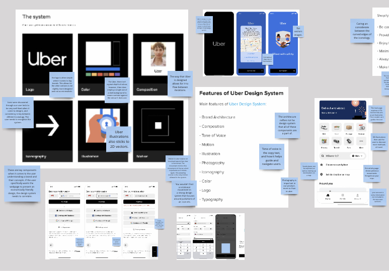
When looking at moving along in the design process, a company must form a design system so that different people within the company design with cohesion in mind, allowing the user to feel comfortable. That is why instead of simply looking at design and function research I chose to look into the way that companies build design systems, starting with some travel agency companies such as TUI and AirB&B.

These are not only massive companies, but they are massive when it comes to viability within design. TUI for example was one of my favourites! They used the same style of illustration throughout, something that surprisingly not a lot of other companies chose to do, as well as using a strong colour pallet. The reason TUI is not found within top 10s of design systems however is where they fall off the mark. And that is at functionality. They have a strong colour scheme, but when two buttons in exactly the same colour mean two different things, the design system doesn’t work with the function.

After that I chose to drop the idea of a travel agency for my research and just look at brands that have been classed as having the top 10 best design systems. Unsurprisingly to me, Uber falls top of the charts.

I eventually placed all of these components onto a singular board to combine the research that I had done, and so this is linked on the above initial research section.

As well as this, I looked at some other factors – particularly how different colours face up against one another. The concept of FFFFFF as a key colour and 000000 is hard to get right, because when contrasted with one another it is far too dark, the colours simply are not visible enough. It is very easy to just move to these colours as they are on opposite sections of the colour frame – however, its important to note that it often ruins designs. It over dominates other colours, especially soft pastel colours which are a large part of my own design system.