Today we had a really useful talk from Jason Brown, a graduate of NUA who studied UI/UX Design. He talked about a lot of different things, and it was really fun to hear about everything he has done since graduating.
Working at both The User Story and Earthware, both being based in Norwich, Jason had worked in data, UI, and Ux since his graduation. He mentioned that it was really interesting to be an internal and that we definitely should be looking into that.
Jason talked about his university work as well, where he mentioned his shift to web accessibility within his third year, expanding his knowledge on visual impaired users, who couldn’t see anything, and those who were slightly visually impaired.
“Accessibility should always be at the forefront of design, especially when it comes to the internet, and how we perceive that.”
He mentioned his involvement in Codebar, as well as different Storefront magazines, where he originally planned on doing Graphic communication before setting his heart on UX, as one of the first students on the course, eventually moving onto working for the National Grid.
The national grid transmits electricity across high voltages all across the super grid in England and Wales, pretty much anywhere in the country. There are several sprouting out of Norwich, and the company maintains and owns all of those assets. Surprisingly, they don’t actually generate electricity. This means they are a business to business company. They use a Scale Agile For Enterprise which allows for the designer to understand the customer, the designer, and the problem, as well as everyone else on their team and what they do. The actual set up of who is employed by who is complicated, however, Jason is hired by a central team to support any department in the National grid, almost like an internal agency, where he is loaned out to different departments.
This talk was really useful, as it helped me understand how a UX designer has to be able to work within different sectors.
Here I made note of some of the little changes that I made to my design to make it flow easier, or just make it all work as a cohesive design.
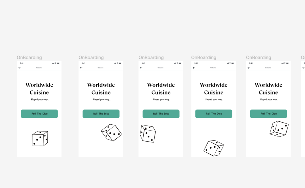
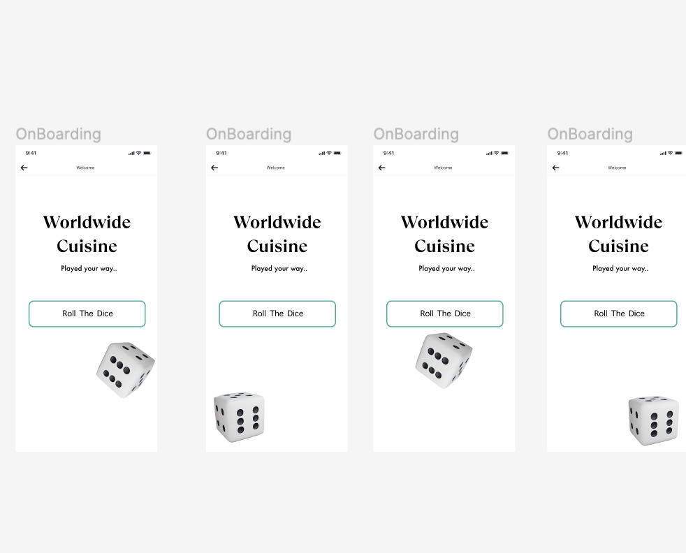
Onboarding Signifier
Here I wanted to give the action some sort of affordance, so that the user doesn’t think they messed something up when they have clicked the correct button. To do this, I changed the ‘Roll the Dice,’ button so that it would have some sort of corresponding action when clicked on at first.
The Checkout Process
I had refined this process quite well, because I had looked at a few other checkout processes previously in Project 2 – however, there were still a few things I had hoped to change when I came around to designing it, or things that didn’t work as well as I thought. For example, below, I had created a process to input information so that the user could write in their emails etc, however, at the bottom, the ‘continue’ button allowed for them to skip the process, something I did not want them to do. To counteract this, I decided to remove the continue button until the user got to the part that was optional ie, the delivery instructions.
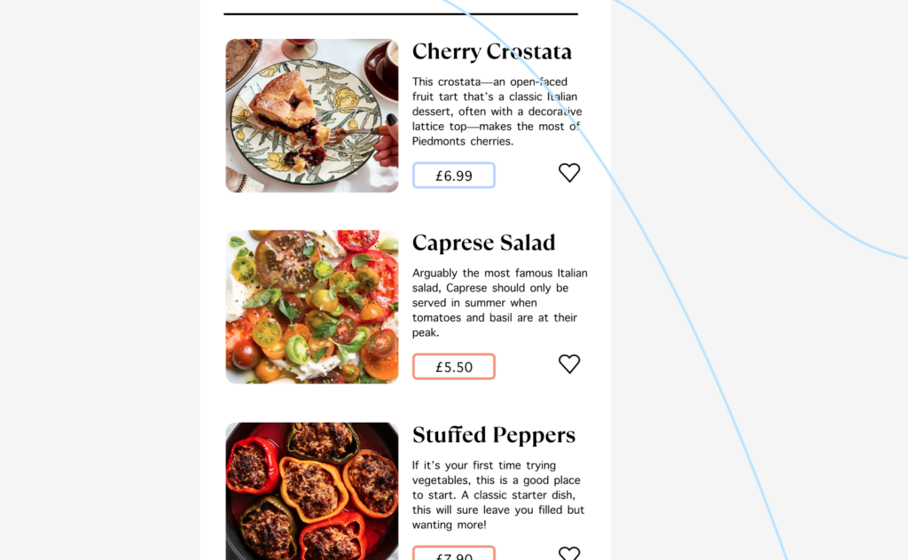
Favourite button
The favourite button is a key part of the process when it comes to ordering your food via this app, and the concept relies on it working efficiently and well. I originally planned on only having favourites in the section within the larger click of the items, however, I wanted some sort of shortcut for the user. If they know they like Caprese salad straight off of the bat, why make them click and waste their time? I did this by adding a favourite button to my component to make them all even.
Illustrations
When researching the different kind of things to put into this section, I had drawn out a few different illustrations of the monopoly man to be used within the design. This was to reinstate the idea that it was ‘monopoly,’ themed. However, after my work in Sync the city and using 3D illustrations, I decided I wanted to use them in order to bring the design system. bit more to life and interactive.
The prototyping section definitely took me the longest out of all of them, as I wanted to make the filter completely interactive so that people could experience the webpage to the fullest extent.
Scroll System
In order to do this, I first wanted to make my scroll systems interactive, however, I stumbled upon a few challenged as I went along.
The scroll bar literally would not work!
I had a few ideas as to why this could be:
Groups and Frames
ou will need to group your elements together before adding the frame. Use auto-layout to space your elements evenly. To make the frame scrollable, you need to put the group inside a frame.
Select the Filter group, Option+Command+G to add a frame selection, rename your layer
Drag the right side of the frame until it hits the side of the screen
Do the same thing for the gallery frame but drag the bottom side of the frame until it hits the bottom of the screen This will limit the view of the content to only be visible within this section
Layers
Figma will only scroll top level objects, so if your object is obscured by other layers, then it will not scroll at all.
Content Clip
To make something scrollable, make sure to check the clip content option. Clip Content will adjust the content to fit within the frame so it doesn’t exceed the width of the screen. When scrolling within the selected area, the view is displayed within the frame, which is something that I had to check before moving forward. It is also important for the frame to be around the items you want displayed.
After I had looked into all of the different reasons, I finally created the scroll system that would work on all of my filter bars, in which I could copy and paste onto different slides. I originally had it slightly curved, however after some design recommendations, I did lower the curve on the sides so that the rectangles were slightly more present – as it was commented on that round shapes felt ‘safer,’ and not as thrilling.
Components Part Two
I needed a fair few different components for this project, and I am glad that I looked into a lot of different methods of doing so, as it really helped me to develop the way I use and create smart components for projects.
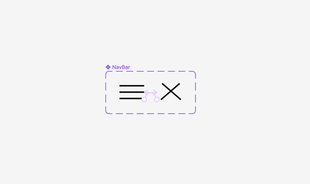
The first thing I needed to do was to create a nav bar for the home page, so that the user can easily get back to the home page if they need to, or to edit their favourites cart and pay. I did this by using a very simple hamburger navigation bar, as I felt the simplicity of it matched the design I was going for, and used a smart animation to create a cross for the user to then close the navigation bar when done.
I then built this into a component so that it could be used within my design multiple times at the same size and dimensions.
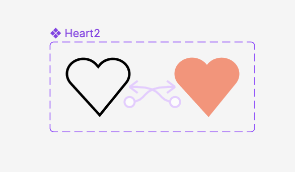
I then had to look into a heart tool so that the user could favourite their meals and in turn, gain some sort of signifier that they had completed that action. I felt as though a signifier was important, because it means that the user knows for sure that they have put something in their cart, saving time and energy.
I used the colours from my design and made the original heart to match the style of my design system. The shape was common in most web design, as I felt a more rounded out approach maps the component in a way that is similar to peoples expectations.
In theory, this should have worked, and for the slightly larger hearts, it did completely work really well, however, upon testing my prototype, the hearts within the components did not want to work for the life of me, and whilst I attempted to move them outside of the component, recreate the heart entirely, and even add it as a separate frame, nothing wanted to work. It turns out that the reason for this was that it was being tested in preview mode, so only the main animation moved – so start prototype viewing gin present mode !!
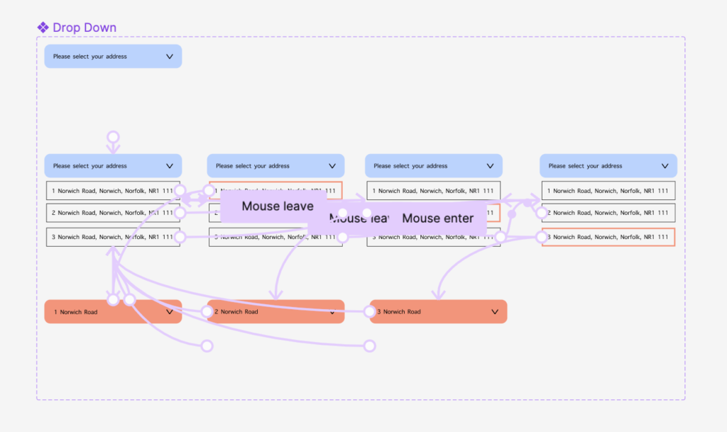
I also wanted to create some sort of location selection tool for the user so that they can input their address at the start of the process. For this, I created a drop down menu with different addresses on so that the user could find their house number or name from a previously input address.
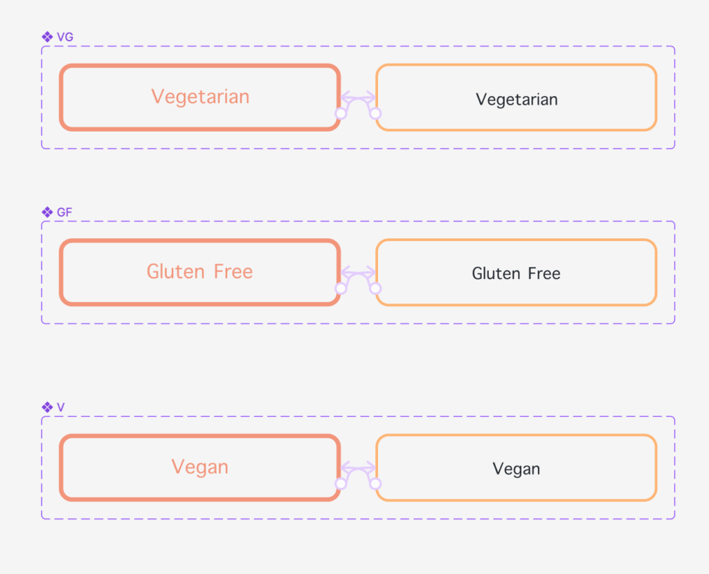
Similar to the one I had previously made, I wanted the user to be able to put their preferences into the website as to avoid any incorrect items on their menus. I made this very simple so that the signifier from the click is obvious enough, but doesn’t change the state of the component too much.
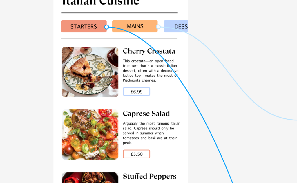
Adding Noodles
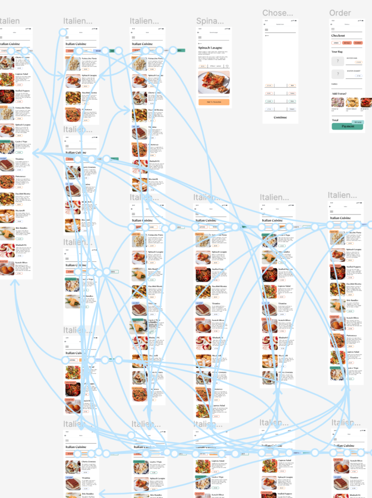
After I had done this, it was time to Strat adding the prototyping noodles in order to connect different frames within my design. I began by using a written down system to see how many different filter selections I needed to create, and highlighted each one appropriately, before going one by one and connecting them all, making sure to include the back arrows at the top of the page. Below is the (somewhat chaotic) final image of that section that I had completed.