Sync The City : Day Two

Day two arrived faster than I thought it would and on 5 hours of sleep after planning out some of the design sprint, me and Fergus got to work on the idea of a gamified version of personal finance, bringing together the concept of Idle games, meaning a game you play in purpose of something else, and the modules that Maggie and Patel researched too create a home page.

Day two was definitely the hardest day, because we began it by thinking that we knew what we were doing, and this proved to be the first mistake of many that we made. We thought we had a colour scheme nailed down, we thought we had a character we could use (inspired by the research of duo lingo) to provide a fun entertaining method of flow. We had all of these ‘we thoughts,’ and not a lot of ‘we know,’ which is why I’m kicking myself writing this knowing that we had absolutely no research to stand on, and believing we, as product users, knew what we were doing.

By 4pm, we had settled on the mascot of an BudgetBeaver, having jargon such as ‘flow through finances,’ and even a name! DamSavvy, inspired by the literal dam’s that beavers build, was the plan we had. By 8pm however, our plan was thrown against a wall as Adam asked the room, and realised the vastly obvious sexual connotations of the word ‘beaver,’ (which I had never heard of) that everyone was in agreement about. We had to lose the Beaver. Do you know how many tines I drew a beaver?

We had all of 20 hours left, no leg to stand on and two stressed out designers, myself nearly in tears and Fergus still trying to convincer everyone that we need to use a Beaver, 3 confused developers who had no idea what to create due to our own lack of knowledge, and a team of business minded people looking to create something for the MVP showcase that we didn’t even have a basis for. When I look back at what we achieved, everything we put together, and watching Daisy give that final 5 minute pitch – it amazes me that in all of 16 hours, we managed to put it all together. Below is a photo of me, Fergus, and Adam, that Fergus appropriately captioned for me.
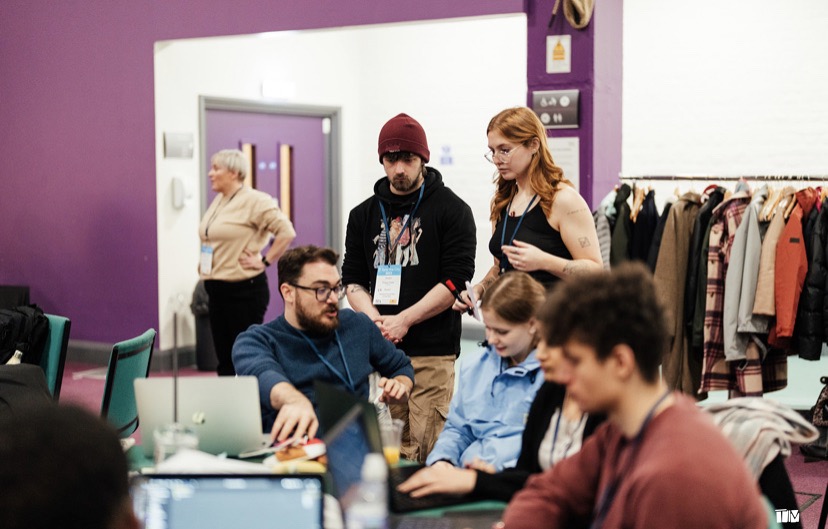
Two designers mortified at what the developer has created : a canon event that cannot be changed.

Sync The City : Day Three

The final day! Literally the most stressful 12 hours of my life I cannot lie to you. The night before, we had changed the mascot, which was originally a beaver, changed the jargon, and decided we would develop upon the idea within the product. It was hectic, as me and Fergus rushed to finish what we had created all whilst changing the entire interface!

We talked it over with the other developers, made sure we were all on the same page, and began using 3D illustrations from library packs in order to create a ‘gamified,’ approach to the final product. I went from (in the space of 2 hours) drawing up illustrations of beavers, which I kept calling otters, to drawing up people, to dogs. These illustrations were all used in the final products and can be seen below, and I was really proud of most of them. I drew them out in co-ordination to specific questions, and made sure that I was only creating what we would actually use for the MVP showcase as well as the final slide deck.

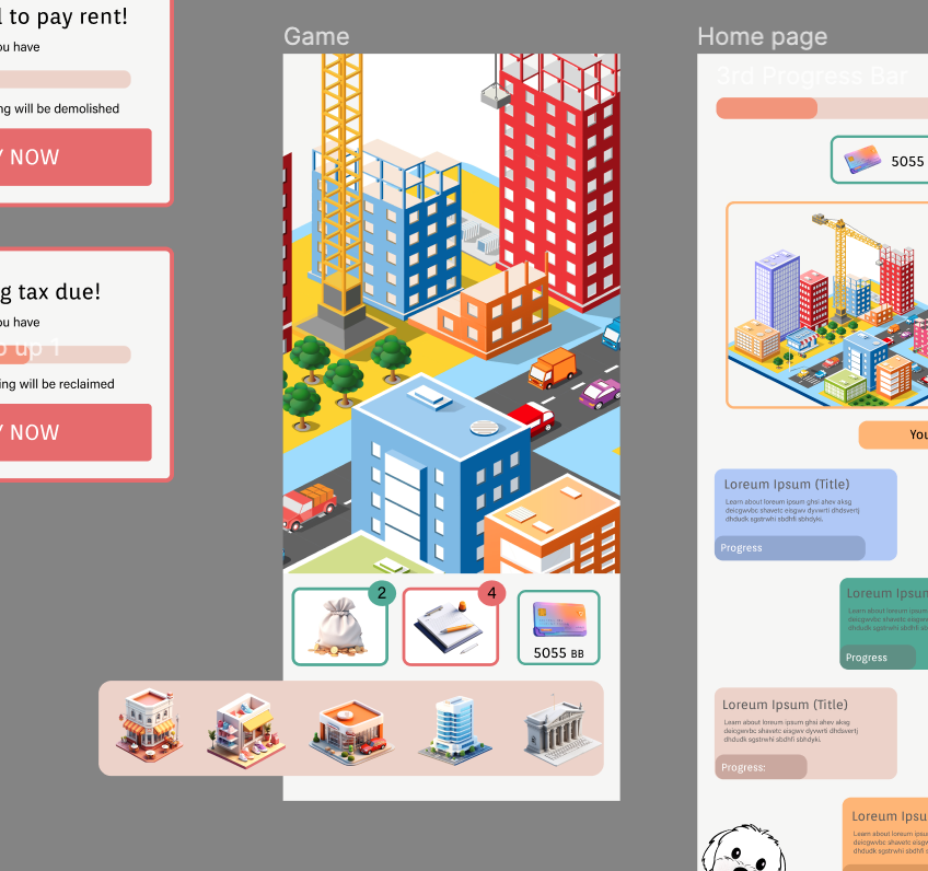
I also looked into creating the final wireframes, and different elements that the developers could place onto he product to create a finished and working platform. We chose to use a singular home page without a nav bar to allow the user to jump easily between the two sections. Below is the gamification section we drew up, as well as some different pop ups.

Evaluate and Iterate : Heuristics and Design Principles

Beginning the project, I wanted to focus on a webpage that was not too large as to be too much work, but to have a fun design system already in place, with an event that I was interested in. For this, I chose Boardmasters, a festival in Cornwall based around surfing and music. Whilst the webpage was developed by a design team from Project Simply, it felt like it lacked basic design principle thought, and there was an inability for simple principles such as the ability for Error Tolerance and Ease of Navigation.

Heuristic Markup

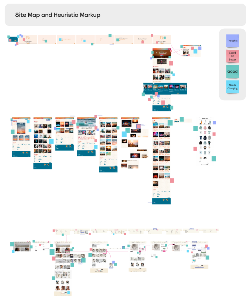
Based on a sitemap and Jakob Neilson’s 10 Heuristics, I noted points of development, positives, negatives, and just general thoughts on the images of flows. These all could then be linked back to the 10 principles, which can be found in my further research (link). Markups are simply short ideas and notes, and so I was not too worried about lengths of explanation but just getting the issues pointed out on the web flow.

I also looked at the selling of a physical product, and where that webpage provided different things that the Boardmasters site could not, be this due tot he nature of it being an experience and not a product being bought, or simply lack of thought in the design of the flow. the physical product webpage, Martha Jackson Jewellery, was beautifully laid out, and provided a steady and easy to follow flow, inclusive of affordances, signifiers, and strong mapping.

Miro Board Link : https://miro.com/app/board/uXjVNfSA41M=/?moveToWidget=3458764566228654072&cot=14

The Seven Design Principles

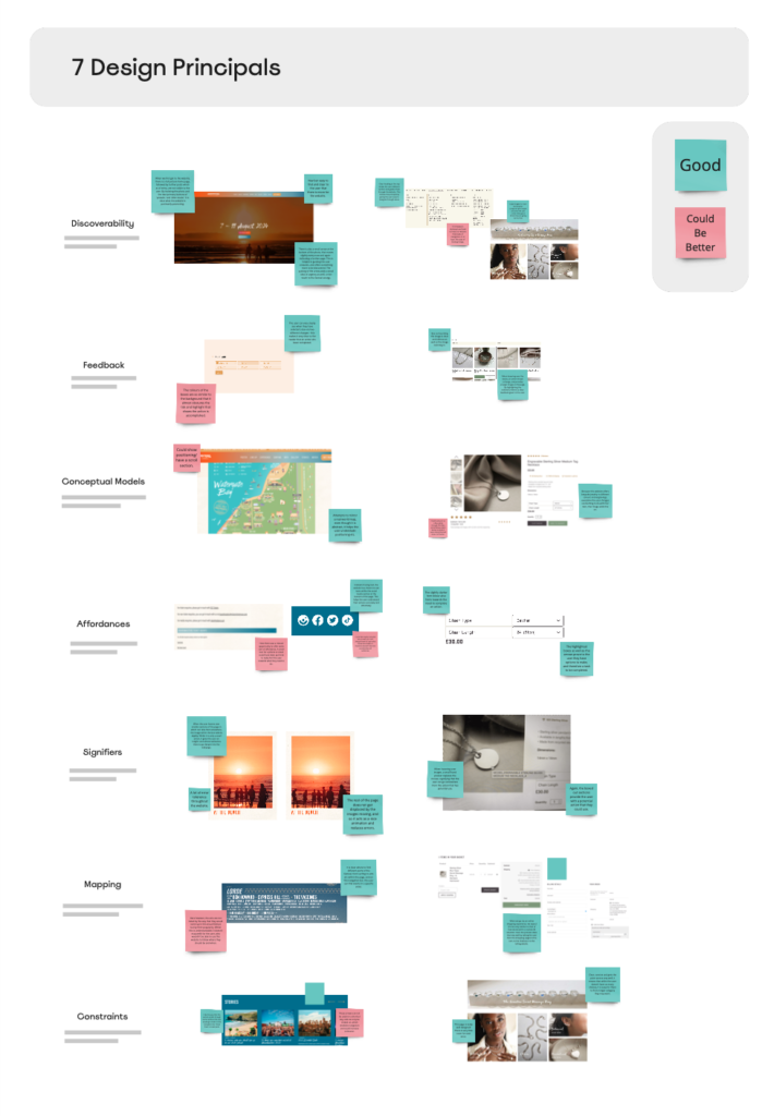
This provided me with the ability to then pull apart both of the websites and look at where they meet and failed to meet the Seven Design Principles as created by Don Norman (link).

The Boardmasters website notably had less of the principles within it’s components, however, this did not mean it lacked all of them, as some of the principles, such as Discoverability and Signifiers, were followed precisely, and made the website easier to navigate.

Miro Board Link : https://miro.com/app/board/uXjVNfSA41M=/?moveToWidget=3458764566229830754&cot=14