Prototyping this project taught me a lot about Figma – and really helped me up my skills! I began by creating basic components, as I believed this was a good place to begin when it came to the elements I would need.
Component Overlays
One problem that I faced was the navigation overlay. I was determined to attempt this on my own and attempt to figure out if I could do it without the help of a video, and I did manage it (after a while of attempting.) I began by making a ‘swap overlay’ component on a separate page.
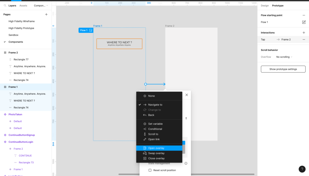

When this was placed onto the original document it came to my attention that the swap overlay could only be as big as the original frame was that it was sat on. This meant if my home page was only 100 pixels long, and I needed my filter bar to be 150px – 50 1/3 of that filter bar would be cut off. This was an issue, as I knew my filter needed to be relatively large due to the research I put into understanding one, and knowing what people needed.
This was an easy problem to get around however, as I simply added more sections to the home page about ‘preplanned trips.’ The main focus of the product is being able to select your places of travel and it creates you a route to backpack – so I thought it best to avoid prototyping every single section and just to stick to the main focus. The issue with length however did mean I had to perfectly align both the home page and the component swap on, as the navigation bar needed to follow the home page to the bottom and sit just right. I didn’t want large white empty spaces, and I also didn’t want to have overfilled pages for no reason.
Fortunately, the process helped me learn a lot about the way components work in Figma – unfortunately the filter bar cause more problems than just this!
Remembering States of Interaction
I wanted the user to be able to select where they want to go, and for the system to remember that and create a journey from it. In order to do this, I needed to make the components that were selected able to remember that selection even when clicked onto another page or element. To do this, I had to build components within components.
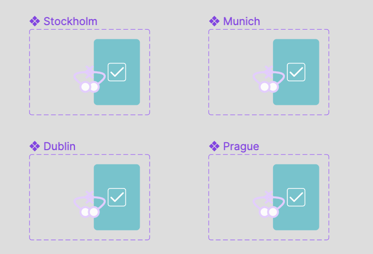
I began by creating selection states, and then duplicating the components (it is important to remember not to use instances, but to create new component sets) for each of the desired places. This means, once clicked, all of the instances of the main component would change, and wouldn’t change back until clicked again by the user.

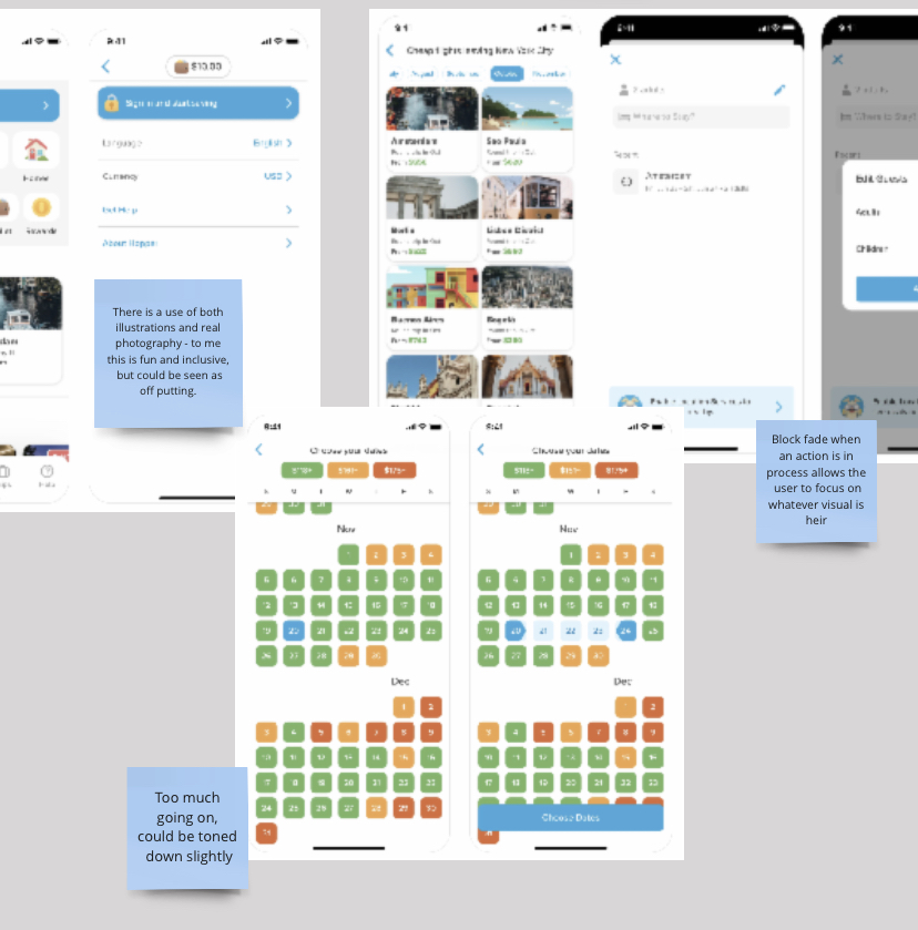
I also created different heading options to filter the places, and linked them up using noodles, dividing each within the larger component of ‘PickFilter,’ placing the 0% opacity sections over their coordinating image.
The filter bar as a whole was a bit tricky to completed and took a lot of different components to be built within for it to work. Sometimes it would mess up for small reasons such as the hierarchy of layers or something not being within a component properly. But these were easily fixable, and helped me to understand how to build more like this in the future.
Final Details
Whilst in a critical with Rob, he brought some really useful things to my attention that I didn’t think about prior to creating the prototype – all quick changes that could be integrated throughout to make sure my product worked as well as it could within the users needs and wants.

The speak to an agent button was previously just a small blue button with text in, it had not been highlighted yet and there was a somewhat lack of focus within it, even thought it was almost a CTA help button. With the user possibly being a new traveller, and possibly there needing that help, it was a correct assumption to possibly highlight it, as it didn’t affect the hierarchy of the page, all whilst aiding the users journey. I highlighted the box, as shown on the right, and then added an icon to suggest that it was a phone call as opposed to an email etc.
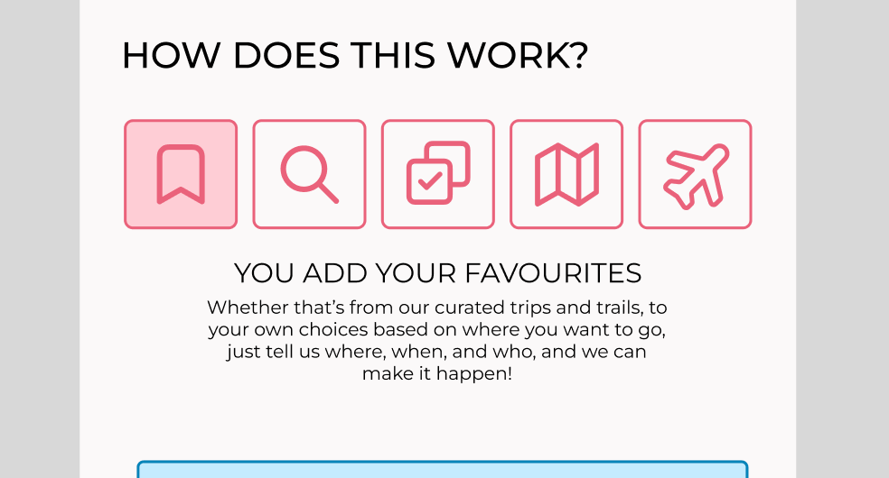
Then, on the informational section where the user gets told what they can expect, almost like a mini onboarding system within the checkout process to aid the users experience, the process began with no text and needed the user to click on it before it began. Rob highlighted this as an issue because the user may not understand they need to be clicked on – which is so true! So I made the component begin at a highlighted section as shown above.
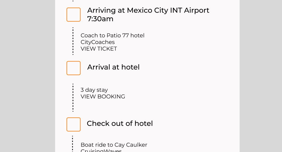
The final thing was edited within the design system section, however it was a good mention here that we made sure the weights of the font where different, as before they all blurred into one another as they were the same.