
For this part of the project I was given the task to oversee designs for the About Us page and lead ideas and execution of work for this specific page.
Original Ideas:
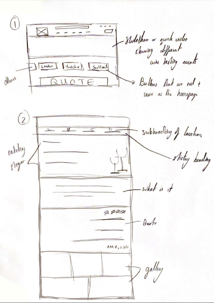
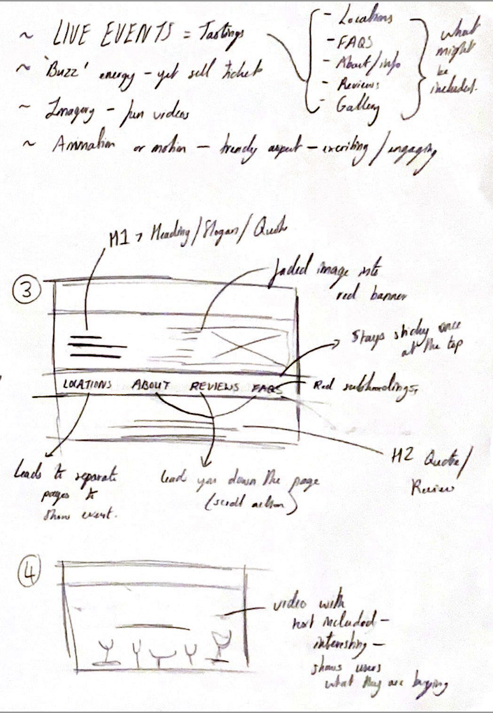
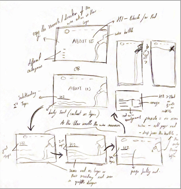
Another original concept was to manipulate the curve from the Virgin Wines logo and incorporate it into our design to mirror the ‘flowing nature’ of the company. This idea was continued as we developed our designs further when starting work on Figma.
Experimentation & Developing Designs:
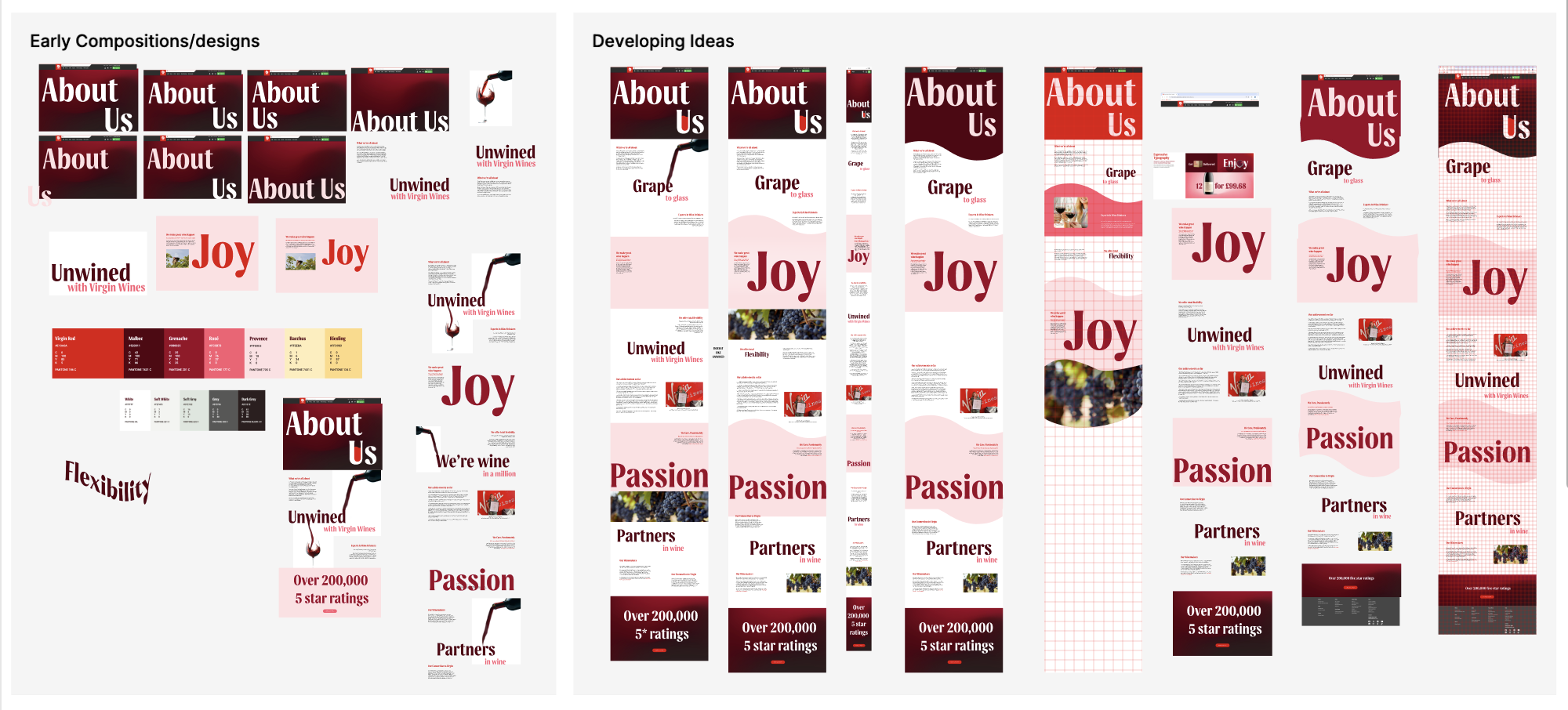
Here I began high fidelity designs for the about us page, experimenting with compositions, ideas and brand colours. To start the page I suggested using a larger size for the font as the typography holds great detail which reflects the company values, service and products with it ‘flowing nature’. Therefore like many competitor websites and previous Virgin Wine designs, I wanted to illustrate the title in a full-screen affect at the top of the page, establishing a gradient from the brand guidelines and a heading. Next I experimented with different layouts/compositions for the text within this top section as I explored the different text alignments too and testing two brand colours for the font. This included a clear white and the brands colour ‘Provence’, resembling on of their own products.
Once we discussed our preferences of the top section as a group, I swiftly moved on to replicated my initial sketches and ideas. The main concept was to entangle large words into our designs, representing the company in one words to emphasis the characteristics of Virgin Wines.
From this I developed ways to add interest for the user by including different shapes to illustrate movement on the page. This is to produce a page which doesn’t follow stereotypical layouts that appeared outdated and boring as we found that information and content tended to be laid out as a stack. I achieved this by recreating the curve in the logo that mimics the motion of wine being poured into a glass. Ultimately I believe this created a theme and a constant reminder to the user about Virgin Wines’ easy flowing nature as this allows them to appear relatable to a user as well as consistently reflecting their main purpose and passion for wine.
Critical Analysis & Further Development:
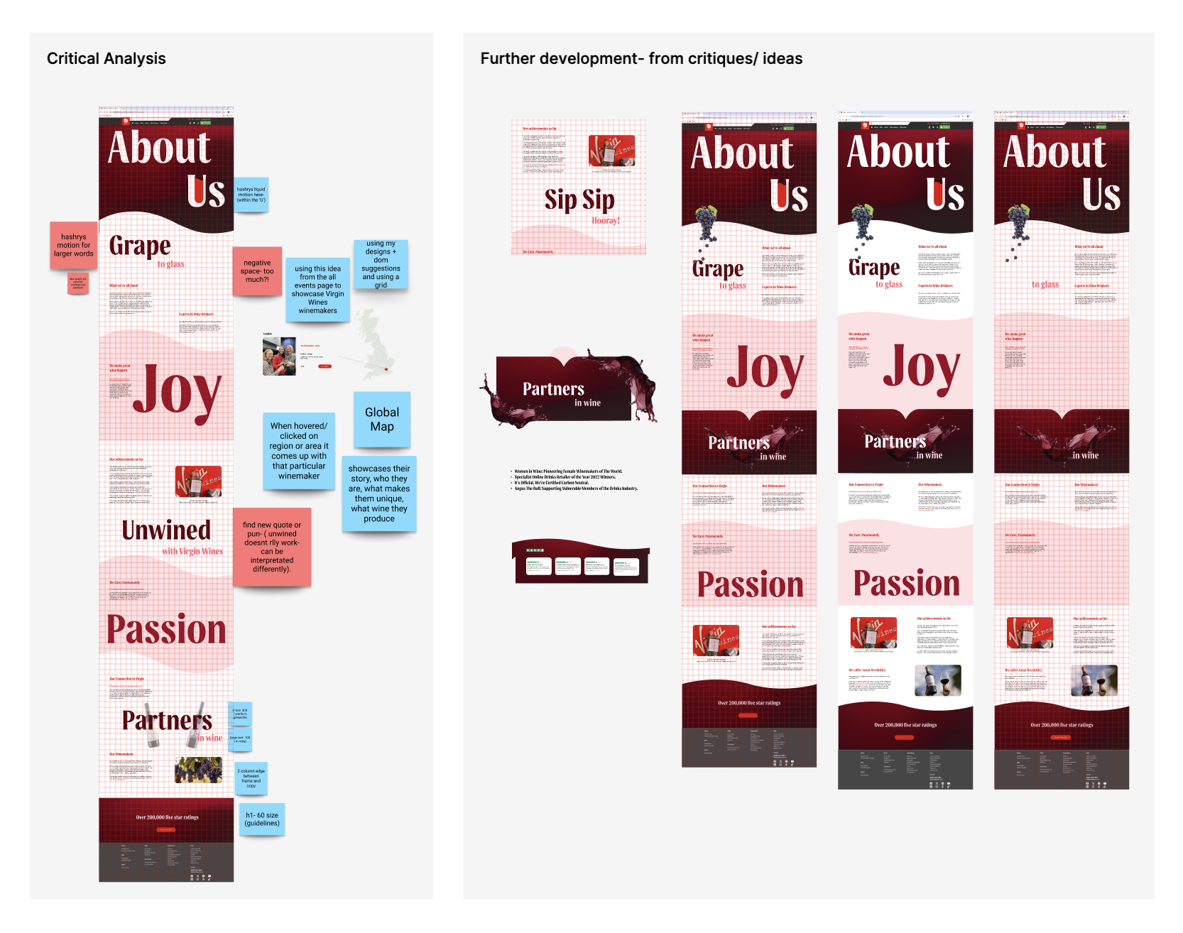
Once a rough outcome for the About Us page was complete we discussed and assessed the design before making a critical analysis to see which areas we could improve on by noting possible suggestions and solutions to improve the users experience through design.
After I conducted a critical analysis Rishabh created a mobile version of this whilst added some of his own ideas. From this we talked about design ideas, resulting in me added some features Rishabh designed and adapting it to my desktop layout, these are presented above as .Further development’.
To add to these design elements I wanted to go back over our copy for this page as I believe the company were missing some aspects which would add a positive outlook on Virgin Wines from the user. These aspects lead to the introduction of two sections; ‘Our Winemakers’ and ‘Our achievements so far’ which I will discuss in further detail in Final Outcomes.
Final Outcomes:
To display our final outcomes, I suggested we used mockups and templates in order to emphasise the professionalism of our work as well as for the client to see how a user would interact with the prototypes by being placed on different device mockups.
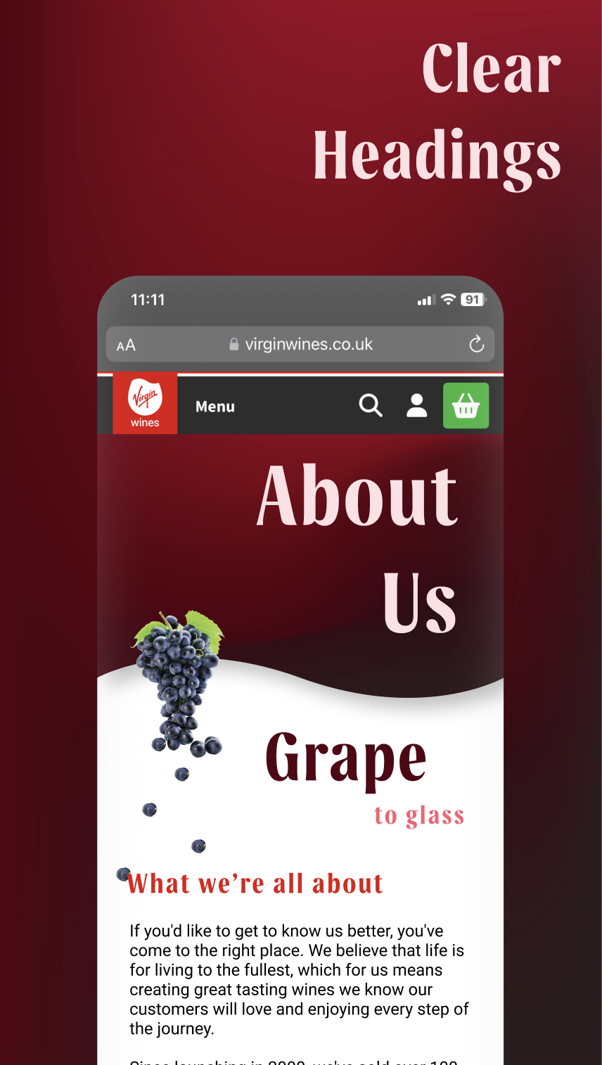
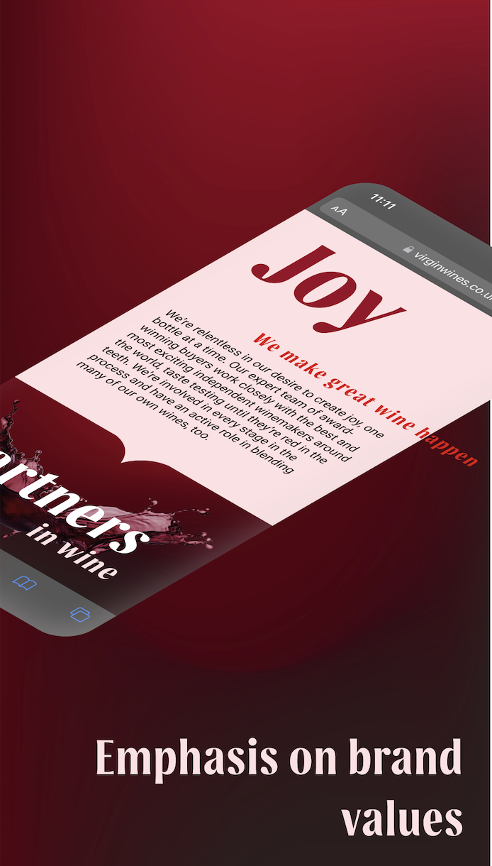
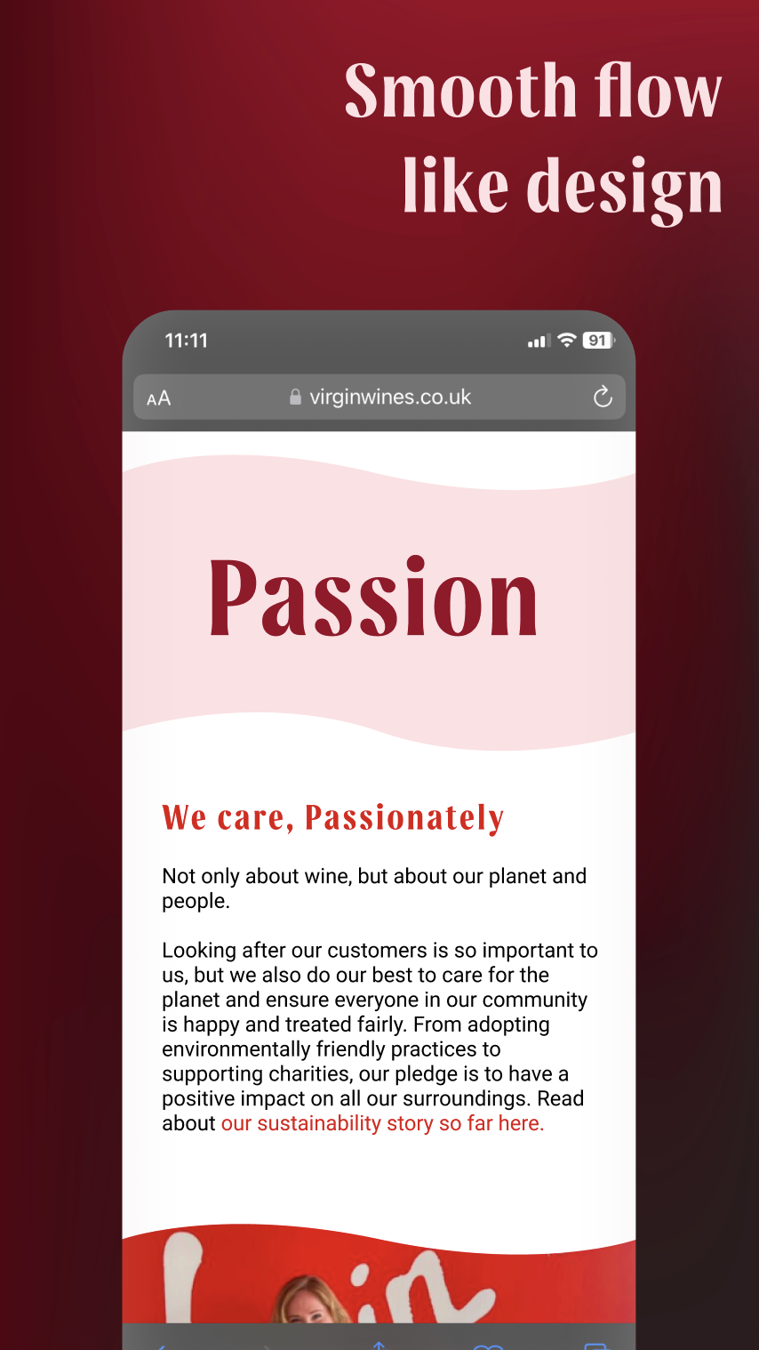
I enjoyed the stories about winemakers on the hub website and believed it should be incorporated here within the partners section as most competitor websites we reviewed illustrated where their wines come from. This also allows the customer to dive further into the stories behind the wine, creating a deeper connection between the consumer and the product.
From these designs and written content, I established links to the hub where users can read the individual stories of each winemaker- this is something that caught my attention straight away on the hub page as we found out that there are even winemakers here in the UK! This is an aspect that we believe is unheard of in the wine industry due to mass amounts linking to warmer countries like Spain, France and Italy.
I loved the motion in the brand guidelines and wanted to remake the design for our prototypes. This was completed by me and Hashry working together as we discussed ideas that would be tangible to make as well as look effortless, this mean’t I came up with design ideas and feedback whilst Hashry created these amazing motions/animations.
The idea of enlarging particular words also came from the guidelines where Borne Agency displayed the font largely. I loved this as we didn’t realise the multiple features or details behind the typeface- aka the curve and flicks on the end of letters.
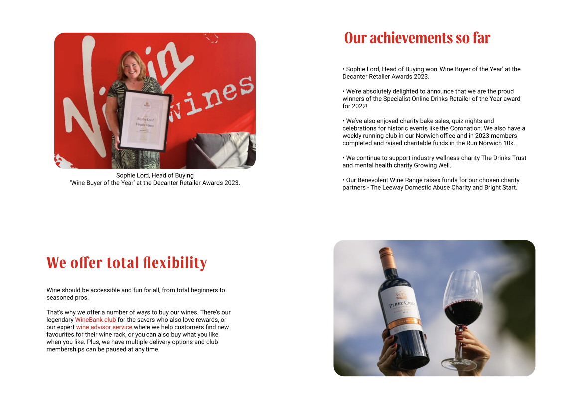
Here I wanted to display Virgin Wines’ achievements as we think this is a something a company should pride themselves on, especially with the amount of celebration and achievements they have accomplished. This could also include regular updates with current achievements like their head buyer winning buyer of the year.
Previously this was only seen on the hub page and the only other achievements displayed on the ‘shopping’ website could only be viewed via the sustainability page. These pages are less interacted with by users and so I believe Virgin Wines are missing the opportunity to broadcast their achievements in order to capture the users attention, just like their competitors would.
No Comments