UI design
With a set of ideas and feedback from my team laid out on in front of me I focused on creating final UI designs for the about us, home and checkout pages. It was an iterative process, involving back-and-forth recommendations from team members, which ultimately led us to a desirable outcome. My initial designs for the mobile version were not wasted; rather, they served as a foundation that we continuously improved upon with constant feedback.
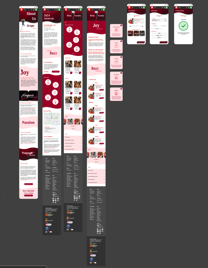
My fav part ofc: creating some mockups I made aimed to highlight the changes that we’ve made which improve the user experience.

We bumped into some unexpected walls: the presentation:0
We were so busy tweaking our designs collectively as a team over and over again, that we ended up leaving the presentation until the very last minute. I would say had we organised ourself much better we would have enough time to work on the presentation, rehearse our bits, and deliver a better presentation.
When it came to the presentation, ultimately we opted to discuss our individual contributions, believing that this approach would allow us to better explain the reasoning behind our design decisions. Accordingly, my role was to pitch my ideas for the mobile versions of the about us and events page. As I stepped into the room, my nerves were off the charts, partly because of our last-minute preparation. Midway through our presentation, I realized one of my key ideas had been overlooked. It was awkward, but I paused the presentation to retrieve it. What mattered most was ensuring the idea got across, despite the hiccup.