Buried under a mountain of research findings, I slowly moved into the ideation phase. Here my role was to focus on the Mobile design while the others focused on their responsibilities. While staying true to their brand guidelines I aimed at making their website readable with appropriate use of hierarchy techniques, more pleasant to the eyes by adding colors and unique designs which will have a positive impact on the user experience.
I began with some rough sketches to visualise my ideas here’s what it looked like! Here I was trying to ideate as many versions and recreate certain aspects of their website with a more creative approach.
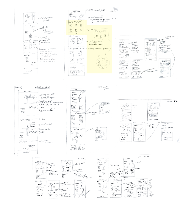
In the sketch below I was ideating different ways I could reinvent their ‘What to expect section’ from what was initially static and boring to an interactive design.

This sketch highlights initial ideas and plans I had of the about us page. I was playing around with content organisation and how I could add more detail to their website This helped me crucially with setting a foundation for my designs, which I then later proposed to my team and asked for constructive feedback. After a quick brainstorming session on how we could improve this design, I took down some notes and started working on low fidelity wireframes and eventually the final UI design