Introduction
The project began with a concise briefing focused on redesigning for Virgin Wines. Our team, consisting of Dom, Sihina, Hashry, Maisy, Robert, and myself, was formed rather randomly sitting around the same table. We got along pretty well since we were familiar with each other which pretty much gave us the upper hand in term of communicating.
In my mind I was like “a group project? that’s gonna be easy” or so I thought.
We began with collaboratively brainstorming questions to ask Graham- the creative director of virgin wines and posted them on a Miro board this was the easy part, after the session with graham we understood what we had to do and what they were looking for in their website. I found this session helpful being able to learn directly from the creative director of the company.
To divide out workload equally we discussed everyones strengths so we could make the best of our abilites, following whcih we created a timeline and a to do list.

Beginning some domain research
At a good start, I was motivated to start this project and decided to do some casual domain research- finding out what their company is about, reading Vle slides and looking at their current designs. I looked into a few more aspects such as reviews and testing out their website myself. Following these tasks i got a clearer idea of the scope of work and domain we were dealing with.
Heuristic Analysis
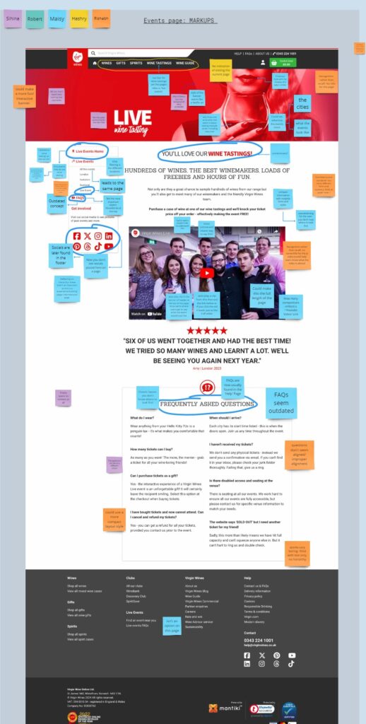
Collectively as a group, we began with Heuristic analysis of their current about us, events and checkout pages. For this activity we used color coded post it notes to help indicate individual work as well as collaborative outcomes of our research. This part was an essential activity to identify pain points according to the 10 usability heuristics of User Interface design.
Some key findings included:
- Unclear heading on pages
- Unorganised sections
- Improper text alignment and hierarchy
- Ease of readability
- Low quality images
- Improper content organisation

Competitor analysis
Moving forward, I took on the role of analyzing our competitors. In this analysis, it was important to consider that Virgin Wines may cater to a different audience and that differences in their designs could be related to this factor. Keeping this in mind, I conducted a brief but helpful analysis of five competitors in their domain. I particularly liked the websites of Yellow Tail and Naked Wines which showcased a minimal and straightforward design with consistent use of their brand color throughout their websites.
Furthermore, I approached this analysis using detailed and concise method. This included researching their value propositions, target audiences, unique selling points (USPs), basic website features, and the pros and cons of their designs.

Statistical research
Here I was interested in learning even the miniscule stats and figures which have an effect of decisions on the website designs. To further understand the benefits of stas in UX research I looked into a blog “UX analysis: best methods and key tools”. I focused on ‘quantitative data’ to better understand the practices and tools used to obtain such data which highlighted Success and error rates, Net Promoter Score(NPS) and customer satisfaction.

https://www.hotjar.com/ux-design/analysis
I made notes on stats relating to the brand. To collect reliable statistics I referred to multiple trusted websites one of them being Statista. These statistics provided an overview of their brand, including the number of customers, sales figures, stock market value, brand awareness, and services offered.

Statistical research outcomes
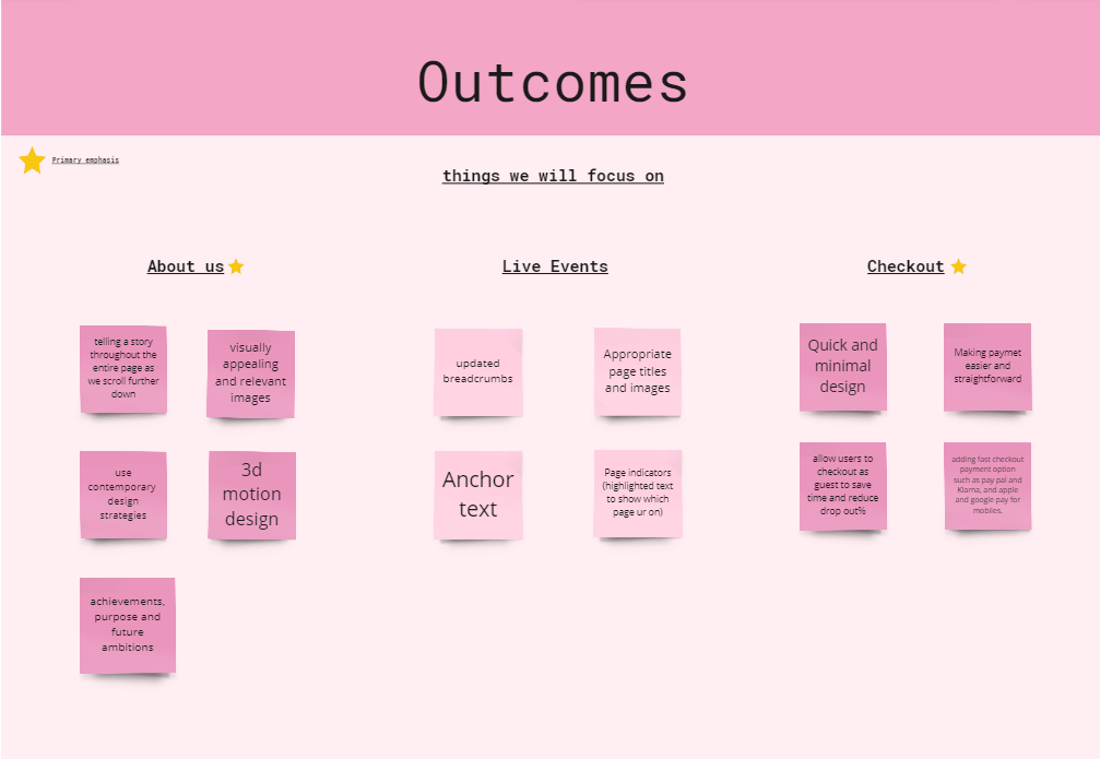
Following a through research we combined out different researches: Stats on brand and notes from the virgin wines lecture. With the help on an affinity map we organised research findings in three different categories: What works well for them, Issues/Problems, and potential solutions which consequently led us to a conclusion of what we had to focus on each of the three pages: about us events and checkout.